My pending thesis is on personal data collection (i.e. quantified self, personal informatics, self-surveillance, or whatever you wanna call it), so there’s a special place in my heart for projects with data about an individual, no matter who they are. It’s like taking a peek at part of someone’s journal that they’ve decided to make public.
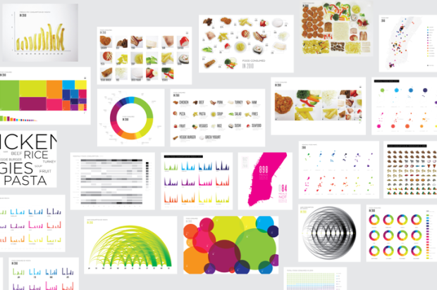
Designer and architecture student Lauren Manning has documented her life for the past two years, and for her thesis project, she visualized a subset of that data — her food consumption in 2010 — with a variety of over 40 graphics. Instead of sticking with a single, optimized view of her data, she stood back and let the data fly to see what would happen.
Here’s a simple aggregate view of what Manning ate during 2010. It was a year dominated by chicken and vegetables.

This one uses concentric circles to show consumption over time. The inner most circle is January, and you work your way out. The thicker the circle, the more of that food item that was eaten that month. It looks like she bought a box of veggie burgers from Costco at the beginning of the year.

And finally, all the graphics were placed in a grid layout as shown below. They were arrange from simple to complex on the horizontal and abstract to literal on the vertical.

Obviously a lot of these graphics aren’t going to fly in the workplace, but as an abstract self-portrait, this is just fine and dandy.
 Visualize This: The FlowingData Guide to Design, Visualization, and Statistics (2nd Edition)
that’s pretty neat, and visualize in such way. Tracking all these year long…good worth and thanks sharing.
I can’t imagine coming up with such an array of beautiful charts if I’d missed even 1% of my meals. Even though I deal with visualisations of data every day (I’m a cartographer), I found the paragraph the most interesting. Great stuff. Now have a cookie, please.
Very cool post – not to be picky but one ‘takes a peek” not a “peak” .
I’ve just recently become interested in data visualization, and I’m still trying to figure out how these types of charts are made. I’m there are many tools that can be used, but can anyone suggest the “industry standard” application to make something like this:
http://www.flickr.com/photos/laurenmanning/5659021847/in/set-72157626586750924
or this
http://www.flickr.com/photos/laurenmanning/5659573290/in/set-72157626586750924
Hey Nathan
Thanks so much for the article! I’m glad you’ve enjoyed the project. I’m so excited for your book to come out soon!
@Martin – the paragraph is one of my personal favorites too – and just so you know – I eat cookies – they just were not part of the documentation :) No worries! I definitely eat cookies!
@David – I used Illustrator almost exclusively, with a little Photoshop on the imaged based ones. There are a few basic tools online available, like Many Eyes, that will get you started, but you’ll need a design program of some sort to create them yourself. Best of luck! Its a great field to be in :)
These are very good examples. Sometimes working in InfoVis you get so caught up in the science of things, it is really very refreshing to see something so creative that communicates the data so well.
Lauren, thanks so much for the reply. I’ve been using illustrator every now and then for years, but never knew it had any graphing tools. Thanks again!
David
@David – the FD book can help you with that :)
Well with a personal recommendation from the author, I just might have to pick it up.
You know, it had *just* occurred to me the other day that Roundy’s Groceries has accumulated a TON of data about my grocery-buying over the last, um, 8 years(?) thanks to that little discount-providing key-fob thinger, and I would like to have access to that data. No idea if I can get it, but I’m already bracing for the conversation when I ask for it and am denied.
Suggestions for making my request as compelling as possible?
BTW, the visualized data is fantastic.