How to map connections with great circles
There are various ways to visualize connections, but one of the most intuitive and straightforward ways is to actually connect entities or objects with lines. And when it comes to geographic connections, great circles are a nice way to do this.
Here’s the technical definition of great circles on Wikipedia:
A great circle, also known as a Riemannian circle, of a sphere is the intersection of the sphere and a plane which passes through the center point of the sphere, as distinct from a small circle. Any diameter of any great circle coincides with a diameter of the sphere, and therefore all great circles have the same circumference as each other, and have the same center as the sphere. A great circle is the largest circle that can be drawn on any given sphere. Every circle in Euclidean space is a great circle of exactly one sphere.
 The important bit is that the shortest distance between two points on a sphere is the minor arc of a great circle. When currents and wind don’t interfere, ships and aircraft use great circle routes, which makes it perfect to show air carrier coverage. This is what you’ll do in this example.
It turns out these maps are relatively easy to make in R once you know how to put the pieces together. The maps that I posted on flight connections for each airline are what we’re after. With only about 30 lines of code, you can produce a series of maps that show flights for every major airline, so you get a lot of bang for the amount of effort.
Step 0. Setup
1. I wish they’d update the site; it totally looks like something out of the 1990s, but nevermind that. It’s useful software.You’re going to use R in this example, so download the free and open-source software if you haven’t already. It’s a straightforward one-click install1.
Step 1. Load packages
Open R. You need two packages to do the heavy-lifting: maps and geosphere. If they’re not installed, you can do that via the main menu Packages & Data > Package Installer. Once installed, load the two packages as follows:
library(maps)
library(geosphere)
The first package maps, is used to draw the base maps, and the second, geosphere is used to draw the great circle arcs.
Step 2. Draw base maps
The maps package makes it easy to draw geographic areas in R with the map() function. Pass it a database name, and you you get a map in one line of code. For example, to map the United States, type the following in the R console.
map("state")
Here’s the map that you get:
Blank state map created in R. Nothing else.
2. Map projections are finicky in R and can be a pain sometimes, but if you want to map with a different projection like say, Albers, look into mapproject() in the maps package.The projection isn’t the prettiest thing in the world, but it’ll do for now2. The bigger problem is that the state database doesn’t include Alaska or Hawaii. To include the two often left out states, you use the world database.
map("world")
This gives you a full black and white map of the world.
A blank world map is just as easy to make in R.
Step 3. Limiting boundaries
The data at hand, which you’ll get to soon, is only domestic flights for the United States, so you should focus on that area. Use the xlim and ylim variables to limit the map to a rectangle that only covers a range of latitude and longitude.
You can also play with the color of the base map at this point. By default, maps() doesn’t fill regions, but it will if you set fill to TRUE. For some reason though, if you set the fill color, you can’t change the border color. So instead (if you don’t want to edit in Illustrator later) you can set the line width (lwd) to something really skinny. For the purpose of this example, we want the the border lines to get out of the way.
xlim <- c(-171.738281, -56.601563)
ylim <- c(12.039321, 71.856229)
map("world", col="#f2f2f2", fill=TRUE, bg="white", lwd=0.05, xlim=xlim, ylim=ylim)
And here’s what you get with the above code. A simple and clean map of the United States that includes Alaska and Hawaii.
Focusing on all states. That includes Hawaii and Alaska.
Step 4. Draw connecting lines
Now that you have a map, you can draw connecting lines. This is really easy with gcIntermediate() from the geosphere package. Pass it the latitude and longitude of the two connecting points, and gcIntermediate() spits out the coordinates of points on the circle.
The n argument indicates how many points you want the function to return. The more points you indicate, the smoother the resulting line will be, but up to a certain point, you won’t see much difference. The addStartEnd argument indicates that you want to include the start and end points in the great circle coordinates. Lastly, use lines() to actually draw the line.
lat_ca <- 39.164141
lon_ca <- -121.640625
lat_me <- 45.213004
lon_me <- -68.906250
inter <- gcIntermediate(c(lon_ca, lat_ca), c(lon_me, lat_me), n=50, addStartEnd=TRUE)
lines(inter)
This draws a great circle arc from California to Maine.
A single connection.
Similarly, you can add another line simply by doing the same as above with different latitude and longitude coordinates. For example, you can draw a line from California to Texas, and you can use the col argument to set the line color to red.
lat_tx <- 29.954935
lon_tx <- -98.701172
inter2 <- gcIntermediate(c(lon_ca, lat_ca), c(lon_tx, lat_tx), n=50, addStartEnd=TRUE)
lines(inter2, col="red")
Okay, now let’s do two connections.
Step 5. Load flight data
So now you know how to do the hard part. You just have to iterate over latitude and longitude pairs to get the full map for a specific carrier. Start by loading the data with read.csv(), as shown below:
airports <- read.csv("http://datasets.flowingdata.com/tuts/maparcs/airports.csv", header=TRUE) flights <- read.csv("http://datasets.flowingdata.com/tuts/maparcs/flights.csv", header=TRUE, as.is=TRUE)
3. I used a five-line Python script to aggregate data that I downloaded from the Bureau of Transportation Statistics. The original file was about 50mb. You can aggregate in R, but it’s usually a better idea to not load large-ish files in R. Luckily airport latitude and longitude coordinates were available on the page for Data Expo 2009. Otherwise, I would’ve geocoded them myself, which I started to do and then got stalled by API limits.This is processed data that I cleaned up for this tutorial. It’s flight counts between each airport, categorized by airline3.
Step 6. Draw multiple connections
Data in. To map all connections for say, American Airlines, you filter as shown in line 3. Then you loop over each row of data, which has latitude/longitude for two two airports and the number of flights between them.
map("world", col="#f2f2f2", fill=TRUE, bg="white", lwd=0.05, xlim=xlim, ylim=ylim)

fsub <- flights[flights$airline == "AA",]
for (j in 1:length(fsub$airline)) {
	air1 <- airports[airports$iata == fsub[j,]$airport1,]
	air2 <- airports[airports$iata == fsub[j,]$airport2,]

	inter <- gcIntermediate(c(air1[1,]$long, air1[1,]$lat), c(air2[1,]$long, air2[1,]$lat), n=100, addStartEnd=TRUE)

	lines(inter, col="black", lwd=0.8)
}
Here’s the mess of black lines that you get from the above code.
Rough image of American Airlines flights.
Not bad, but you can do better than that with some rearranging and coloring appropriately.
Step 7. Color for clarity
You learned how to change the color of lines back in step 4. You change the col argument in lines(). You hard-coded the color though. You could instead create a vector of colors that scaled from, say, light gray to black, and then pick a shade from farther down the vector for connections with more flights. That way connections with more flights would be more prominent.
If only there were a way to create a color scale automagically. Oh wait, there is. It’s called colorRampPalette(). Pass it the base colors you want to use, and it’ll fill in everything in between. More specifically, it creates a function that you can pass a number two, indicating how many shades you want to use. In the code below, we use 100 (lines 1 and 2).
Then you do the same as you did the previous step, but instead of setting all lines to black, you calculate the color based on how many fewer flights the current connection has compared to the maximum flight count.
pal <- colorRampPalette(c("#f2f2f2", "black"))
colors <- pal(100)

map("world", col="#f2f2f2", fill=TRUE, bg="white", lwd=0.05, xlim=xlim, ylim=ylim)

fsub <- flights[flights$airline == "AA",]
maxcnt <- max(fsub$cnt)
for (j in 1:length(fsub$airline)) {
	air1 <- airports[airports$iata == fsub[j,]$airport1,]
	air2 <- airports[airports$iata == fsub[j,]$airport2,]

	inter <- gcIntermediate(c(air1[1,]$long, air1[1,]$lat), c(air2[1,]$long, air2[1,]$lat), n=100, addStartEnd=TRUE)
	colindex <- round( (fsub[j,]$cnt / maxcnt) * length(colors) )

	lines(inter, col=colors[colindex], lwd=0.8)
}
Below is the map that you get. The problem is the longer, less prominent flights are obscuring the more popular connections, because they’re being drawn on top. The above code just draws lines in the order that the data comes.
Use color to emphasize more prominent flights.
To fix this we use the same method that Paul Butler used for his Facebook map. We just order connection from least to greatest flight counts. That way less popular connections are drawn first and therefore, will be on the bottom, while the darker connections will be drawn on top.
pal <- colorRampPalette(c("#f2f2f2", "black"))
pal <- colorRampPalette(c("#f2f2f2", "red"))
colors <- pal(100)

map("world", col="#f2f2f2", fill=TRUE, bg="white", lwd=0.05, xlim=xlim, ylim=ylim)

fsub <- flights[flights$airline == "AA",]
fsub <- fsub[order(fsub$cnt),]
maxcnt <- max(fsub$cnt)
for (j in 1:length(fsub$airline)) {
	air1 <- airports[airports$iata == fsub[j,]$airport1,]
	air2 <- airports[airports$iata == fsub[j,]$airport2,]

	inter <- gcIntermediate(c(air1[1,]$long, air1[1,]$lat), c(air2[1,]$long, air2[1,]$lat), n=100, addStartEnd=TRUE)
	colindex <- round( (fsub[j,]$cnt / maxcnt) * length(colors) )

	lines(inter, col=colors[colindex], lwd=0.8)
}
Layer dark on top of light so that it’s easier to read.
That’s much better. At this point, you can play around with color, by changing the shades in colorRampPalette(). Below uses a light gray (#f2f2f2) to red, but you can do whatever you like. You can even use more than two colors.
pal <- colorRampPalette(c("#f2f2f2", "red"))
Red? Sure, you can do that, too.
Step 8. Map every carrier
The only thing left to do is make a map for each carrier. You can do it manually by changing the airline code and the rerunning the script, but there’s an easier way. Find all unique carriers with the unique() function, and iterate over each one. The place that you put “AA” you replace with carriers[i] to indicate the current carrier in the loop. The code below will create a PDF for each carrier and save to your current working directory.
# Unique carriers
carriers <- unique(flights$airline)

# Color
pal <- colorRampPalette(c("#333333", "white", "#1292db"))
colors <- pal(100)

for (i in 1:length(carriers)) {

	pdf(paste("carrier", carriers[i], ".pdf", sep=""), width=11, height=7)
	map("world", col="#191919", fill=TRUE, bg="#000000", lwd=0.05, xlim=xlim, ylim=ylim)
	fsub <- flights[flights$airline == carriers[i],]
	fsub <- fsub[order(fsub$cnt),]
	maxcnt <- max(fsub$cnt)
	for (j in 1:length(fsub$airline)) {
		air1 <- airports[airports$iata == fsub[j,]$airport1,]
		air2 <- airports[airports$iata == fsub[j,]$airport2,]

		inter <- gcIntermediate(c(air1[1,]$long, air1[1,]$lat), c(air2[1,]$long, air2[1,]$lat), n=100, addStartEnd=TRUE)
		colindex <- round( (fsub[j,]$cnt / maxcnt) * length(colors) )

		lines(inter, col=colors[colindex], lwd=0.6)
	}

	dev.off()
}
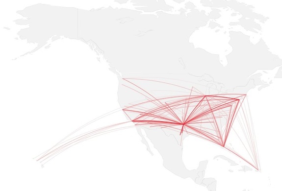
Here is the map for American Airlines again, produced by the code above. I fiddled with color some to match the maps I created for the original flight post.
A dark map background with gray to white to blue paths.
That’s all there is to it. Can you think of other datasets this method could be applied to? Give this tutorial a whirl and post your results in the comments.
For more examples, guidance, and all-around data goodness like this, sign up for FlowingData membership.
Made possible by FlowingData members.
Become a member to support an independent site and learn to make great charts.
About the Author
Nathan Yau is a statistician who works primarily with visualization. He earned his PhD in statistics from UCLA, is the author of two best-selling books — Data Points and Visualize This — and runs FlowingData. Introvert. Likes food. Likes beer.
50 Comments
Add Comment
You must be logged in and a member to post a comment.
Great tutorial! I used the same methods a while back to produce these migration maps:
http://spatial.ly/dF9RWR
Thanks Nathan! Great tutorial!
Great stuff! This will definitely come in handy in my teaching. There’s a html-misprint in the code in step 3: it says “xlim <-” instead of “xlim <-" (and the same for ylim).
@Måns – Thanks, fixed.
Great job on the tutorial. It would have saved me a lot of time when I was playing around with similar plots sometime ago.
You might also want to mention that gcIntermediate() works pretty well in this case, but you can run into problems with longer paths. For example, if you use it to plot an edge from Australia to the US it will follow the shortest path, which means it will go East from Australia until the date line, break the line and come back heading East from Hawaii to the mainland US. The best way I found of making the line go West (across Africa and Europe) was to use greatCircle() and choose which path to plot, (the longest or the shortest).
I came across this problem when trying to plot a global citation network a couple of months ago. With gcIntermediate() you would have a lot of “whiskers” sticking out of the image on the left and right edges.
You can see the resulting animation here: http://mobs.soic.indiana.edu/uncategorized/visualizing-embryology-science-the-last-20-years
Completely done in R, except for the intro/outro done in iMovie and background image.
Each edge is plotted with a green to red gradient to indicate direction and i used rasterImage() to load a photoshop for the background.
@Bruno – Thanks for the tip. That will probably come in handy one day :)
Hi Bruno – I ran into the same problem – the gcIntermediate() function has an optional argument breakAtDateLine which, if true, will return a list with two matrices if the path crosses over the international date line. Video looks great though, very interesting
Robin, Yes, I know. But it only breaks the line in two. One going from, say, Australia towards 180 and another one coming from -180 to the US. This is the behavior I (tried) to describe in my original post and very different (and ugly) from my intent that I show in the movie.
The best way I found of doing it was going the “longest” way using the greatCircle() function.
This actually a life-saver for me. I’ve been thinking about replicating Butler’s Facebook map for a project I’m working on to show social/geographic connections in the Bible. But, I’ve never used R and have been worried I’d be stuck with Gephi, which currently can’t do great-circle routes (only staight lines). Now I think I can manage a better way thanks to the example code you gave.
@Robert – Glad you found it helpful.
I love your blog. I leave cranky remarks about statistical issues most of the time but really – you’re really pushing the visualization community forward. Thanks for the great tutorial.
Thank you very much Nathan!
Great Tutorial!!!
I had concerns in one of your footnotes about R not aggregating and handling large data files. We are looking at R to replace some JMP and SAS solutions, but those solutions perform statistical analysis on large datasets and then graph the results. Will R be able to handle it or is the limitation strictly related to Map visualizations?
@Rob – It depends on the data, what you’re doing with the data, and your system. Also, there are a growing number of solutions in R for handling big data (that I haven’t had to get into yet), so it’s much less of a challenge that it was a couple of years ago.
@Rob: I use SAS every day and R several times a month. I often use SAS for ETL (aggregate from many sources and export a .csv), and then import .csv into R for machine learning. Some machine learning operations require a huge amount of memory relative to the original data set size (say, 2-64GB from a 100MB csv file). Other operations fit easily in memory. I have more experience with SAS for ETL, it’s already paid for, and it’s what my team knows, so I will continue this way.
Thanks for the replies!
Great tutorial – can’t wait to try this out on my own datasets.
This is AWESOME!
Thanks! Just needed this for a project! Tore
awesome.. thank you nathan.. was still searching for methods in R or Processing, until this.
Great!
How did you collect the longitude / latitude for the airports?
I’ve got a bunch of international flights that I’d rather not add in the long / lat by hand.
Never mind..
I found this and was able to clean and convert it in SAS within a few minutes…
http://www.partow.net/miscellaneous/airportdatabase/#Download
Thanks for posting this. I used your technique to replace the straight lines on my previous plots. SAS and R make a great combination: http://bit.ly/l6vnr4
Nice tutorial, but it seems to have a small flow that I found out when trying it with my own data – if in the flights data we don’t have all the airports in either “airport1” or “airport2”, we’ll get an error when using comparison “airports$iata == fsub[j,]$airport1,]” saying that “level sets of factors are different”.
May be it isn’t a big problem, but I couldn’t find a better way to solve it than to manually add missing airports in flights (with count=0) which was a bit lame :(
Try using the as.character() function in R to eliminate that error.
You’ll still have to account for the missing airports as gcIntermediate will throw an error with a null object.
Or when you load your data with read.csv(), set the as.is argument to TRUE.
Well done! Thank you.
Thank you Nathan. Great tut.
Thank you very much for your useful tutorial. I have made some modifications to your code in order to use the sp, raster, lattice and latticeExtra packages (http://procomun.wordpress.com/2011/05/20/great-circles/).
Hi Nathan, excellent tutorial and map display. Flowingdata.com is great.
I have a question as a Southern Hemisphere user:
When using the “World” map, when R prompts:
“Error in if (antipodal(p1, p2)) { : missing value where TRUE/FALSE needed”
Following your code example, I changed the decimal lat/long to go from New Zealand to Europe with the Americas in the middle:
xlim <- c(170.0, 30.0)
ylim <- c(-70.0, 70.0)
My subsequent code (using an airports and flights dataset I created following your example) is:
fsub <- flights[flights$airline == "AR",]
for (j in 1:length(fsub$airline)) {
air1 <- airports[airports$iata == fsub[j,]$airport1,]
air2 <- airports[airports$iata == fsub[j,]$airport2,]
inter <- gcIntermediate(c(air1[1,]$long, air1[1,]$lat), c(air2[1,]$long, air2[1,]$lat), n=100, addStartEnd=TRUE)
lines(inter, col="black", lwd=0.8)
}
But is missing the "if (antipodal(p1, p2)) – { : missing value where TRUE/FALSE needed"
Can you help please?
Many thanks
Simon
Hi Simon. As a fellow antipodean, I’ve struck this one as well as I’ve been playing with this. Fantastic tutorial BTW Nathan – thank you!
Try this ….. addStartEnd=TRUE, breakAtDateLine=TRUE)
The other issue you’ll strike, is that gcIntermediate will produce 2 separate matrices (one for each side of the date line). In this case, when you run the “lines” to draw the great circle, it doesn’t care about this date line business (for me at least) and draws a horizontal line straight across the page where the date line was crossed. Therefore you need to get line to draw each side separately.
This all results in the need to do some special handling to either draw normally, or as 2 lines depending on the date line being crossed.
I’ve got a project I’m just finishing now and will post code soon.
cheers
ben
Hi Ben,
Many thanks! appreciate your tips, and look forward to hearing more about your project.
Cheers
Simon
Hi Simon, here is some code that I used to get around some dateline issues. You’ll obviously need to tweak it to suit your work, but hopefully the idea of drawing the Two GC’s split by the dateline comes across.
ben
library(maps)
library(geosphere)
map(“world”, col=”grey22″, fill=TRUE, bg=”navyblue”, lwd=.2)
traces <- read.csv("your_data_file_here", sep = "," , header=FALSE)
lines <- nrow(traces)
this_width=.5
for (this_one in 1:lines) {
long1 <- traces$V3[this_one]
lat1 <- traces$V2[this_one]
long2 <- traces$V5[this_one]
lat2 <- traces$V4[this_one]
inter 6 ) {
#this will draw any Great Circles that did not cross the dateline in green
lines(inter, col=”green”, lwd=this_width)
}
# However, if length(inter) = 2, it means there are 2 submatrices, which were created
# by gcIntermediate because the GC crossed the dateline.
else {
#Draw the GC on one side of the dateline in red
lines(inter[[1]], col=”red”, lwd=this_width)
#And the other side of the dateline in green
lines(inter[[2]], col=”white”, lwd=this_width)
}
}
This was really useful!! I used your code to make a map of where graduate students in my department got their undergraduate degrees. Here are the pics: http://www.aaronhardin.com/#f17/flickr and here is the code: https://github.com/aihardin/Academic_Migrations I added some code to take care of the whisker issue that @Bruno mentioned.
Hi Nathan:
Great tutorial! Thanks for the pointer to gcIntermediate() — I had missed it and wrote my own last year when I first started making route maps in R.
Perhaps I can return the favor: BTS does publish airport locations themselves. The table is called “Master Coordinate” in their “Aviation Support Tables” database: http://www.transtats.bts.gov/Fields.asp?Table_ID=288 No need for geocoding!
Thanks,
Jeffrey
Hi Nathan
I have database of exchange with country
I do like this tutorial . but have ?
I don’t have level like airlines with AA
and when lines are drawn
I dont know if we see the return exchange ?it disapear?
Really great tutorial! I used it to create a map of global academic collaborations in my subject, evolutionary biology: http://www.datajujitsu.co.uk/2011/06/mapping-academic-collaborations-in.html .
I got arounf the whiskers problem mentioned here by splitting the great circles into two if they go from the maximum positive to the maximum negative values.
Like everyone else, I have to say this is a great tutorial. Thank you!
Is it possible to color code countries using the maps library? That would be a great addition. Conversely, if one uses maptools, will most of the code transfer?
Hi – thanks for a fascinating and inspiring tutorial. I’m afraid I’ve tried this a few times, but always get stuck at step 4, when I enter ‘lines(inter)’. R then gives the following error:
‘Error in plot.xy(xy.coords(x, y), type = type, …) :
plot.new has not been called yet’
Is there something fairly obvious I may have missed? Thanks for any help!
Hi – just in case anyone else comes across the same issue, I found that simply adding ‘plot.new()’ at the beginning of the coding fixed it.
Great tutorial! I’ve been able to use the aiports.csv with information from our local Gov’t travel data for 2010, numbering the amount of flights from each of the mainland states to all of our island’s major airports (Hawaii) . I tweaked the local Gov data so that each state name was replaced by their major airport’s abbreviation and changed the Island airport columns to be in rows, next to each state repeated 8 times consecutively. I think there must be a better way to create a For loop to read through each state row and leave the islands as columns, instead of reformatting I’m still sorting it out. The first image has all the data from Alaska to Connecticut and already shaping up to be pretty interesting. Hawaii is already obscured by all the instances of flights by those first few states alone. I don’t know if this is a distortion of the map proportions, or if we really are just a series of tiny volcanic rocks in the center of the Pacific. I hope to refine it enough to post.
Great tutorial. But I’ve tried viewing this tutorial in firefox v5 and chrome v13 browsers with all scripts enabled, and do not see any maps from step 3 on, only the arcs. Is that what’s intended?
Does anybody know how I might change the map projection as well as the great circle projections? I’ve loaded the mapproj library and, using the relevant arguments/code, I can change the projection of the basemap but not the great circle lines.
In case it matters, to change the basemap projection I used:
map(“world”, proj=”mollweide”, col=”#1F1F1F”, fill=TRUE, bg=”black”, lwd=0.05)
If I could second Geoff’s question. I would like to increase the “bend” in the great circle lines, does anyone know of a way to do this. My map is just the east coast of the United States and so the lines are nearly straight through this region. Increasing the bend in the lines would make them more visible, almost jittering with lines in a way.
Thanks!
Great tutorial!
By the way, does anyone know how to change dimensions of the plotted map (final picture height and width in pixels)?
Here’s how to draw great circle arcs in Processing!
https://gist.github.com/1306578
I’d also love to know how to change the dimensions. Thanks!
Great tutorial, thank you!!! I’m curious how you would go about labeling the airports to make the routes clearer. Could this be achieved in the code, or would you have to do it after the fact?
I would do it after so that labels are placed on top of the lines instead of underneath. Use the airport latitude-longitude locations for the text coordinates.
This annotation tutorial might help:
https://flowingdata.com/2016/07/06/annotating-charts-in-r/
Or this:
https://flowingdata.com/2013/10/22/working-with-text-in-r/