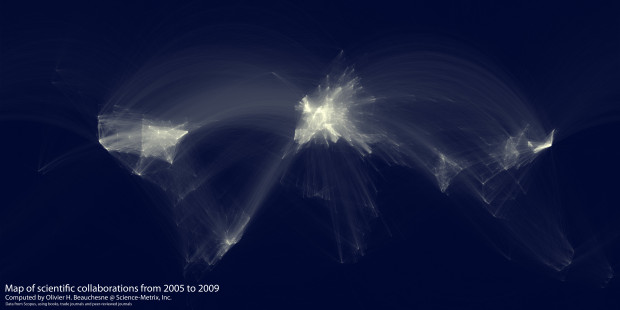
In the spirit of the well-circulated Facebook friendship map by Paul Butler, research analyst Olivier Beauchesne at Science-Metrix examines scientific collaboration around the world from 2005 to 2009:
I was very impressed by the friendship map made by Facebook intern, Paul Buffer [sp] and I realized that I had access to a similar dataset. Instead of a database of friendship data, I had access to a database of scientific collaboration.
From an extensive database of academic citations:
I extracted and aggregated scientific collaboration between cities all over the world. For example, if a UCLA researcher published a paper with a colleague at the University of Tokyo, this would create an instance of collaboration between Los Angeles and Tokyo.
After that, Beauchesne used a similar mapping scheme that Butler used, and behold the results above. The brighter the lines, the more collaborations between a pair of universities.
There doesn’t seem to be much going on in places outside of the United States and Europe, but I wonder if that’s because of a limited dataset or really because there’s little collaboration in those areas. I suspect the former. Still very cool though.
Here’s the collaboration going on in Europe:

And here it is zoomed in on the United States:

Check out the high-resolution version here.
 Visualize This: The FlowingData Guide to Design, Visualization, and Statistics (2nd Edition)
These are great. How I would love to see how exactly this is done in R.
You are probably right regarding the limited dataset. Journals in Chinese or Cyrillic are probably not in there.
What I also found interesting (but intuitive) is that there is less going on in France (and if so then in/around Paris) than in the other big European countries as french scientists seem publish more in French journals and less internationally.
Beautiful & fascinating. As a German scientific reporter and editor of a German language physics journal it is in particular interesting for me to take a closer look @ Europe, of course. Interestingly, English, Italian (!) and German scientists are most active in this map. As Sebastian already posted, this fits to the experience that French scientists tend to publish in French journals.
Well, and the East-Wast pattern in the USA is not surprising.
Cool!
Interestingly, I came to the same conclusion, but noticed that the brightest country is actually the Netherlands! People, including myself, are always biased to check their roots! ;-)
Phenonmenal map by the way!
As a researcher and academic in Amsterdam, I too also noticed that the Netherland was the brightest spot on the entire map.
This post was intriguing. It would be interesting to see a similar graphic that represents how relationships in the business world, sort of like the one about CEOs and board of directors, but in this format. For an interesting twist, include politicians and political contribution data!
This blog always inspires me. Thanks for sharing this, Nathan!
@Lynn: I know a German scientist who produces such network maps. One of it is (or was) displayed in the NY Hall of Science. For more details see here: http://www.mpg.de/988216/Thinking%20with%20Your%20Eyes.pdf
Interesting to compare to the map of all the daily flights in the world:
http://www.lx97.com/maps/
Tourist and airline hubs like Hawaii and Denver don’t show as much in the scientific collaboration map.
Also, what’s going on with the vertical line down the center of the United States? It looks like it’s too far west for the Mississippi.
The central U.S. states have some large research universities. Certainly I can see Minneapolis as a major hub, some smaller spots around Dallas/Austin up through Norman, Wichita, Lincoln and onward. These states west of the Mississippi have sizable populations, and thus relatively well funded public universities.
Very nice map. It seems that we Italians tend to collaborate more with other Italians than with scientists from other countries: it must be because of the barrier of the different language. I wonder where this data comes from; the link to the original post on the olihb website seems to be offline at the moment.
Excellent! Would it be possible to get a focus on Ireland and the United Kingdom?
“French scientists tends to publish in French” ??? Not at all my experience, and until I see robust data on this, I will not buy it! What you see here are only publications involving collaborations between different cities. As you might know, and it appears clearly on this map, France, for historical reasons, is organized around Paris. It is true for railways, roads, people mobility and so on. It’s clear on the map that there are few collaborations between other French cities.
What is not displayed are collaborations between institutions both located in Paris….
Anyway, very nice map, and as Sebastian said, I’d love to see to R code for this!
Nicolas, you may be correct. The concentration of science around Paris (Saclai etc.) drives one to a bit too quick conclusions as it did with me. Think I was wrong
Yes, good point. And I can’t provide any empirical analyses that would support my subjective impression that (in my field, social sciences) country- or language-internal publications would be more prevalent in France. So that might be nonsense.
Wonderful visualization. I would suspect that this picture would look very different over time. Is it possible to do the same picture by decade? Is the data readily available? I would suspect that the end of the cold war would really pop out. From a visual standpoint, using a Hans Rosling style time series mapping would be really cool.
@Jared Chung I wrote a feature for Nature last year, which does a Hans Rosling style time series mapping the scientific output of cities (and also the relative impact of their publications). It’s based on the same dataset as this tremendous visualisation. [http://www.nature.com/news/2010/101020/full/467906a.html is the feature, and http://www.nature.com/news/specials/cities/best-cities.html contains the interactive graphic].
How would do you propose doing a time series mapping of collaborations?
Very cool. I love how Beijing is flying across the bottom there!
For the time series mapping of collaborations, I would propose that the collaborations are mapped in a video form like this twitter map: http://www
You would need each collaboration to have a date (which should be pretty easy) and then set a certain duration for each “line” connecting locations (a second or less). As we move from the 80s to the 90s to the aughts, we should see more lines popping up across borders and the map will look messier… I think…
looks like the UE is more U than the USA. LOL.
anyway, it would really help to know the geographical names of the nodes. is it Heidelberg & Köln below that white cloud?
New Zealand and Australia are noticably absent despite having a combined population similar to that of Germany! As English is the national languages there, there is no language bias from this dataset I would assume but sometimes NZ is cut off the map in mapping 0 – 360o? I am surprised that Sydney and Melbourne and Brisbane do not feature more predominantly.
You must have wrong numbers.
Australia: 22.5 million
+ New Zealand: 4.3 million
!= Germany: 81.8 million
Moreover, this will look even different if applied with a Peter’s representation, where Africa and the southern continents are much bigger.
R or Processing?
Research analyst, so R is my guess.
Canadá?
And Barcelona?
This looks great, but I’m struggling to get understanding from it. Maybe I’m missing something, but the brightness of the lines says more to me about the spatial density of researchers (and their publication rate) than their tendencies to collaborate. Would 10 hypercollaborative researchers at the University of New England (Armidale, NSW, Australia) ever hope to register on the same visual scale as 10,000 moderately collaborative researchers at the University of New York?
It would be interesting if the intensity of the figures was weighted based on papers published or at least persons involved. Some countries like China or some regions like Brasil might have less institutions ready to make links, but when links are made they are quite strong (many persons strong). My only surprise is that given the state of the collaboration map in Europe, why is it so hard to get into a european university as a professor? They tend to choose their own Ph.D. graduates…
There are many collaborations between USA and India, as well as between Brazil and Japan, but such line pass over Europe. Do you have an idea on how these lines would increase the density of lines over Europe? Or more general how lines that just pass over some places misleadingly increase the collaborations density? Have you tried other kinds of map representation?
I did a paper on an international sample of open source communication studies journals ( http://ijoc.org/ojs/index.php/ijoc/article/viewFile/568/360 ), studying their global citation patterns. The dataset drives all the results (and the data can be impossible to get — the SSCI is mainly US and English-language journals, which I didn’t want). I didn’t do this kind of visualization, though, I don’t think I had enough datapoints, but I did do some mapping (see the article). Language clusters were evident (and expected). One small problem here is that this maps the researcher’s current university location, not, say, their country of origin or where their PhD is from. I have a friend from Serbia who did his undergrad in London, his PhD in Ann Arbor, and now works in Singapore. Quantitatively he is the same in this mapping as a Singaporean scholar who has never left Singapore, but qualitatively they are different. I also know other people who move around internationally, but perhaps their numbers are too minor to affect the mapping. Another interpretation is that this is a mapping, in part, of weak local co-author potential.
Great Work…
Is it possible to mark the boundaries of countries on the map, so that it becomes more visible which countries has more collaborations?
thanks
It is unfortunate that Scandinavia isn’t included in your picture of Europe.
hmhmmmm… the intensity of a region also depends on the amount of edges crossing it. So, if there is one collaboration between Liverpool and Paris, London gets luminisence points, just because it is geographically between them. Perhaps edges and hubs should have different colors. An interesting plot though.