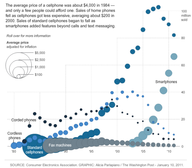
New gadgets, from Web-connected TVs, to smartphones, to Fax machines, always seem to start expensive and then decrease in price a few months later. We all know this. But by how much? Alicia Parlapiano of The Washington Post takes a look in this interactive. It shows units sold by year for different gadgets. Bubble size indicates average price.
Poor tape player. The Consumer Electronics Association didn’t even bother tracking its sales after 2005.


 Visualize This: The FlowingData Guide to Design, Visualization, and Statistics (2nd Edition)

There’s something funny going on with digital cameras: 2005 sales according to the mouseover: 23.2, but the bubble is floating up near the 32 mark (which is what the mouseover suggests 2006 sales were)
Weird. I suspect someone made some typos, but I’m not sure what kind of typos. According to the mouseover, there were more cameras sold in 2010 than in 2009, but the 2010 bubble is lower than the 2009. Maybe someone from the Post is reading this :)
Sorry, but isn’t this a little chartjunky? Why not just have price as the X-axis? Or drop the price variable and just have sales by year?
I’m not sure of what relationships we’re supposed to be tracking here, given that price has a positive relationship with sales in some cases (as P falls, Q increases for smartphones) and negative for others (as the price of fax machines falls, Q also falls).
Let’s not even talk about the fact that fax machines shouldn’t be included in this chart, since they always filled a different niche than everything else (they’re involved in document transmission, not voice transmission, for one thing).
Shouldn’t data visualization be judged on whether it makes relationships easier to understand? If so, this chart fails badly.
Did you look at the interactive version? Gadgets are placed into five categories, and the Fax is rightly placed in the Communication category. Roll over a specific gadget and the other ones fade out so you can see it more clearly.
The main point is not the correlation between price and units sold (although that might be interesting), but how those two factors change over time.
Yes, this ain’t no junk! I think this works rather nicely. And actually, the chart shows that price is not a predictor of sales. Sometimes sales are driven by price reductions (DVD players are a good example) and other times low prices are a consequence of lower demand (hello FAX!).
One key element not captured here is the qualitative value. In particular I’m thinking of PC’s which have had relatively modest price reductions over time, but have had significant improvements in processing and storage capacity, etc. The reader naturally brings that knowledge with them, so there’s no need to try to cram that on the chart.
The interactive version is interesting… the problems with the static image seem to be transformed into positives, sucking the reader into interaction and much more engaged study than one would give to a well-done (but not great) static image.
Price is a predictor of sales. All of these devices are in the consumer market. The consumer market is a stack. The B2C early adopter pays any price, but before the category leaves these early adopters, the price has to fall. The geekier the thing is the longer it will remain in the high priced portion of the market and the fewer units it will sell.
After all of that, you have to ask about the Hype Cycle generation involved. Digital cameras went to the price floor many times now. Continued innovation from various S-curves have raised the price again and again.
Sales is not adoption. If the only thing you look at is what the consumer market is doing, you are only seeing the late mainstream phase of the technology adoption lifecycle. With phones you are also seeing a category enter the laggard, information appliance phase. That phase like all phases have a stack starting with the early adopters, maybe technical enthusiasts, maybe code geeks at the very bottom of the stack. Teasing out these sub populations is messy and depends on how much of the device’s functionality really gets used. If you never write code to touch the API, you are further up in the stack. If you don’t run an app, you are further up in the stack. If you get upset, because making a simple phone call has exploded into such a difficult mess, then you are further up again, and later.
As far as info design goes, you cannot do something generic to reach all. Instead, you decide on a single purpose, usually a single audience, and do everything you can to fit them. No chart can nor should reach everyone.
Pingback: Price Technology Sales « UCD Science Visualization Projects
Pingback: 4 liens rapides pour la semaine (2011-12) « La BI ça vous gagne!