I grew up in a relatively small city where it took no more than fifteen minutes to get where I needed to go. When I went to college, the public transportation was really good, and everything was pretty close together. So when I found myself in Los Angeles for a couple of years, it was hard to swallow the hour long drive without traffic and three-hour long drive in traffic to get places. I still can’t stand it.
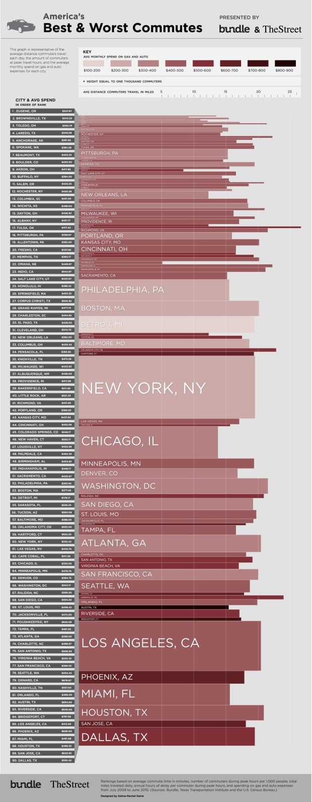
In a similar vein to their food spending graphic, Bundle, with Selma-Rachel Swire, has a look at commuting in major cities in the US. Darker reds indicate greater spending, height represents number of commuters in a city, and length indicates average distance travelled by commuters.
What’s commuting like in your neck of the woods?
[Bundle | Thanks, Mike & Lauren]
 Visualize This: The FlowingData Guide to Design, Visualization, and Statistics (2nd Edition)
I may be missing something here, but what doesn’t seem to be clear from this is any indication of how long these journeys take. For many, a long distance commute is fine, as long as they are moving at a decent speed all the time?
Agreed! I kept looking around for time, average speed, or other indicators of what the experience of commuting is like, rather than just the distance, dollars spent, and number of commuters. I would not base a ranking of the quality of the commute based on those factors.
To be fair, since this is from Bundle, a finance-focused site, they of course come at this from a spending point of view. They also have this other graphic, in addition to a detailed article of what’s going on.
But yeah, as far as commute time, I’d turn to this:
https://flowingdata.com/2010/09/14/where-your-neighbors-commute-to-and-from/
I agree with the other commenters. These are pretty graphics, but don’t relay the appropriate information and not really effectively. The height of the bar is misleading because it represents the number of commuters in the metro region, a somewhat arbitrary figure. Also, i’m not sure what criteria they used to determine the rank order. It’s difficult to compare cities by any of the factors presented other than monthly spending on gas.
Maybe that’s what the “Rank” is? There is no indication of what they’re being ranked on.
The length of the bars are misleading since the scale is either non-linear or the zero point (commute distance of zero miles) isn’t at the far left of the bars.
This “data” is questionable at best. People who live & work in Manhattan, NYC for example may have a 25-minute commute (maybe being the key word), but people who live in the suburbs of NYC & drive into the city or to the train/ferry have a MUCH longer commute and about that may hours a MONTH of delays that this data indicate are annual.
Pingback: The Best and The Worst Commutes in America « The Everyday Minimalist