
I was going to post this graphic from Good when it came out, but decided not to. I made the same mistake when I first started out. It was another case of wrongly sized bubbles. But they fixed the problem, so now we can see what a big difference it makes.
The above is the original. Notice how much bigger the right bubble is compared to the rest; however, it should only be a little over four times bigger than the second from the right, and about 30 times bigger than that itsy bitsy, tiny bubble on the left. It’s clearly wrong. I scaled some circles to see what was going on, but I’m not sure. It wasn’t even sizing by radius.
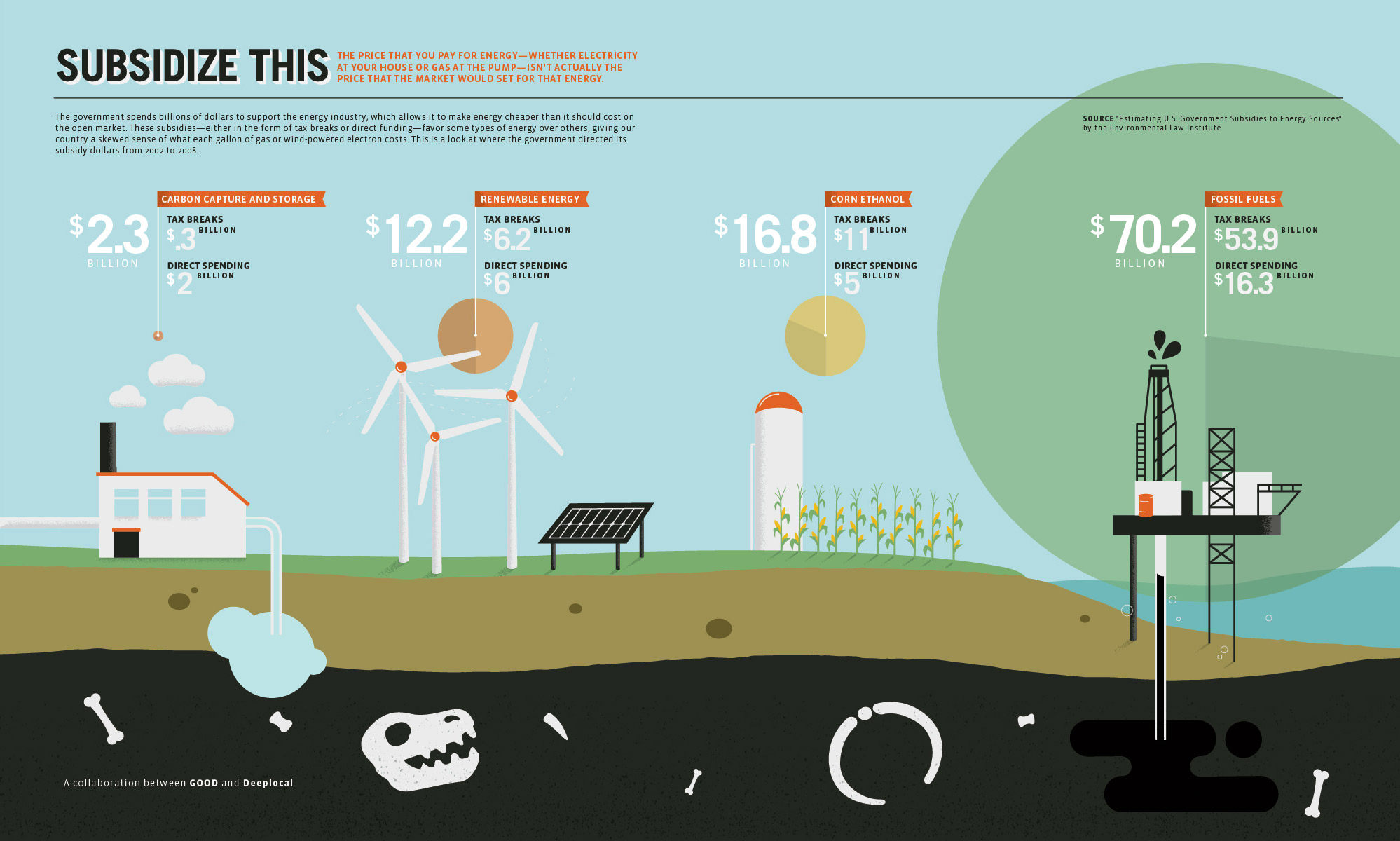
Here’s the revised version. Bubbles are correctly sized by area (proportionate to the square root of the radius). Much better.

The lesson: graphs and charts might be automatically generated by your software, but you still have to make sure the output is right.
Now we can discuss the content rather than the mechanics. The graphic shows government subsidies for different energy sources. It argues that there is a skew in funding for fossil fuels, hence the larger green bubble. But how much of that difference is simply because there are more fossil fuel sources than the others?
 Visualize This: The FlowingData Guide to Design, Visualization, and Statistics (2nd Edition)
just today Open Knowledge Foundation released the charts of energy consumption in Europe http://blog.okfn.org/2010/12/16/exploring-european-energy-data/
Pingback: Flowing Data Compares Before/After Bubble Sizes | Compel Me
How does nuclear subsidies compare to other fuel sources?
The chart does not take into account the size of each industry. It needs to be put into some kind of unit like subsidy $ per unit of energy.
Fossil Fuels account for so much of the energy that we use, that I am thinking that the subsidy per unit of energy is lower than the rest.
I guess it does have it there, but on my laptop screen I did not see the pie charting as there was not enough contrast. Still with the exception of carbon capture there is an inverse relationship between the size of the pie charts and the size of the subsidy per electron. It is rather misleading in that area.
It doesn’t matter if the bubbles are sized right or not as the chart is designed to mislead. The text talks about “each gallon of gas” while showing a total, not per unit, amount.
Further, what about efficiency of the programs? EtOH is notorious for being very cost-ineffective compared to both “green” and “dirty” energy sources, as it is often produced via corn, which consumes vast inputs. It is more of a political “solution” than an economic or environmental one.
“It wasn’t even sizing by radius. Maybe diameter?”
There is no real distinction between sizing by diameter and sizing by radius. Diameter is just twice the radius, so the only difference between the two would be a constant scaling factor.
It looks like they may have been setting the radius to be proportional to the log of the value, rather than the square root.
Pingback: Subsidize this.. | Vyaadhiiyamaana
But what are subsidies for? The fact that fossil fuels are such a large part of the market right now begs the question – “Why should they be subsidized?” Subsidies should be designed to support new innovative approaches that are going to help with key social-environmental problems. It is more the proportion of spending by government on different technologies that is important here.
“Bubbles are correctly sized by area (with radius proportionate to the square root of the radius).”
Speaking of right and wrong ways to describe geometric calculations… (Oh, weren’t we?) ;)
I agree with Wil W. There are other ways to show these data and it’s important to look at each way.
A quick look at the energy consumed in the US in 2009 (http://tonto.eia.doe.gov/cfapps/ipdbproject/IEDIndex3.cfm) shows we used about 78 quadrillion BTUs (or “quads”) of energy from fossil fuels (petroleum, natural gas, coal), 4 quads from renewables (although mostly hydro, not the kind of renewables we’re talking about), and a little less than 1 quad from biofuels (741,000 barrels per day * ~76,000 btu per gallon * 42 gallons per barrel = 0.9 quads).
Normalizing the subsidies by annual energy output yields, in units of billion dollars per quad:
fossil: 0.9
renewables: 3.0
biofuels: 18.7
carbon capture = ?
In this way, renewables and biofuels (the fledgling industries needing subsidies) are subsidized more than fossil fuels (the old industry), which makes sense. Of course we could argue the values all day long. We could play with these consumption numbers (lowering renewable output to exclude hydro, which will raise the $ per BTU value). The most important way to look at these values would probably be dollars per expected output (or expected GHG reduction) or some other value like that.