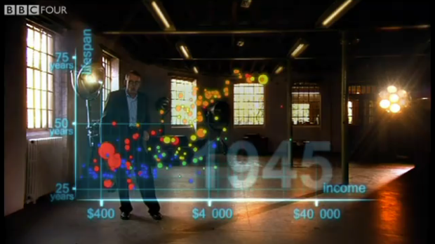
The Joy of Stats, a one-hour documentary, hosted by none other than the charismatic Hans Rosling, explores the growing importance of statistics:
[W]ithout statistics we are cast adrift on an ocean of confusion, but armed with stats we can take control of our lives, hold our rulers to account and see the world as it really is. What’s more, Hans concludes, we can now collect and analyse such huge quantities of data and at such speeds that scientific method itself seems to be changing.
From the description, it sounds like they’ll touch on Crimespotting by Stamen, Google Translation, among other data-driven projects. Whatever they cover, it’s bound to be interesting with Rosling at the front.
Below is a four-minute clip of Rosling presenting world development in the context of income versus lifespan. The material is more or less the same as his TED talk, but this time around, the motion chart isn’t projected on a screen. The data is CGI’d into the air where Rosling can pluck and grasp at points as he highlights the significance of specific points in history. Zoink.
The Joy of Stats airs on the BBC next Tuesday. I really hope they put the full documentary online, but if not, I won’t complain if someone accidentally records it and uploads it to YouTube.


If its on the BBC they won’t put it all online, if you are in the UK you will get it all on IPlayer but you’ve got to be a UK TV Licence holder to access it – Hans Rosling is just brilliant – so engaging and entertaining
David,You don’t need to hold a UK license – you just need to be in the UK (presumably that’s done by IP checking?)
Agreed (I think) – I think I’ll check the BBCs Ts and Cs with regards to Iplayer usage – anyway still good material
Ok I’ve had a look at their site Andrew and it seems that yes can watch BBC content if you are in the UK because as you say you will have a UK IP Address.
However you can’t if your watching in simulcasting mode, meaning if you watch this programme online as its being broadcast then you need a UK licence. It seems to be a bit more relaxed about ondemand formats but you’ll only get 7 days to watch it anyway.
I don’t think you can even see it outwith the UK can you? I don’t know
Best
David
You are correct. You don’t need a TV Licence to watch recorded content on iPlayer, but you do need one to watch live programs, either with a receiver (like your TV) or by watching live via iPlayer. It’s a common misconception that you need a TV licence if you own a TV. You don’t so long as you don’t use it to watch live broadcasts. I don’t have a TV licence, but watch recorded programmes on iPlayer on my TV via my PS3 completely within the law :)
Check out this website: http://www.televisionlicence.info/
Whoa, beautiful!
This video is awesome. It talks and it’s beautiful!
Pingback: The Joy of Stats with Hans Rosling | VizWorld.com
This is an awesome video – and makes its point about data visualization very well. I wonder if it’s not overly optimistic though and wouldn’t look different if wild forests and arable land were also represented.
The producers say that it will be available on the Gapminder site soon after the broadcast. Apparently negotiations are on-going to have a showing on US television as well.
This is amazing! i hope every chart can move like that
Really looking forward to the full documentary but I noticed that in this clip, despite some initial announcement about 3D or in real space or something to that effect, he’s still just using 2 dimensions (and time/motion), it’s that the 2 dimensions are projected onto thin air instead of a screen. Hmm.
Pingback: » fieldnotes
The Open University (where I work) has an agreement with the producers and the BBC to put several substantial extracts from the programme on http://www.open.ac.uk/openlean/joyofstats , and indeed there are a couple up there already. Also I believe that at some point the whole ting is going to be streamed from http://www.gapminder.org
I love Hans. I really do. But doesn’t the last frame look much like the first frame, just moved up. So the relative differences are still quite the same. Right? And how would it look with income on a linear scale? Okay, I’m not a statistician or a sociologist, but as much as I love Hans’ work in data viz, this bubble chart has always raised questions for me.
Pingback: Being Hans Rosling | Impure Blog
Pingback: Speech Stats « Commentary on life and reading
If you switch the axes, you get a different picture.
Pingback: Länksprutning – 14 December 2010 – Månhus
Of course he hides or doesn’t know where wealth, health, progress, increase of prosperity comes from (like most economists) – from the environment stupid – is this inexhaustible?
environment?…really??..at least you didn’t say government….now that would be stupid..