This past Sunday, well-known whistle-blower site Wikileaks released over 91,000 secret US military reports, covering the war in Afghanistan. Each report contains the time, geographic location, and details of an event the US military thought was important enough to put on paper.
The Afghan War Diary is the most significant archive about the reality of war to have ever been released during the course of a war. The deaths of tens of thousands is normally only a statistic but the archive reveals the locations and the key events behind each most of these deaths. We hope its release will lead to a comprehensive understanding of the war in Afghanistan and provide the raw ingredients necessary to change its course.
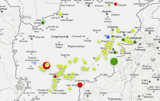
The Guardian has mapped the data in both an interactive (above) and a graphic (below). The interactive is particularly interesting as it lets you move through time, from 2004 to 2010. Circles, sized by number of people killed and colored by who most of those people were, appear on the map as events occur.
Use the slider to move back and forth through time or press start to see six years of incidents play out. Filters in the top right let you focus on provided categories.
The Guardian group definitely upped their game for this important dataset. Download the processed data from the Guardian, or grab the entire raw set from Wikileaks.

[Thanks, Simon]
 Visualize This: The FlowingData Guide to Design, Visualization, and Statistics (2nd Edition)
Currently developing some Tableau visualisations for this data: http://www.visualisingdata.com/index.php/2010/07/visualising-the-wikileaks-war-logs-using-tableau-public/
Like Andy K, I’ve also done my take on the data:
http://bit.ly/bNVyBO
It’s a pretty good dataset with lots of rich potential in it! I modelled my Tableau version on the Guardian’s interactive version – making it an exercise in seeing how easy it is to do in Tableau what one can do with some whizzy graphics package. Conclusion? It’s easy!
Pingback: Afghan War Interactive | joelotz.net
Does anyone know how these spatio-temporal visualisations like the interactive graphic above, or NY-Times celebrated Taxi Flow Map ( http://www.nytimes.com/interactive/2010/04/02/nyregion/taxi-map.html ) are produced?
@Francis – Flash libraries, probably in-house. You might want to check out modest maps.
@Francis – you should appreciate this guest post from the Guardian:
https://flowingdata.com/2010/07/28/process-mapping-war-logs-for-the-guardian/
That is just a grim visualization, and quite more disconcerting when you map it out in the span of half a decade.