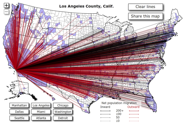
Jon Bruner of Forbes reports that more than 10 million Americans moved from one county to the other in 2008, based on data from the IRS. The above interactive map show these moves in and out of nine major cities. Red lines represent moves out of the city and black lines show the opposite. The less opaque a line, the less people.
The interaction is kind of clunky, and it’s hard to see all the movement, even when you zoom in, simply because there are so many lines. Further moves, say from California to Florida, get more visual dominance too, when it’s actually less than it looks, I think. Placing less emphasis on the lines, and coloring counties as you select the major cities might make this more clear. Nevertheless, it’s still an interesting view.
[Thanks, @jonbruner]
Update: Check out data.gov and look for ‘migration’ to get your hands on the data behind the map.
 Visualize This: The FlowingData Guide to Design, Visualization, and Statistics (2nd Edition)
The map is not my favorite one cause the lines cover up a lot of the map, at least for the major cities. I would have worked with bumps in the map indicating the outflow from a city or with different shades of colouring.
On behalf of the various red-green color anomalous – it sure would be sweet to be able to tell the difference between the ‘black’ inward lines and the ‘black-appearing’ outward lines.
For the love of all goodness folks, this is something we’ve known about for a very long time in data presentation.
However- I have no hope whatsoever- I’m a vision scientist, at my annual conference- a conference of people who -really- should know better, dark red lines, dark green lines, black lines… all together.
Will the last person leaving Detroit please turn out the lights?
I think the red lines are much more dominant than the blue, especially since the county and state borders are drawn in black and the counties are shaded in blue. Equal influx and outflux would probably still look more red.
Er wait, the outflux lines are black, but with transparency, they sometimes appear blue. This means some of the red lines look purple! Oh dear.
This is a good example of how NOT to do a useful visualization! Perhaps one line per state would be more useful…
Pingback: Wayne State Web Communications Blog » Blog Archive » [Friday Links] The Father’s Day Edition
Pingback: TAXI – BLOG » Blog Archive » Infographics: It’s information. It’s graphics. It’s much easier to say than Graphormation.