How to Make a US County Thematic Map Using Free Tools
There are about a million ways to make a choropleth map. The problem is that a lot of solutions require expensive software or have a high learning curve. It doesn’t have to be that way.
What if you just want a simple map without all the GIS stuff? In this post, I’ll show you how to make a county-specific choropleth map using only free tools.
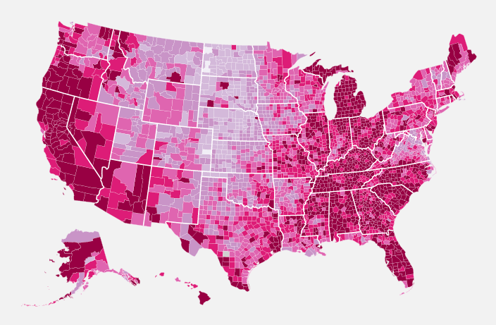
Here’s what we’re after. It’s an unemployment map from 2009.
Step 0. System requirements
This tutorial was written with Python 2.5 and Beautiful Soup 3. If you’re using a more recent version of either, you might have to modify the code. See comments below for tips.Just as a heads up, you’ll need Python installed on your computer. Python comes pre-installed on the Mac. I’m not sure about Windows. If you’re on Linux, well, I’m sure you’re a big enough nerd to already be fluent in Python.
We’re going to make good use of the Python library Beautiful Soup, so you’ll need that too. It’s a super easy, super useful HTML/XML parser that you should come to know and love.
Step 1. Prepare county-specific data
The first step of every visualization is to get the data. You can’t do anything without it. In this example we’re going to use county-level unemployment data from the Bureau of Labor Statistics. However, you have to go through FTP to get the most recent numbers, so to save some time, download the comma-separated (CSV) file here.
It was originally an Excel file. All I did was remove the headers and save as a CSV.
Step 2. Get the blank map
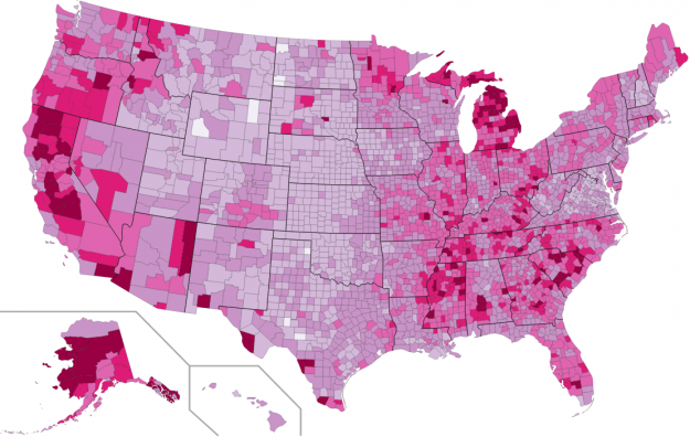
Luckily, we don’t have to start from scratch. We can get a blank USA counties map from Wikimedia Commons. The page links to the map in four sizes in PNG format and then one as SVG (USA_Counties_with_FIPS_and_names.svg‎). We want the SVG one. Download the SVG file onto your computer and save it as counties.svg.
Blank US counties map in SVG format
The important thing here, if you’re not familiar with SVG (which stands for scalable vector graphics), is that it’s actually an XML file. It’s text with tags, and you can edit it in a text editor like you would a HTML file. The browser or image viewer reads the XML. The XML tells the browser what to show.
Anyways, we’ve downloaded our SVG map. Let’s move on to the next step.
Step 3. Open the SVG file in a text editor
I want to make sure we’re clear on what we’re editing. Like I said in Step 2, our SVG map is simply an XML file. We’re not doing any photoshop or image-editing. We’re editing an XML file. Open up the SVG file in a text editor so that we can see what we’re dealing with.
You should see something like this:
SVG is just XML that you can change in a text editor.
We don’t care so much about the beginning of the SVG file, other than the width and height variables, but we’ll get back to that later.
Scroll down some more, and we’ll get into the meat of the map:
The path tags contain the geographies of each county.
Each path is a county. The long run of numbers are the coordinates for the county’s boundary lines. We’re not going to fuss with those numbers.
We only care about the beginning and very end of the path tag. We’re going to change the style attribute, namely fill color. We want the darkness of fill to correspond to the unemployment rate in each given county.
We could change each one manually, but there are over 3,000 counties. That would take too long. Instead we’ll use Beautiful Soup, an XML parsing Python library, to change colors accordingly.
Each path also has an id, which is actually something called a FIPS code. FIPS stands for Federal Information Processing Standard. Every county has a unique FIPS code, and it’s how we are going to associate each path with our unemployment data.
Step 4. Create Python script
Open a blank file in the same directory as the SVG map and unemployment data. Save it as color_map.py.
Step 5. Import necessary modules
Our script is going to do a few things. The first is read in our CSV file of unemployment data. So we’ll import the csv module in Python. We’re also going to use Beautiful Soup later, so let’s import that too.
import csv
from BeautifulSoup import BeautifulSoup
Step 6. Read in unemployment data with Python
Now let’s read in the data.
# Read in unemployment rates
unemployment = {}
reader = csv.reader(open('unemployment09.csv'), delimiter=",")
for row in reader:
    try:
        full_fips = row[1] + row[2]
        rate = float( row[8].strip() )
        unemployment[full_fips] = rate
    except:
        pass
We read in the data with csv.reader() and then iterate through each row in the CSV file. The FIPS code is split up in the CSV by state code (second column) and then county code (third column). We put the two together for the full FIPS county code, making a five digit number.
Rate is the ninth column. We convert it to a float since it’s initially a string when we read it from the CSV.
The rate is then stored in the unemployment dictionary with the full_fips as key.
Cool. The data is in. Now let’s load the SVG map, which remember, is an XML file.
Step 7. Load county map
Loading the map is straightforward. It’s just one line of code.
# Load the SVG map
svg = open('counties.svg', 'r').read()
The entire string is stored in svg.
Step 8. Parse it with Beautiful Soup
Loading svg into Beautiful Soup is also straightforward.
# Load into Beautiful Soup
soup = BeautifulSoup(svg, selfClosingTags=['defs','sodipodi:namedview'])
Step 9. Find all the counties in the SVG
Beautiful Soup has a nifty findAll() function that we can use to find all the counties in our SVG file.
# Find counties
paths = soup.findAll('path')
All paths are stored in the paths array.
Step 10. Decide what colors to use for map
There are plenty of color schemes to choose from, but if you don’t want to think about it, give the ColorBrewer a whirl. It’s a tool to help you decide your colors. For this particular map, I chose the PurpleRed scheme with six data classes.
ColorBrewer interface for easy, straightforward way to pick colors
In the bottom, left-hand corner, are our color codes. Select the hexadecimal option (HEX), and then create an array of those hexadecimal colors.
# Map colors
colors = ["#F1EEF6", "#D4B9DA", "#C994C7", "#DF65B0", "#DD1C77", "#980043"]
Step 11. Prepare style for paths
We’re getting close to the climax. Like I said earlier, we’re going to change the style attribute for each path in the SVG. We’re just interested in fill color, but to make things easier we’re going to replace the entire style instead of parsing to replace only the color.
# County style
'font-size:12px;fill-rule:nonzero;stroke:#FFFFFF;stroke-opacity:1;
stroke-width:0.1;stroke-miterlimit:4;stroke-dasharray:none;stroke-linecap:butt;
marker-start:none;stroke-linejoin:bevel;fill:'
Everything is the same as the previous style except we moved fill to the end and left the value blank. We’re going to fill that in just a second. We also changed stroke to #FFFFFF to make county borders white. We didn’t have to leave that value blank, because we want all borders to be white while fill depends on unemployment rate.
Step 12. Change color of counties
We’re ready to change colors now! Loop through all the paths, find the unemployment rate from the unemployment dictionary, and then select color class accordingly. Here’s the code:
# Color the counties based on unemployment rate
for p in paths:

    if p['id'] not in ["State_Lines", "separator"]:
        # pass
        try:
            rate = unemployment[p['id']]
        except:
            continue

        if rate > 10:
            color_class = 5
        elif rate > 8:
            color_class = 4
        elif rate > 6:
            color_class = 3
        elif rate > 4:
            color_class = 2
        elif rate > 2:
            color_class = 1
        else:
            color_class = 0

        color = colors[color_class]
        p['style'] = path_style + color
Notice the if statement. I don’t want to change the style of state lines or the line that separates Hawaii and Alaska from the rest of the states.
I also hard-coded the conditions to decide the color class because I knew beforehand what the distribution is like. If however, you didn’t know the distribution, you could use something like this: float(len(colors)-1) * float(rate - min_value) / float(max_value - min_value).
Step 13. Output modified map
Almost done. We just need to output the newly colored SVG map.
# Output map
print soup.prettify()
Save your Python script. For the sake of completeness, here’s what your Python script should now look like:
### color_map.py

import csv
from BeautifulSoup import BeautifulSoup

# Read in unemployment rates
unemployment = {}
min_value = 100; max_value = 0
reader = csv.reader(open('unemployment09.csv'), delimiter=",")
for row in reader:
    try:
        full_fips = row[1] + row[2]
        rate = float( row[8].strip() )
        unemployment[full_fips] = rate
    except:
        pass


# Load the SVG map
svg = open('counties.svg', 'r').read()

# Load into Beautiful Soup
soup = BeautifulSoup(svg, selfClosingTags=['defs','sodipodi:namedview'])

# Find counties
paths = soup.findAll('path')

# Map colors
colors = ["#F1EEF6", "#D4B9DA", "#C994C7", "#DF65B0", "#DD1C77", "#980043"]

# County style
path_style = 'font-size:12px;fill-rule:nonzero;stroke:#FFFFFF;stroke-opacity:1;
stroke-width:0.1;stroke-miterlimit:4;stroke-dasharray:none;stroke-linecap:butt;
marker-start:none;stroke-linejoin:bevel;fill:'

# Color the counties based on unemployment rate
for p in paths:

    if p['id'] not in ["State_Lines", "separator"]:
        try:
            rate = unemployment[p['id']]
        except:
            continue


        if rate > 10:
            color_class = 5
        elif rate > 8:
            color_class = 4
        elif rate > 6:
            color_class = 3
        elif rate > 4:
            color_class = 2
        elif rate > 2:
            color_class = 1
        else:
            color_class = 0


        color = colors[color_class]
        p['style'] = path_style + color

print soup.prettify()
Step 14. Run script and save new map
Now all we have to do is run our script and save the output.
Running script in OS X Terminal
We’re done! Open your SVG in FIrefox or Safari, and you should see a nicely colored map similar to the one below.
Oh wait, there’s one teeny little thing. The state borders are still dark grey. We can make those white by editing the the SVG file manually.
We open our new SVG in a text editor, and change the stroke to #FFFFFF from #221e1f around line 15780. Do something similar on line 15785 for the separator. Okay. Now we’re done.
Where to Go From Here
While this tutorial was focused on unemployment data, I tried to keep it general enough so that you could apply it to other datasets. All you need are data with FIPS codes, and it should be fairly straightforward to hack the above script.
You can also load the SVG into Adobe Illustrator or your favorite open source vector art software and edit the map from there, which is what I did for the final graphic.
So go ahead. Give it a try. Have fun.
For more examples, guidance, and all-around data goodness like this, order Visualize This, the FlowingData book on visualization, design, and statistics.
Made possible by FlowingData members.
Become a member to support an independent site and learn to make great charts.
About the Author
Nathan Yau is a statistician who works primarily with visualization. He earned his PhD in statistics from UCLA, is the author of two best-selling books — Data Points and Visualize This — and runs FlowingData. Introvert. Likes food. Likes beer.


This is a superb demonstration that there exist ample raw materials lying around for us to use, and that data don’t care how they’re rendered. If your objective is to illustrate a point, results can be minutes away.
If you’re doing work on the web you would be well served by considering the new cartographer.js library: http://cartographer.visualmotive.com/
yeah, i posted about that last week:
https://flowingdata.com/2009/11/05/make-thematic-maps-with-cartographer-js/
it only works at the state level right now though.
Doh, of course, that’s where I learned about Chris’ latest project!
Nice approach, thanks for sharing :)
Thanks Nathan for the step-by-step instructions
for those interested in world map choropleths (thes?), the kind folks at Nagoya University also propose a python script: http://bit.ly/29csKc
Pingback: Progress report: Google Maps and Dutch elections « Weird Correlations
Pingback: marc (murdelta) 's status on Thursday, 12-Nov-09 12:22:31 UTC - Identi.ca
Would you post the original site where you got the unemployment data excel file please?
@Matt: The Bureau of Labor Statistics provides state-by-state unemployment data as well as comprehensive data on the nation’s workforce.
Got it. For the viewers at home, here’s the hosted table for 2008…
ftp://ftp.bls.gov/pub/special.requests/la/laucnty08.txt
or see the page linking to it here…
http://www.bls.gov/lau/
and scroll down to the heading “COUNTY DATA”. Looks like they have tables going back to 1990. Anyone want to make an animated version of this map showing the changes from 1990 to present?
Actually, I don’t see any county unemployment statistics for 2009, anyone see where that info is located?
Matt, here are the instructions I got from BLS (I had to email them) on how to get up-to-date county data via FTP:
http://docs.google.com/View?id=dhk56npq_89cm48gqgz
Very nice article, but I think the counties map you want to link to is USA_Counties_with_FIPS_and_names.svg. USA_Counties_with_names.svg does not contain the FIPS data.
http://upload.wikimedia.org/wikipedia/commons/5/5f/USA_Counties_with_FIPS_and_names.svg
thanks, scott for pointing that out. fixed.
What type of classification does ColorBrewer use? It could drastically change the appearance of the map depending on the distribution of the data
ColorBrewer doesn’t deal with the classification; he’s classified the data in the code in step 12, in this case dividing it by equal intervals.
I see now, thanks! Probably would have behooved me to actually look at the code.
It’s not really accurate to call BeautifulSoup “the XML parsing Python library”, it’s only one of many python libraries that can parse XML.
right. i just meant that it’s, well, an XML parsing python library.
Really cool; thanks!
Would be nice to see the final result allow interactive comparison of different years; e.g. use a single map. How would one do that? Use some JS to switch the color values depending on year?
How about some R code?! It would be much more succinct.
I tried, and then I got fed up with undocumented details that I should know about. Care to point to some guides?
Here’s my attempt – http://gist.github.com/233134. A better county data source would result in more succinct code.
Also, what’s with your choice of colour scale? The data range from 1.2 to 30.1.
thanks, i’ll check that out.
i based by color scale on the BLS maps:
http://www.bls.gov/lau/maps/twmcort.gif
I took a crack at it too, first using maps and then switching over to ggplot2, which I’m quickly learning to love…
http://www.thisisthegreenroom.com/2009/choropleths-in-r/
Hi, very cool tutorial. For preparing the data, you could take a look at a web API I created: Elev.at (http://elev.at). It converts an XLS or Delimited File (e.g. CSV) into XML in real-time. It can also return results in JSON/P for consumption in JavaScript.
Following along, we construct an unemployment dictionary using five digit numbers as keys. But the SVG file uses strings (e.g. AK_North_Slope) has keys.
rate = unemployment[p[‘id’]], thus never finds a match.
stephen, use this SVG file instead (just updated link in the post):
http://upload.wikimedia.org/wikipedia/commons/5/5f/USA_Counties_with_FIPS_and_names.svg
sorry, i linked to the wrong SVG originally.
There we go! And great tutorial BTW.
Awesome!
Great tutorial. More posts like this please!
Pingback: Thematic Mapping at the US County Level with Free Tools | GIS Lounge – Geographic Information Systems
Ugh, Python + BeautifulSoup? How would anyone guess that that is an XML Parser? In Perl we have XML::Parser (SVG::Parser too, I wonder what the Python equivalent is called).
At least Kudos for using free tools until you then built a flash site with it.
flash? there are ways to do that for free too. that’s for another post though.
Wondering if the flash comment is regarding the drag and zoom capability of your final map. I’d like to know how you did that. If would be a really great follow up post. This one’s definately a break-through post, and thanks very much. I’ll be emailing this one around my office.
If you want to do the same with Google Earth .KML files check out my project at:
http://josh.gourneau.com/wiki/methmap
Pingback: Google Maps and Dutch Elections – Working demo « Weird Correlations
Thanks for the tutorial, its really cool and helps beginners like myself try Python for visualisation.
One question, I liked the font you used in the unemployment map for the text – can you post what it was as it seemed to really complement the image ?
eoin, it was nothing fancy. georgia for the copy and avenir for the header.
This is a much less dramatic map if you spread the map colors evenly between the range of values.
Pingback: How to Make a US County Thematic Map « Chris Farris
Awesome post!
If you decide to do another tutorial, could it be using Processing :)?
Thanks for the great blog.
Here’s a version of Nathan’s map in Processing: http://www.tom-carden.co.uk/misc/unemployment/processing.html
See the sourcecode and http://www.tom-carden.co.uk/misc/unemployment/ for details of a couple of changes from the files posted here.
@Tom: That’s awesome. Only starting to learn Processing now, this gives me hopes :)
Pingback: Choropleths in R at This is the Green Room
For web-only use, wouldn’t it be simpler to create a separate CSS file adding the coloring styles to the SVG? You could probably do the processing in Excel, frankly, and export a text file from there, rather than writing a custom script to change every path in the original SVG file.
It wouldn’t be the most elegant CSS, but what I have in mind is
#02220 {fill:medium}
#02260 {fill:darker}
…
Basically calculate the fill color, match it up with a FIPS id, and use CSS to style the path by referring to its id.
Pingback: links for 2009-11-12 « doug – off the record
Pingback: michelle m. hudson / blog » Blog Archive » Daily Digest for November 13th
Pingback: Destillat KW46-2009 | duetsch.info - GNU/Linux, Open Source, Softwareentwicklung, Selbstmanagement, Vim ...
Pingback: Daily Digest for November 13th
As someone who’s never used Python, I found this intriguing yet ultimately confusing—especially Step 4, which assumes readers will know how to start writing a script etc. You don’t have to include a Python tutorial, but a little more explanation of how you get from Step 3 to 4 would be nice. I spent over an hour trying to get the script up and running. Is this how-to for pros only?
Step 4 is really just creating a new blank file. From there just sequentially add in the text from each step to that file. At the end of the process your file should be very similar (or identical) to the sample of the complete script at the end of the article.
I did that and kept getting error messages when I ran the script.
It the goal is to make thematic maps with free tools, it’s surprising R wasn’t mentioned. Several examples of creating the same chart in R (using shape files instead of SVG maps) are here:
http://blog.revolution-computing.com/2009/11/choropleth-challenge-result.html
As a bonus, R provides an environment for not just plotting but also analyzing the unemployment data.
Great tutorial, Nathan!
For those of you using BI tools like Pentaho, I’ve created a proof of concept of the solution above using Pentaho data integration, which is also free. Pentaho is a little less intimidating than scripting in Python, since it has a Visio-style GUI. My solution required a bit of XML knowledge, but the actual formulas I used in the solution were quite rudimentary.
http://blog.braintapper.com/2009/11/using-pentaho-data-integration-to-make.html
You could easily tweak the Pentaho solution to load the data from Excel, a database or any other type of data source.
(Yeah, I know my CSS is a little ugly, I’m working on it!)
Fascinating tutorial, Nathan… but after spending about 8 hours, I find some gaps. Of course, I find gaps… because I’m Python (and most other code-illiterate). Sticking point for me seems to be figuring out WHERE and HOW to install BeautifulSoup in a place where Python will see it.
Can you explain that step?
Paul, start Python, import sys, and look at sys.path, which gives you a list of folders, with complete paths. One (or more) of these folders are called “site-packages”. Copy BeautifulSoup.py to there.
On my machine, it’s “/Library/Python/2.5/site-packages”.
New to code and confused still. How do I “look” at sys.path? Is that $echo or list or what?
You need to start an interactive Python session, and how you do it depends on your platform. When you get the >>> prompt, type “import sys” and enter, then type “sys.path” to see the list of folders.
Here’s my map:
http://amosnewcombe.info/wordpress/wp-content/uploads/2009/11/CountyUnemployment.mov
It’s a movie of twenty years of data 1990-2009. Rather than group counties together and color each group exactly the same, I used the same color (dark red #800000), but made the opacity proportional to the rate. (Specifically fill-opacity = min(rate*5, 1). A 20% rate is fully opaque, % is transparent. ackground is white) And I thought it looked best with zero-width boundaries.
20 frames; 0.5 sec/frame.
The biggest PITA was saving each of the 20 SVG files in Illustrator, to PNG so GraphicConverter could use them.
Any suggestions for how to do this based on congressional districts rather than counties? I have CD data that this would work great for.
The government supplies lat/long coordinates for congressional districts here: http://www.census.gov/geo/www/cob/bdy_files.html
That data should be compatible with an R-based methods using ggplot, similar to what Hadley and I have detailed above. You’d have to do a little work to line up your data with the coordinate data, but it shouldn’t be too bad.
Unfortunately I’m traveling until tomorrow and can’t really take a look at the data myself right now. Pls let me know if this gives you some direction, happy to help further if I can.
Pingback: Ennuyer.net » Blog Archive » Rails Reading - November 15, 2009
I’m having a strange problem that I hope somebody can help me with. The script runs OK, but in addition to modifying the path tags as expected, it’s also changing the and tags by pulling out the closing delimiters in those tags, and then adding new closing tags at the very end of the file. The resulting svg file doesn’t render unless I go in and manually correct it.
I’m running Vista, Python 2.6.4, and Beautiful Soup 3.0.7a. Any help would be greatly appreciated. Even with the problems this is an absolutely amazing tool!
I’m having a strange problem that I hope somebody can help me with. The script runs OK, but in addition to modifying the path tags as expected, it’s also changing the sodipodi:namedview … / and defs id=”defs9561″ / tags by pulling out the closing delimiters in those tags, and then adding new closing tags at the very end of the file. The resulting svg file doesn’t render unless I go in and manually correct it.
I’m running Vista, Python 2.6.4, and Beautiful Soup 3.0.7a. Any help would be greatly appreciated. Even with the problems this is an absolutely amazing tool!
I’m stuck on this too.
I installed BeautifulSoup as in the comments above.
I used the script above except I added
import csv
from BeautifulSoup import BeautifulSoup
(at the beginning)
and made the line that copied over as three lines one line again.
Now when I try “python colorize_svg.py > unemployment2009.svg”, it makes the svg file, but it the image part is blank (but the right size). The svg file has plenty of code in it, but it appears to not display anything. The fill colors have been changed as expected, and I don’t see any errors, but something isn’t working.
Any ideas?
Now that I see Russel’s post, it looks like I’m having the same problem. I’m running Mac OS 10.6, Python 2.6.1, and BeautifulSoup 3.0.7a
I may be a bit slow, but I think I’ve figured this out. Beautiful Soup is doing a lot more than just parsing the svg file. The prettify command tells it to fix anything it thinks is wrong with the file, and it doesn’t seem to like the embedded closing tags in the sodipodi:namedview and defs id tags, so it strips them out and adds explicit closing tags at the end of the file, which breaks it.
The easy solution is to edit the original svg file to add explicit closing tags where they should have been in the first place. This keeps Beautiful Soup happy and works fine. I’ll post a link to my corrected version in a bit.
Thanks, Russell, that works great (and sorry I spelled your name wrong earlier) :)
Here’s a link to my modified counties.svg file. It should fix the problem if your svg output file doesn’t render but everything else seems to be OK:
http://www.box.net/shared/tqnqiedfoi
Thanks Russell, that .svg file of yours just helped me finally solve the puzzle and get the whole thing to work :)
I ran into this too, and solved it by running the output of BeautifulSoup.prettify() through the following function:
import re
reSodipodi = re.compile(r”)
reDefs = re.compile(r”)
def CleanSoup(s):
‘Remove the problematic tags written by BeautifulSoup.’
s = reSodipodi.sub(”, s)
s = reDefs.sub(”, s)
return s
This trashes both the beginning and the end tags, which are unneeded to display the SVG.
Pingback: Choropleth maps — head’s up, Google « Everything Right Is Wrong Again
Nice tutorial Nathan!
(Lots of calls for R solutions I see, though none of the Revolutions challengers included Alaska or Hawaii in their solution.)
I’m personally interested in (a) keeping things dynamic and (b) making things web-native.
With that in mind, I ported some of your code over to javascript, hacked the CSV into JSON/P-ish form and used SVGWeb to render the county shapes: http://www.tom-carden.co.uk/misc/unemployment/
I haven’t used SVG in a long time so this was a nice refresher. SVGWeb works well: it doesn’t mess with Safari or Firefox but I tested this in IE8 too and got comparable results* as promised.
*The only tweak I made was to set stroke-opacity to 0.1 instead of stroke-weight, because the flash renderer used by SVGWeb didn’t like fractional line weight.
PS I noticed two errors in the SVG file from Wikipedia. I’m trying to figure out how to correct it there, in the meantime here’s the one I’m using if you want to avoid the blank (grey) counties: http://www.tom-carden.co.uk/misc/unemployment/USA_Counties_with_FIPS_and_names.svg
Hey Tom, when I was running through the exercise to render the map using Pentaho’s tools I found that the Inkscape generated XML is a little less than standards compliant.
You might want to open up the SVG in Inkscape and save it as a “Plain SVG” which will strip out a lot of junk attributes.
oh wow, that’s awesome. thanks, tom
I kept getting errors until someone pointed out that these commands have to be the colorize_py.svg script.
import csv
from BeautifulSoup import BeautifulSoup
They’re missing from the “complete Python script” referenced at the end.
Very basic question here – how do I run the script (step 14) in Windows?
My file path is C:\Users\Owner\Desktop\thematicmaps\colorize_svg.py
I was reading about making python scripts ‘double-clickable’ and it was a bit over my head, but when I double-click to open it, it opens python quickly and then closes. I was told to use CMD but I’m a newbie and don’t know what to type to run the script with the proper output. Also – I’m using Python 2.6.4 Windows installer (Windows binary — does not include source) and I put Beautiful Soup in the Site Packages folder correctly as well.
Start –> Run –> Type in ‘cmd’
cd over to the directory you mention above
colorize_svg.py > unemployment2009.svg
A new file called “unemployment2009.svg” will appear in the same directory.
Drag the file to your browser. Et voila!
Thank you! I did get an error though –
“C:\Users\Owner\Desktop\thematicmaps\colorize_svg.py”, line 31
path_style = ‘font-size:12px;fill-rule:nonzero;stroke:#FFFFFF;stroke-opacity:1;
^
SyntaxError: EOL while scanning string literal
When you copy that line over, it turns into three lines
path_style = ‘font-size:12px;fill-rule:nonzero;stroke:#FFFFFF;stroke-opacity:1;
stroke-width:0.1;stroke-miterlimit:4;stroke-dasharray:none;stroke-linecap:butt;
marker-start:none;stroke-linejoin:bevel;fill:’
but should really be one :)
path_style = ‘font-size:12px;fill-rule:nonzero;stroke:#FFFFFF;stroke-opacity:1;stroke-width:0.1;stroke-miterlimit:4;stroke-dasharray:none;stroke-linecap:butt;marker-start:none;stroke-linejoin:bevel;fill:’
Thanks Mollie that did the trick, I appreciate you taking the time to look at that!
Nathan, awesome script! But, help! Got all the way through the end, ran it in Firefox and this is what I got:
XML Parsing Error:
Location: file:///C:/unemployment2009.svg
Line Number 18, Column 101:
I don’t have a skins-1.5 directory, but somehow the code refers to one? What’s up?
Hmm, comment fail. Anyway, line 18 in that file refers to this href:
href=”/skins-1.5/common/shared.css?243z2″
Nevermind – I used http://www.tom-carden.co.uk/misc/unemployment/USA_Counties_with_FIPS_and_names.svg that Tom provided above as the base and everything works now.
Thanks!
Thanks for the great tutorial! I’m sure I’ll make good use of it. When I have some free time on my hands I’m going to try to figure out how to do something similar with world maps. It should be pretty straight forward now that I understand this tutorial.
Also, the comments on this post are very helpful, both in pointing out other ways to make similar maps and in clarifying how to make this one this way.
No more filling in maps one region at a time in Photoshop. Hooray!
Wow! This looks awesome. I’m going to have to come back later when I have some time to walk through it. Thanks for posting this!
Pingback: VatulBlog: Making US Unemployment Maps
Pingback: Esempio di infomappa con R…
Pingback: How to Make a US County Thematic Map Using Free Tools (FlowingData) « Kelso’s Corner
Pingback: Make your own choropleth map « big mike in DC — большой Миша
Pingback: data visualizations and the tragically hip, part 0 | newsprint fray
Pingback: US School Density SVG « Programmish
Pingback: How to make a Russian regional thematic map « Anton From Perm
Thanks for this useful tutorial. I tested interactive mapping with SVG a while ago for a paper, and produced some classification algorithms (and proportional symbols sizing too) in JS which could be interesting.
The paper : http://mappemonde.mgm.fr/num2/articles/art04201.en.html
The new SVG version : http://www.geotests.net/test/russie/
Pingback: Answer My Searches » Blog Archive » Mini Searches with Answers
Thanks for a very interesting tutorial — Weird problem:
import csv
from library/frameworks/Python.framework/Versions/3.1/lib/python3.1/site-packages/BeautifulSoup-3.1.01/BeautifulSoup import BeautifulSoup
Returns a syntax error. Any ideas? Thanks ever so much!
Hi
When I run the program, I get the following, which is Greek to me :-)
Traceback (most recent call last):
File “/Users/MaryJane/Desktop/PythonFiles/colorize_svg.py”, line 4, in
from BeautifulSoup import BeautifulSoup
File “/Library/Frameworks/Python.framework/Versions/3.1/lib/python3.1/BeautifulSoup.py”, line 427
raise AttributeError, “‘%s’ object has no attribute ‘%s'” % (self.__class__.__name__, attr)
^
SyntaxError: invalid syntax
Python 3 is a significant departure from Python 2.x, and many third-party libraries, evidently including BeautifulSoup, are broken and need to be rewritten by their developer. You’re better off using Python 2.6 for this.
Pingback: Infomaps using R – Visualizing German unemployment rates by district on a map « R you ready? temporary R-Test-Blog
Pingback: Choropleth maps of Africa - My Microcosm
Not knowing anything about python, I copied and pasted the code in step 13, following ### colorize_svg.py into a new document that I titled colorize_svg.py. I also removed any line breaks in the county style section, which seemed to give me problems initially.
When I run the script, it does generate a file titled unemployment2009.svg, but all I see is a blank white document. When I open the document in a text editor, there is definitely information in it, though I cannot yet decipher it (being the layman that I am).
I am running python 2.5.1 and have beautiful soup 3.0.8 in the same folder as all of my unemployment/colorize files.
Any ideas?
A couple of tags in the SVG file get mangled by BeautifulSoup. See earlier comments for solutions.
I just used this method to create a map for a project I’m working on. Thanks for the tutorial!
FIPS is now INCITS,
see http://www.census.gov/geo/www/ansi/ansi.html
Hi Nathan
Excellent tutorial. I am a little behind the curve, but I have taken your tutorial and converted into a Processing App for the time series 2005 to September 2009.
You might have to increase your Java Heap Space to run it, there is a lot of data to load! Thanks again, I can’t wait to work through the next one!
Regards
Anthony
The link might help: http://openprocessing.org/visuals/?visualID=6636
Pingback: How to Make a US County Thematic Map Using Free Tools « PixelBits