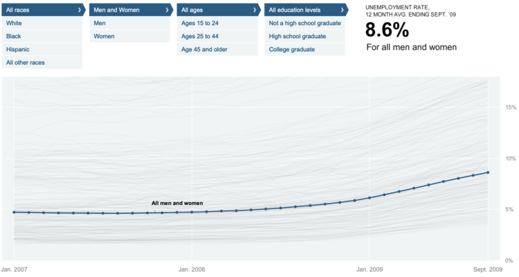
Shan Carter, Amanda Cox, and Kevin Quealy of The New York Times explore 12-month average unemployment rates for just about any breakdown you can imagine. The main point: not everyone has been affected by the recession equally, and here’s how each group has felt it.
Start with the filters up top for race, gender, age, and education level. The corresponding time series highlights blue.
Change the filters – and here’s where the graphic gets a lot of mileage – the lit line moves up or down and the vertical axis updates, depending on what you were originally looking at. That up and down movement makes comparison between demographic groups much easier, especially because there are so many time series on a single plot.
I’m impressed, NYT. Again.

 Visualize This: The FlowingData Guide to Design, Visualization, and Statistics (2nd Edition)
New York unemployment is on the rise, but conditions vary throughout the state according to this heat map:
http://www.localetrends.com/st/ny_new_york_unemployment.php?MAP_TYPE=curr_ue
I wonder If the statistic was ran again with those who speak fluent English with a minimum of a 5th grade English level:
a) whether age, and race mattered as much as the ability to communicate.
b) whether education level, whether it is a high school degree or a college degree mattered as much as the ability to speak and be understood.
c) whether the ability to speak a second or third language aided in the ability to be employed.
@Will the BLS provides many ways to slice and dice, but it doesn’t appear language skills are tracked in their survey http://www.bls.gov/cps/tables.htm#monthly
Pingback: Unemployment Rate For People Like You – NYT Interactive — Some Random Dude
Pingback: Daily Digest for November 10th
Pingback: Daily Research » Shared Items - November 10, 2009
Pingback: The Obama Presidency
Pingback: Unemployment Rate Breakdowns – Nyt Interactive | Flowingdata « Gross Recipes for Halloween
Pingback: 5 Best Data Visualization Projects of the Year – 2009 « Earth to Bobby
Pingback: 5 Best Data Visualization Projects of the Year – 2009 « Bytes Hotdish
Pingback: 5 Best Data Visualization Projects of the Year – 2009 « WebGlide - Data-Visualization
Its comforting to know that those of us in interactive media still have jobs. Someone has to make the interactive maps about the unemployed.