As you know, states have received billions of dollars of federal stimulus funding. But do you know where all the money goes?
Stamen Design, in its most recent project with the State of California, lets you explore the money breakdown. Like most of Stamen’s work, at the base is an interactive map, but it is of course much more than that.
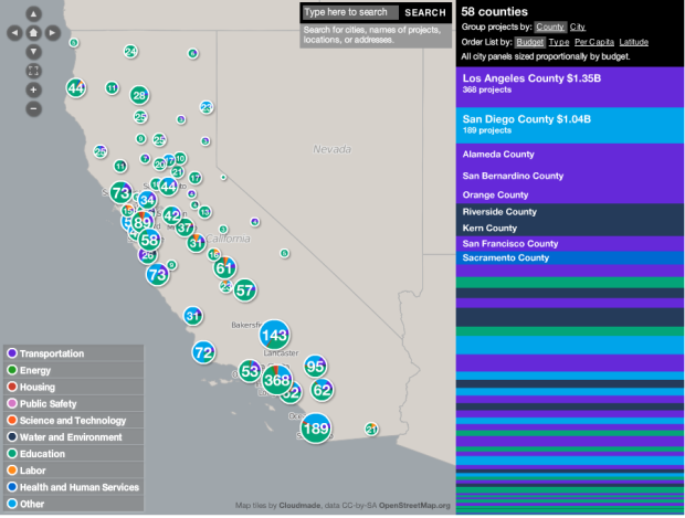
Roll over for breakdowns, search for your city or county, select sectors of interest, and take a look at project-specific information. The color-coded bars change depend on what’s geographically in view, and the map zooms in on points of interest on the fly.
In Eric’s words, “It’s just slick as hell.”
 Visualize This: The FlowingData Guide to Design, Visualization, and Statistics (2nd Edition)
This is interesting as it brings information to the people. the project brings public transparency.
But I look for a more structural view. Counties with many people get much money, seems to be the first impression. But is this truism true? Are there small counties which get the best parts of the cake? and vice versa.
The map is a good start, but provides no structural insight.
you can filter by sector and sort by per capita, which i think answers those questions, right?
I agree it is very slick interface.
Nathan, would you consider comparing it to the Tableau workbook at: http://www.tableausoftware.com/blog/announcing-winners-tableau-viz-challenge ?
The full screen mode is very sweet.
It might also be interesting if the map had location data for each project. Then, as you drill down to the city level, you would be able to see where the money was flowing. Of course, this probably won’t work with every project, as it might cover an area or serve a program. But the education projects could easily be located using the school’s attendance area. And many of the infrastructure projects could be located using either points or lines.
Pingback: Stimulus Funding Map is ‘Slick as Hell’ — Some Random Dude
My guess is that all of the stimulus funding went into building this Stimulus Funding Map. It’s cool. But is it necessary in this case. It doesn’t do the one thing that it should: make me feel as though the money is being spent wisely.
i don’t think that’s the purpose. the point is that people can see where the money is going and can make their own decision on what’s wise. On the other side, bureaucrats know that the information is out there, so they’re forced to make better decisions.
Pingback: An Interview With Edward Tufte | VizWorld.com
I was working from this stimulus funding map of projects from the NIH (National Institutes of Health).
http://report.nih.gov/recovery/arragrants.cfm
There’s definitely millions of ARRA dollars coming from the NIH that do not seem to be represented on this interface.
Aside from that, the interface is leaps and bounds better than what the NIH has for ARRA funding.
While I have to agree that the information presented on this map is great, the execution is not so much.
First of all, the color choice is bad. The colors are so bright that they hurt my eyes. They are also so similar that you have to look really hard to differentiate them. For example Energy and education are almost the same. Science and Technology is almost the same as Labor.
The numbers inside the pie charts are so big that you can barely see anything behind them. I am not a big fan of pie charts because they distort the data slightly. For example, with a stack bar chart your eyes only have to compare one dimension, the height. That is demonstrated by the stack bar on the right, which I think is good. With a pie chart, especially when it is so small, you can’t really see the difference between two smaller slices.
Combine all that with the funky color scheme, I think this map is barely readable.
I do have to admit that I like the way the information is presented in the stack bar on the right.
I don’t know why, but I expected to see a longer tail in “Other”. The bulk is DOD and VA projects hidden behind the thin veil.
Pingback: Planner Reads » Blog Archive » Stimulus Funding Map is ‘Slick as Hell’