Data visualization continues to grow online and in the real world. It exists as masterful art pieces and amazingly useful analysis tools. In both cases though it brings data — which is oftentimes cryptic — to the masses and shows that data is more than a bucket of numbers. Data is interesting. As we collect more and more data about ourselves and our surroundings, the data and the visualization will only get more interesting. On that note, I give you FlowingData’s picks for the top 5 data visualization projects of 2008. Visualizations were judged based on the use of data, aesthetics, overall effect on the visualization arena, and how well they told a story.
Honorable Mention: Wordle

Wordle, by Jonathan Feinberg, is the word cloud revamped. Wordle caught on like wildfire across the Web as people were putting in their RSS/Atom feeds, cutting and pasting snippets, and visualizing presidential speeches. It was even added to the Many Eyes visualization toolbox. It’s hard to say what exactly made Wordle so popular, but I think it was a mix of randomness, aesthetics, and customization options.
5. Decision Tree: The Obama-Clinton Divide
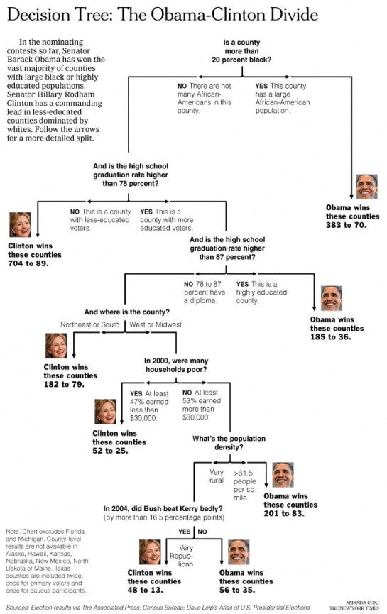
Amanda Cox of The New York Times has a knack for creating excellent graphics. She managed to make regression trees interesting and spark some heated debate with her Obama-Clinton graphic. I would also like to note that Amanda has, yes, a statistics degree. Excuse me while I beam with pride.
4. Radiohead “House of Cards” Music Video

The Radiohead “House of Cards” music video was a bit different in that no cameras were used to “film” it. Instead, they used a rotating scanner and lasers to collect 3D data. What you see in the music video (below) is a visualization of all that data. The group behind the video also made the data freely available, which is icing on the cake. You don’t have to be a Radiohead fan to appreciate that.
3. Last.fm and Movie Box Office Streamgraphs
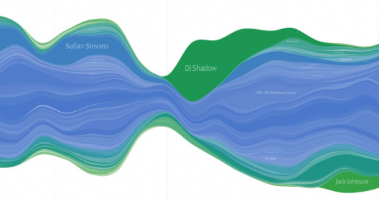
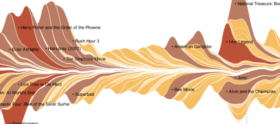
Lee Byron was certainly on to something when he created Streamgraphs to visualize music listening history on last.fm. They are a variant of stacked graphs and an improvement on Havre et al.’s ThemeRiver in the way the baseline is chosen, layer ordering, and color choice. In February 2008, Amanda Cox (yes, again), Matthew Bloch, and Shan Carter of The New York Times, together with Lee, used a similar technique to show the ebb and flow of box office receipts for 7,500 movies over 21 years. Discussion burst out across the Web — about the technique and what people were seeing in the data — that I am convinced would not have come about if instead of a Streamgraph, they used say, a stacked bar chart.
Read more about the Streamgraph in Lee Byron and Martin Wattenberg’s paper: Stacked Graphs – Geometry & Aesthetics.
2. I Want You to Want Me
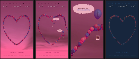
I Want You to Want Me was commissioned by New York’s Museum of Modern Art and created by Jonathan Harris and Sep Kamvar, who you probably know from past projects, We Feel Fine and Lovelines. The two are best known for the ability to tell stories with data, and it shows in IWYTWM, which explores the world of online dating. Individuals float in balloons hoping to find their match.
Here’s the video, so you can more fully appreciate the work:
This blend of art, computer science, and mathematics is beautiful.
1. Britain From Above
When I first caught a glimpse of a clip from Britain from Above, I was immediately impressed, and it only left me wanting more. It was a special series on the BBC with beautiful visuals produced by 422 South. GPS traces from taxi cabs and airline flights scurried to locations; telephone communications glowed in the sky; ground lights twinkled as if the roles of sky and earth were switched; and internet traffic burst from computer to computer. With all that data on display, patterns emerged – zero air traffic in no-fly zones and taxis taking alternate routes to avoid heavy traffic.
At the time, the videos weren’t available to the U.S., but they are now, and the BBC has posted them on YouTube as well. Pretty lights:
There you have it – FlowingData’s top 5 data visualizations for 2008. It’s going to be interesting to see what comes out in 2009. Now it’s your turn. What’s on your list?


 Visualize This: The FlowingData Guide to Design, Visualization, and Statistics (2nd Edition)

Pingback: rascunho » Blog Archive » links for 2008-12-19
Pingback: Daily Research » Shared Items - December 20, 2008
What makes Wordle so popular is that people can use it to make their own visualization. Even the most appealing and insightful displays have difficulty providing the user with such interaction.
Thanks for the collecting these great projects!
Pingback: Links - 22nd December 2008 « Curiously Persistent
Pingback: Visualisation de données : les plus beaux projets 2008 | taggle.org
Pingback: 5 Best Data Visualization Projects of the Year | FlowingData | yscv.com
Pingback: Bookmarks for December 22nd from 10:50 to 10:50 - bplusd
Those BBC videos are amazing. Thanks Nathan.
Pingback: Links for 12.22.08: Music’s short tail, Hulu for music, 2008’s best new words… « the listenerd
Pingback: From Fay To Z » Blog Archive » Turning data into beauty
Pingback: Partial Recall » Bookmarks for 2008-12-18 through 2008-12-24
Pingback: Michael Nielsen » Biweekly links for 12/26/2008
Look at Internet visualisation service http://walk2web.com
They’re attractive, certainly, but I think Wordle is a half-baked project because of its dequantified nature, and that’s true with all but one of the projects you’ve identified. Wordle is especially problematic: Lots of work has documented that people have different perceptions of vertical and horizontal dimensions (remember the optical illusions with horizontal and vertical bars).
@Sherman – Your points are valid but they’re meant for a different list. I know there’s plenty of literature on perception of vertical, horizontal, round, spacing, color, transparency, shapes, etc. If I were to pick data viz for analysis or quantitative reasoning, none of these 5 would have made the cut. Instead I chose these 5 because they excel in telling the story they were trying to tell, and they show us the beauty in data that is oftentimes missed.
Pingback: Data Visualization Projects « Andrew’s Photos - Blog
I would have loved to see the presentation of , “I Want You To Want Me” at the art exhibition. It looks SOOOOO cool and intreging to say the least.
Pingback: Data Visualization ARt | Social Networking for Artists.
Pingback: Daily Summary 2008-12-26 - mskari.org
very interesting. the simple and aesthetic visualisation of last.fm is my favorite. simply nice to look at…
Pingback: Internet Gold, 29/12/08 « Mike Stuchbery
Pingback: 2008最佳数æ®å¯è§†åŒ–:Britain From Above
Pingback: more end-of-year stuff - data visualizations « info-fetishist
This is my favorite visualization on the year,
Population Density per zip-code on the east coast:
http://uuorld.com/gallery?image=89
I like it b/c it makes cities feel both large and small. While living in the city it’s easy to feel like you’re part of something big. But spatially, it’s quite small. When you’re living in the country it’s easy look out on the vast expanses and forget that almost all the wealth, taxes and votes in the US come from cities.
My friend Chris Mueller made the image using software we developed. So it’s clearly a biased choice, but there you have it…
Pingback: Marpeta » Blog Archive » Duomenų Å¡vieselÄ—s ir gaisrai
Pingback: Daily Links #2 | CloudKnow
Pingback: Matt Weiss Online
Pingback: Top, best and predictions - as we enter 2009
Pingback: Top “N” for 2009 « BLOg Source INTelligence
Pingback: Capillary Refill: Old Blood, New Perfusion » Blog Archive » Time
Pingback: Rememorando el 2008: Las listas de lo top « Humanismo y Conectividad
Pingback: Best of the Year « Healthy Algorithms
Pingback: DesignNotes by Michael Surtees » Blog Archive » More of Britain from Above
Pingback: Best Data Visualization of 2008 at Industrial Brand
Pingback: New Years and other cool things « Matt Weiss Online
Pingback: MarkMalta.com » Blog Archive » Britain is cool.
Pingback: BBC – Britain From Above. » Heuserkampf – Gestalt & Gestaltung
Pingback: Partial Recall » Links for 2008-12-24
Pingback: adaptive path » blog » Adaptive Path » Signposts for the Week Ending January, 2009
Pingback: Top 3 data visualisatie 2008 « twistrends
Pingback: dirtypotatoes » Blog Archive » last.fm streamgraph
It seems that someone kindly setup a service to generate the streamgraphs for people’s last.fm histories.
http://lastgraph3.aeracode.org/
You can download big fat pdf files (20MB in my case) if you want a super detailed graph with a lot of your history.
@unkosan – Thanks for pointing that out. There’s also one for Twitter by Jeff Clarke http://www.neoformix.com/Projects/TwitterStreamGraphs/view.php
I love this list! Also of note, is this last.fm data visualization http://www.diametunim.com/muse/
Pingback: yosefblog » Blog Archive » viz
Pingback: günlük kayıtlar 2009-01-12 « Blogdivx
Pingback: Imagethief : Data visualization as a cool communication tool
NASA Scientific Visualization Studio http://svs.gsfc.nasa.gov/index.html
Pingback: 5 Best Data Visualization Projects of the Year | FlowingData | From Bogota With Love, A Web Industry Blog focusing on Design, Technology & Innovation
Pingback: Thursday Stories: at The Brian Sullivan Blog
Pingback: philnicholas.com » Blog Archive » Showcase of outstanding data representation at FlowingData.com
Pingback: Made in England by Gentlemen Data Visualisation
Pingback: Data Visualisation Top 5 « Graoutso’s Blog
Pingback: This Week’s Bits & Bytes | Bits & Bytes 2.0
Pingback: Connected: Visualisation, Inspiration, Gotham | Pocket Noodle
Pingback: MANTONE » Archives » I Want You to Want Me
Pingback: Twitter records real-time unfolding of collective consciousness during an historic event « VERTIGELT
Pingback: Datenspuren | eduFutureBlog
Pingback: My favourite new site is: flowingdata.com | The Evolving Newsroom
Pingback: BendTech » High Desert Zeitgeist ™
Pingback: eirikso.com » Visual thinking
Pingback: Los cinco mejores proyectos para visualización de datos [EN]
Pingback: Bird’s eye view of planes, trains and phone lines | The Evolving Newsroom
Pingback: Semiconducted » Blog Archive » 5 Best Data Visualization Projects of the Year by Damon Hamm
Pingback: Yo quiero que me quieras « Yonoveotele
Pingback: Information Societies Data « Information Societies
Pingback: R-ohjelmointi.org » Blog Archive » Tilastollisen kuvion valinta
Pingback: The Writing on the Wall (Jan 21 to Jan 22) — Transplanted
Pingback: Flowing Data’s 5 Best « Information Design at Penn
Pingback: Journalismus & Recherche » Blog Archiv » Viele bunte Bilder: Visualisierung von Daten
Pingback: Visualizing information « Culture of Pop
Pingback: 493 flashback : we saw 4 out of the 6 best viz of the year! « Carlos Fiorentino | Design Teaching | Design Thinking
Pingback: 5 Best Data Visualization Projects of the Year | FlowingData « Nehemiah Blake
Pingback: Partial Recall » Links for 2008-12-24
Thanks for putting together such a great list. Just wanted to let you know: the link on the House of Cards video is broken, so you might want to find another copy of it.
Pingback: Visualisierungen « ryanblog
Pingback: Data-visualization: seeing is believing | Working Wikily
Pingback: Data visualization of 2008 « A Gadget Girl’s Gab
Hello @Sherman –
Wordle can be configured (easily) to use only horizontal orientation. The point here is though that it’s one example of a powerful movement toward democratising data visualisation. Vis tools are the first cab off the rank, and analysis tools will hopefully follow.
We’ll get lots of ugly visualisations by non-experts, just as we get lots of ugly web pages. On the other hand, the experts have been quite capable of producing ugly, bad, wrong, impenetrable visualisations; a facility with R or SPSS is not always associated with a solid understanding of visual communication. And we’ll get new, unexpected, beautiful and useful visualisations as well.
Cheers,
V.
Pingback: fun with data « orgtheory.net
Pingback: Daily Links | AndySowards.com :: Professional Web Design, Development, Programming, Hacks, Downloads, Math and being a Web 2.0 Hipster?
Pingback: #WDNDL For 5/24/2009 - Weekend Web Update! | AndySowards.com :: Professional Web Design, Development, Programming, Hacks, Downloads, Math and being a Web 2.0 Hipster?
Pingback: Yiayi and Shih-Wen Young @ Axis Gallery | SquareCylinder.com