This is a guest post by Greg J. Smith, a Toronto-based designer and researcher. Greg writes about design, visualization and digital culture on his personal blog Serial Consign.
A few weeks ago the second edition of the Visualizar workshop wrapped up at Medialab-Prado in Madrid. In curating the event this year, organizer José Luis de Vicente selected urban informatics as the focus of research and visualization development. Partially inspired by Cascade on Wheels (a project created at the workshop last year), the Visualizar mandate was in line with contemporary thinking about the city where the street is viewed as a platform and urban space is considered a DIY enterprise. Visualizar’08 brought together a range of programmers, designers, architects, illustrators and scholars to participate in a seminar on contemporary thinking about the city and then bunker down to “rapid prototype” seven visualization projects over a two-week period.
These visualizations provide a range of strategies for representing urban space and address issues of mobility, perception, the environment and flows of information. Each of these interfaces is proof positive that urban cartography is rapidly evolving and (more importantly) open to reconsideration by a motivated citizenry. Although each of these projects is credited to a singular author or collective it has to be noted that this work was produced by groups of up to a dozen collaborators – more info on these teams is available at the site for each project. Input and guidance came from guest lecturers Aaron Meyers, Bestiario, Fabien Girardin, Adam Greenfield and Juan Freire.
BCNoids (Marina Rocarols & Enrique Soriano)
Taking advantage of the data generated by Barcelona’s community bicycle program Bicing, BCNoids aims to explore the movement of 6000 bikes across a network of 400 stations. Developed in VVVV, the research draws inspiration from Craig Reynolds’ 1980s experiments with simulated flocking behviour and aspires to deliver “a tool for the analysis of human mobility patterns”.
Ecovisualizacion-Ecoanalogizacion: Modelo de Ciudad Biocentric (Francisco Castillo)
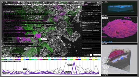
Providing environmental information on agents which include synthetic chemicals, neurotoxins and bioaccumulative toxic substances, Ecovisualiacion is an interactive system for representing the levels of various pollutants. Working at multiple scales, this Processing application displays emissions from various EU capital cities (noting potential health risks), acts to “spatialize the dynamic behavior” of these substances and tracks concentrations at a molecular scale.
In the Air (Nerea Calvillo)

The city of Madrid currently tracks air quality through a network of sensors distributed throughout the city. This allows for the monitoring of pollutants such as sulfur dioxide, carbon monoxide and ozone at sites of traffic congestion and public interaction. In the Air uses this data to provide a (Processing-powered) realtime index of the air quality and a highly customizable interface for examining historical data. This visualization was simultaneously developed alongside a prototype of a diffuse facade – an experiment in using architecture as an ambient display for environmental information.
Much Ado About Nothing (Iván Huelves Illas)

Delving into the realm of subjective experience, Much Ado About Nothing utilizes noise pollution data from Madrid City Council to create virtual spaces in which to explore and discover the character and quality of sounds created at specific sensor stations. The resulting panoramic interface provides an immersive experience coupled with a graphic overlay that displays the intensity (in decibels) and source of each noise.
Murmur (Writing Academic English)

Finding inspiration in the question “Have you ever thought of urban space as seen through the eyes of the media?”, Murmur proposes an alternate means of mapping Madrid. Fed by a stream of more than 600 RSS feeds, this Actionscript/PHP application creates several models for “media geography” which geolocate, aggregate and abstract the flow of information from major media outlets and the blogosphere.
Lazarillo GPS (Carolina Paola & Caluori Funes)

Maps are often founded on the misguided notion that their end-users are all equally mobile. Lazarillo GPS proposes a system for mapping areas of “cultural interest” in Madrid for the physically disabled. Armed with GPS receivers and disabled test subjects, the Lazarillo team went out into the city and conducted field research to serve as the basis for a custom notational system which maps accessibility in several tourist districts.
Cartography of the Strait 2.0 (Indymedia Estrecho)

Picking up on the momentum of the 2004 research project Critical Cartography of the Strait of Gibraltar, Cartography of the Strait proposes a visualization of the “migratory, economic, political and cultural flows” between southern Europe and northern Africa. This research saw the prototyping of a 3D environment for representing these sociopolitical flows which is currently under development.
Big thanks to Greg for the detailed recap of Visualizar. Subscribe to Serial Consign to read more from Greg.
 Visualize This: The FlowingData Guide to Design, Visualization, and Statistics (2nd Edition)
Pingback: sustain » Blog Archive » Shared Bicycling Visualizations
Pingback: Think Stick! » Visualization Projects from Database City - Visualizar’08
Pingback: Jenna’s blog » In the Air
Pingback: The Classification of 3D City Models | Vector One