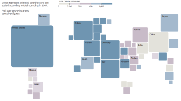
This pseudo-map graphic from The New York Times shows how consumers in different countries spend their money. Squares represent selected countries and are sized and colored according to spending in 2007. As you might expect, the United States does some heavy spending on clothing and footwear.
Does the graphic remind you of anything? The Times put up a different pseudo-map in force-directed graph format for the olympic medals. What do you prefer – pseudo-map or traditional?
 Visualize This: The FlowingData Guide to Design, Visualization, and Statistics (2nd Edition)
I really like the pseudo maps. (Prefer the blocks to bubbles.) Just want to let you know that the link to the money clock website (not your blog post on the money clock) results in a 404.
This cartogram from the New York Times…?
@Hadley – i think fivekitten is talking about an old post on a “money clock.” It looks like the site is down now.
This is just like the Olympics medals graphic they did earlier. Except they used squares and a different set of data here. Triangles next?
@Nathan: I was trying to suggest a more accurate starting sentence ;)
ohh, in that case – rectangular location-based doo-dad
Pingback: Charts of the Week [Sep 19] | Pointy Haired Dilbert - Chandoo.org
Pingback: Consumption Around the World « Kitsune’s Thoughts
Pingback: On consumer spending « Fredzimny’s Blog