Gas prices have been pretty crazy lately. I’m not used to paying over $45 for a tank of gas in my fuel-efficient Honda Civic. I mean, come on, what the heck?
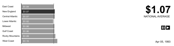
So naturally, we want to know, “What do the data look like for gasoline prices?” The Energy Information Administration has this data available for download. They have historic gas prices for certain states (not all, unfortunately) as well as for U.S. regions. Check out the animation showing the rise and fall… and rise.. and fall and rise of U.S. gas prices from 1993 up until now. Things started going crazy in 2006.
Is Animation the Best Visualization?
I could’ve just as easily plotted this data as time series – a line for each region and a colored line for the national average, but I already know how to do that, and I’m all about learning new stuff. Would a time series be any better than this animation? What about a map? If anyone wants a go at the data, here they are in a nice, clean spreadsheet.
UPDATE: Thanks Rob, Andy, and Jons for the versions in Many Eyes, Tableau, and Swivel. You all can probably guess where each graph came from:


 Visualize This: The FlowingData Guide to Design, Visualization, and Statistics (2nd Edition)
Personally, I think the animation is much more engaging than a regular time series, especially with multiple categories.
Also: here is a timeseries on Swivel, one coloured line per region, etc.
Jons – nice. thanks for doing that. next stop, Many eyes.
Wow, that’s a great animated visualization. I was mesmerized for the whole thing.
The animation works well to show how prices suddenly start to swing back and forth while the average increases.
One minor nit: some of the dollar values in the average are “1.6” rather than “1.60” and this causes the numbers to jump. Reformatting them to all be 3 digits would make watching the average easier.
How do you do it?
I can see some potential here for displaying goals in a work place. We could add vertical markers to show critical hurdles – overheads, profit etc., either marking them absolutely or on the date we passed them.
How do you do it?
I can see some potential here for displaying goals in a work place. We could add vertical markers to show critical hurdles – overheads, profit etc., either marking them absolutely or on the date we passed them.
Here’s the data in a really quickly thrown together Tableau workbook:
http://tinyurl.com/6ywgtz
It’s the same as the Swivel example.
Your animation is mesmerising, but it suffers from leaving the user unable to compare prices at two different times. However, it’s easier to see the individual regions’ data in your visualtion. The Tableau and Swivel time series are less thrilling, but the user can see the whole time series in one snapshot.
There are page filters in Tableau that could possibly allow for the time series to be animated, but in the time available I’m not sure how to get it to leave “trails” over time.
Interesting insight.
I think at this time that while animation has some advantages, since it’s engaging, it in fact *hides* the temporal scale.
I don’t have the perception of the time evolution and swings: a single plotting line will show it better, I think. :)
I liked the animation, but given the number of points, it was almost too long to watch. For most people I think a point a month or every other month, although showing less data, would be more consumable.
Also, if you could plot a point or line for the lowest price in a given year, or average price for that year, so that as the time goes on you can compare the current prices as they go by to what the previous ones were while still enjoying the animation.
Is there an easy way to get source code to these cool flash files or a program that helps in creating dynamic data display similar to these?
Alex
Has anyone posted the data in Many Eyes?
I couldn’t find it…
I think animation can be very effective – my challenge with this particular one was just that the timeline was too obscure & hidden. To see “where” you wereyou had to look away from the data being displayed.
It would likely be more effective with a scrolling timeline across the bottom (showing the entire timescale with an indicator to show where you are)
Given the progression of the prices it would fit as well as your eye would move to the right following the timeline as the gas prices moved in that direction as well.
I also agree that you could probably think out the data points a bit and just pick a monthly “keyframe” to shorten the runtime a bit.
Great visual though!
Ryan
Guilherme – it’s not on many eyes yet (that i know of), but if you copy and paste the spreadsheet, it should be pretty easy to stick in there.
@Guilherme, I’ve posted the data on ManyEyes here:
http://services.alphaworks.ibm.com/manyeyes/view/Sq22ZPsOtha6kZU_lYfcP2~
Too lazy to convert the values from cents to dollars, but the regional trends can still be seen. x-axis labels could use some work as well.
I’ve always wondered how does the price of a barrel of oil relate the gallon of gas price? For example, does the drop in oil futures correlate to the drop in the price of a gallon of gas? How quickly do they react to each other. For example, when a barrel of oil started to get really crazy gas prices seemed to drive up almost every other day. But when the price for a barrel of oil came down, it didn’t seem to affect the price of a gallon of gas as quickly.
By the way that was an awesome animation. It made me sad to see it back in the old days when gas was still in the $1 range.
Why not an animated time series? Combine the best of both worlds.
Otherwise, sticking with the existing visualization, it would definitely benefit from a more prominently displayed date…might also be interesting to color code the bars to delineate seasonal changes (red for summer, brown for fall, white for winter, and green for spring). This way, you would also have a more instinctive feel for year to year change.
In what situations is an animation actually helpful?
In this case, my opinion is that the animation is *not* useful, for reasons mentioned in the earlier comments. Since there’s no interactivity you have to wait and hope that something pops out at you. The Gapminder animations are interesting precisely because they are interactive and encourage exploration.
For this data an at-a-glance visualization is preferable. I’d suggest a log scale for the vertical/price axis. A useful interactive capability would be to pan & zoom the time series – perhaps amCharts (Flash) or Chronoscope (AJAX) would be appropriate.
Pingback: Gas Prices - Animated Bar Chart for Excel » PTS Blog
Not to be outdone, I’ve duplicated Nathan’s chart in Excel. It’s a bit more interactive, because you can view it forward and backward, pause, and scroll to any particular date.
Gas Prices – Animated Bar Chart for Excel
I agree that while the animation is entertaining, it loses the sense of the time scale. I have an idea or two which I am following up on.
For this to be more accurate, the prices should all be adjusted for inflation. Likely, the recent increase would then seem even higher – although I bet there would be a declining average, which would show that $4 gas is still quite cheap…
@dave: adjusting for inflation makes sense, but there’s a detail i’ve always wondered about in this context: gas is itself a part of the CPI, so wouldn’t adjusting for inflation end up mildly underestimating the amount it has risen? i wonder what economists do in this situation… do you adjust for a version of the CPI that’s everything but gas?
I’ve adjusted my version of this chart by adding a small time series of the national average price, with a vertical marker that shows the date of the bar chart.
Gas Prices – Animated Bar Chart for Excel 2
Don’t take this bad, but you should first do a quick visit to Europe and only than complain about gas prices.
Now, since gas is drivern by supply and demand (right…) there should be something logical behind this moves.
Pingback: Gas Prices - Interactive Time Series » PTS Blog
Pingback: Visualizing Rising Gas Prices « Kitsune’s Thoughts
I’ve posted the gasoline price around the world at swivel:
http://www.swivel.com/graphs/show/29542040
And this is the average prices for each continent derived from the same data: http://www.swivel.com/graphs/show/29542163
Pingback: Don’t Blame The Media. Blame The Culture. - The Seminal :: Independent Media and Politics
This would have been more illuminating if you would have shown crude oil prices with gasoline prices. For example, today 10/10/2008, we have the lowest crude oil prices since 9/2007, (which according to your data the gas price on 9/24/2007 was 2.86 on the West Coast) but I am paying $3.34 today. The crooks at the oil company are pocketing the profits again!
Our whole economic crisis is the result of greed. Here is one of the pieces of evidence of that fact.
Pingback: Bookmarks about Retail
Neato! It’s rather dramatic to see the different areas over time, especially when the price hikes or falls.
Is more data (September 2008 on) available? The fall in prices would add to this too :)