Visualization
Showing the stories in data through statistics, design, aesthetics, and code.
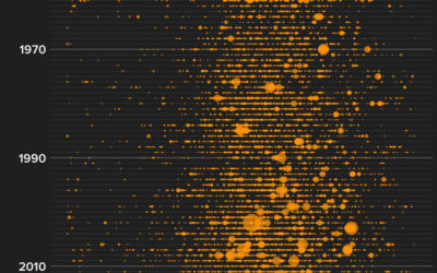
More wildfires than ever
Peter Aldhous for BuzzFeed News delves into the increasing number of wildfires in…
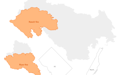
Scale of the California wildfires
The Mendocino Complex Fire, now the largest in California ever, continues to burn.…
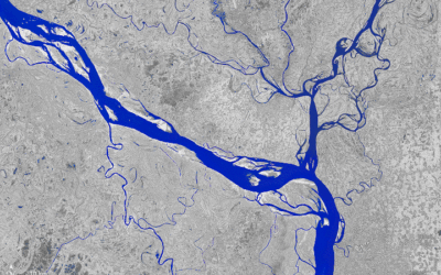
A transforming river seen from above
The Padma River in Bangladesh is constantly shifting its 75-mile path. Joshua Stevens…
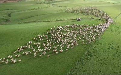
Aerial view of sheepdogs herding sheep
Sometimes the visualization takes care of itself. Photographer Tim Whittaker filmed sheepdogs herding…
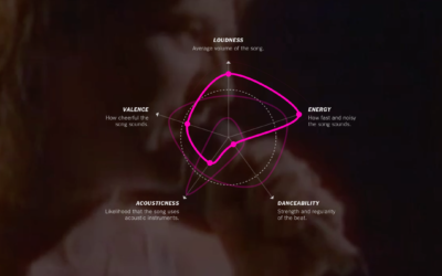
Charting the similarity of summer songs
Popular summer songs have had a bubbly, generic feel to them the past…
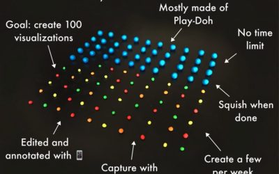
Visualizations using Play-Doh
We usually visualize data on computers, because it’s where the data exists and…
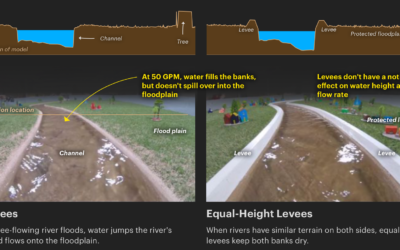
Scale model shows how levees increase flooding
Levees are intended to prevent flooding in the areas they are built, but…
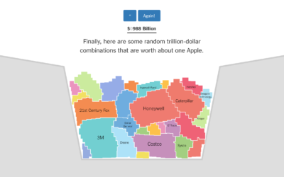
Bucket o’ companies compared to Apple $1 trillion value
Apple’s value passed $1 trillion on Thursday, and as tradition requires, we must…
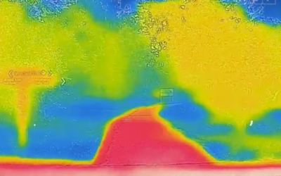
Why the city is hotter than the suburb
NPR used video from a thermographic camera to explain why cities tend to…
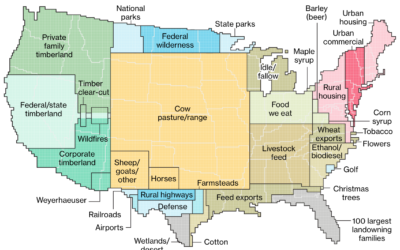
How America uses its land
Dave Merrill and Lauren Leatherby for Bloomberg visualized land use for the conterminous…
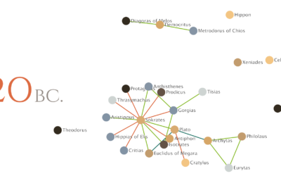
Relationships between philosophers over time
Maximilian Noichl visualized the relationships between philosophers from 600 B.C. to 160 B.C.:…
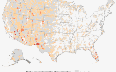
Searching for education deserts
The Chronicle of Higher Education looked for education deserts — places where people…
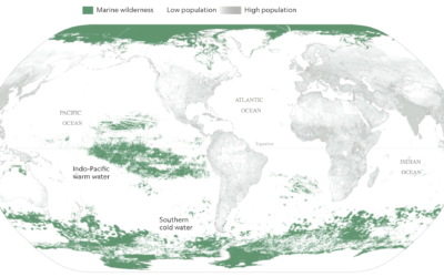
Mapping the ocean undisturbed by humans
Researchers recently published estimates for the amount of area undisturbed by humans —…
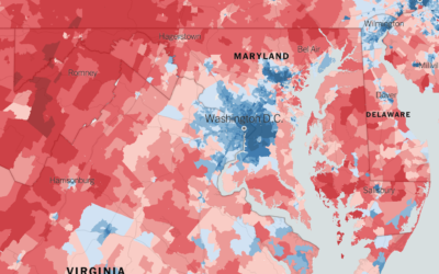
Extremely detailed election map
The Upshot returns to 2016 election results mapped at the precinct level. Because…
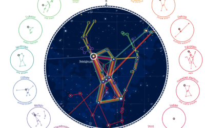
Same stars, different constellations
Cultures have formed different stories and pieced together different constellations from the stars,…
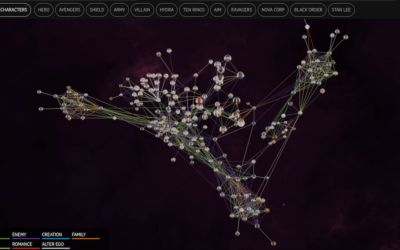
Marvel Cinematic Universe as a 3-D network
The Straits Times visualized the Marvel Cinematic Universe with a 3-D browsable network.…
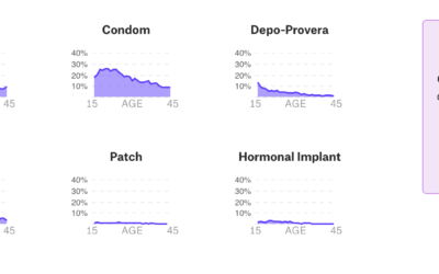
Data-centric view of birth control
Birth control is one of those topics often saved for private conversations, so…