Visualization
Showing the stories in data through statistics, design, aesthetics, and code.
50 Cars to Make One Bus?
Flygbussarna, a Swedish coach bus company, in partnership with the Acne marketing group,…
Interaction Design Pilot Year Churns Out Great Student Projects
In a collaborative initiative between Copenhagen Institute of Interaction Design and The Danish…
37 Data-ish Blogs You Should Know About
You might not know it, but there are actually a ton of data…
Here & There: Horizonless Perspective of Manhattan
Jack Schulze provides this horizonless view of Manhattan:
Here & There is a…
10 Visualizations for Number of Days to Pay Your Taxes
A couple weeks ago, FlowingData ran another Visualize This challenge. I posted a…
Spectrum of Online Friendship
This graphic, from Mike Arauz, describes different levels of online friendship, starting at…
What Drugs Pose the Greatest Danger?
While The New York Times continues to produce excellent work, GOOD Magazine has…
Is Your Country Involved in Open Source?
Red Hat, an open source leader best known for their Linux distribution, maps…
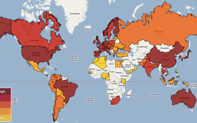
Tracking Swine Flu Worldwide – Where and How, Plus Data
Just about everywhere you go there’s something in the news about swine flu,…
Visualizing the United States Power Grid
NPR provides an in depth view of the U.S. electric grid, exploring the…
A Couple New Looks for Google News
The ever popular newsmap (above), a tree map view of Google News, got…
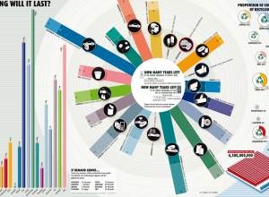
How Long Will the World’s Natural Resources Last?
This graphic from New Scientist shows when certain natural resources will run out…
Visual Guides to the World of Street Vendors
There are over 10,000 street vendors in New York City. But how much…
Visual Representation of Tabular Information – How to Fix the Uncommunicative Table
This is a guest post by Martin Krzywinski who develops Circos, a GPL-licensed…
Jobs Vanish Across Our Country
As a nation, we gained jobs every month during 2007 compared to the…
Creating a World in Holograms
This holographic video by Bruce Branit is completely fictional but oh so sexy.…
Geography of Buzz In Los Angeles and New York
Elizabeth Currid (USC) and Sarah Williams (Columbia University), collaborate to map the geography…


