Visualization
Showing the stories in data through statistics, design, aesthetics, and code.
Trash balloons released by North Korea landing in South Korea
North Korea has been releasing thousands of trash bags into the air with…
Hurricane categories, visually explained
As Hurricane Helene approached Florida, it grew from a tropical storm to a…
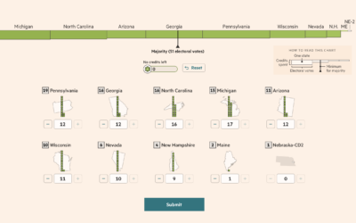
Election game to win the White House against other readers
For Financial Times, Sam Learner, Oliver Roeder, and Irene de la Torre Arenas…
Energy used to generate an email with AI
For The Washington Post, Pranshu Verma and Shelly Tan illustrate the scale of…
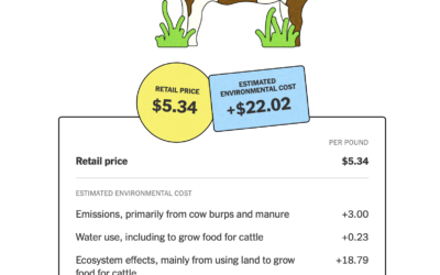
Environmental cost of food
The New York Times highlights the work of True Price Foundation, a group…
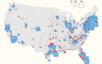
Immigration in Democrat counties
For Bloomberg, Elena Mejía and Shawn Donnan use a transitioning cartogram to show…
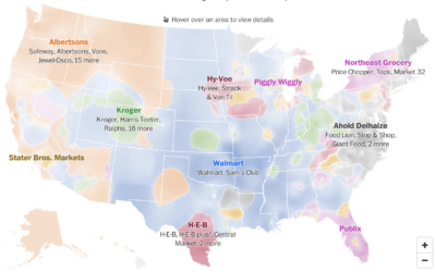
Political leanings of first and last names
For The Washington Post, Andrew Van Dam and Lenny Bronner analyzed names and…
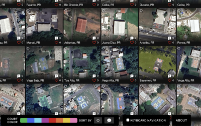
Satellite imagery of all the outdoor basketball courts
For The Pudding, Matthew Daniels extracted all the outdoor basketball courts in the…
Spell your name with satellite imagery
Here’s a fun interactive from NASA Landsat that lets you enter your name…
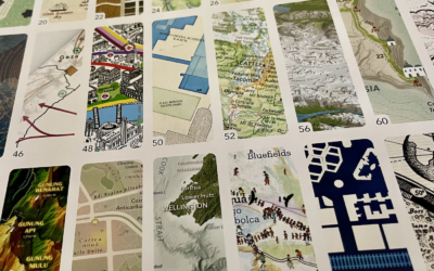
Atlas of Design, Volume 7
Every two years, since 2012, the North American Cartographic Information Society publishes Atlas…
Making unrefined vs. refined avocado oil, illustrated
For The Washington Post, Anahad O’Connor and Aaron Steckelberg show the contrast between…
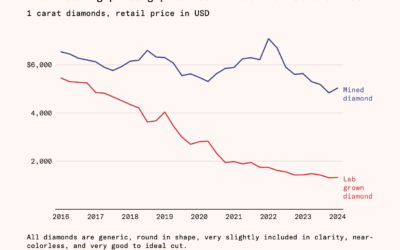
Falling cost of lab-grown diamonds
Natural diamonds require a lot of pressure and time, and then someone has…
Music visualizer in the style of a Pong game
You know the classic game Pong with the paddles and ball that moves…
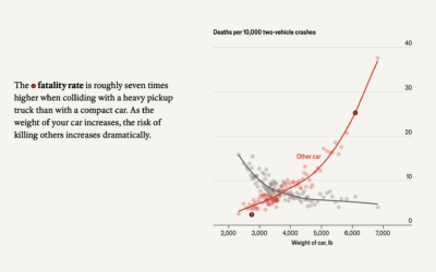
Weight of cars and fatalities
The Economist examines car weight and fatalities in car crashes. In two-vehicle collisions,…
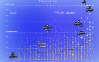
Internationalization of K-Pop
K-pop grew mainstream-popular in countries outside South Korea over the past few years.…

