Visualization
Showing the stories in data through statistics, design, aesthetics, and code.
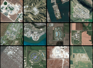
Geography of incarceration
New York University graduate student Josh Begley grabbed 4,916 satellite images of prisons…
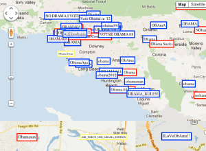
Political allegiance via wireless network SSIDs, mapped
Wireless network SSIDs in residential areas are typically left on default router names…
How a Virus Changes the World
From Take Part, a short video on how a virus spreads and its…
Tasty Tweets makes smoothies based on trending fruits
During a one-week visualization course at the Copenhagen Institute of Interaction Design, Kat…

Typewriter installation remembers killed journalists
Julian Koschwitz uses a typewriter linked to data from the Committee to Protect…
America Revealed on PBS
I’m not sure how I missed this, but PBS’s America Revealed, which has…

Meshu makes physical objects with your location
Location data typically stays within the realm of online maps and digital check-ins,…
Walt Disney: Story of Menstruation
A previously banned Disney cartoon on menstruation. So informative.
[Thanks, Kevin]…
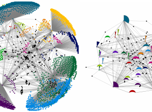
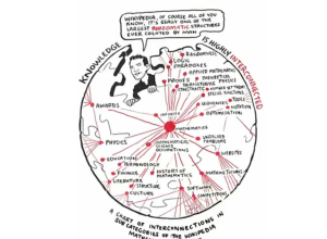
Network diagrams simplified
Network diagrams are notoriously messy. Even a small number of nodes can be…
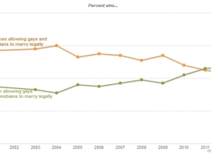
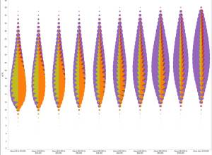
Even simple charts can tell a story
Regardless of your politics, this chart is a great example of how data…
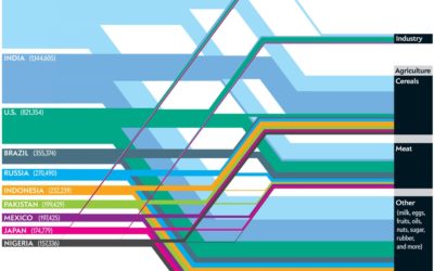
Which nations consume the most water?
This Scientific American article by Mark Fischetti and infographic by Jen Christiansen detail…
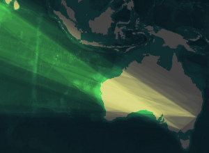
Image compositing in TileMill
TileMill is a tool that makes it easy to create interactive maps. Soon…
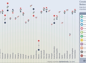
Updated OECD Better Life index
The OECD’s Better Life Index which debuted last year to much fanfare has…
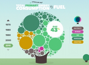
The U.K. energy consumption guide
I’m a sucker for anything cute and bubbly, and the U.K. Energy Consumption…