Visualization
Showing the stories in data through statistics, design, aesthetics, and code.
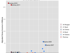
Comparing Romney’s tax returns to presidential returns →
Lee Drutman, a Senior Fellow at the Sunlight Foundation, compared the tax returns…
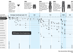
Swimsuit technology and breaking world records
The Washington Post has a fine graphic on swimming world records and the…
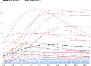
Tracking the spread of AIDS →
Adam Cole and Nelson Hsu for NPR plotted the percentage of people, ages…
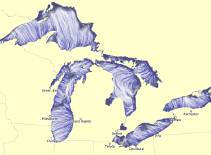
Great Lakes currents map
Using the same tech Martin Wattenberg and Fernanda Viegas created to show wind…
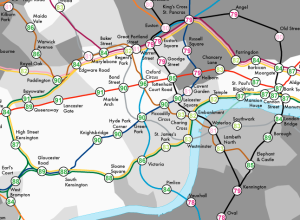
Life expectancy and child poverty as a tube map
Geographers James Cheshire and Oliver O’Brien visualized life expectancy in London as a…
Eyeo Festival talks online
The Eyeo Festival, hosted over at the Walker Art Center in Minneapolis, seems…
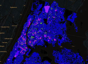
Stop-and-frisk hotspots mapped →
WNYC mapped all street stops that resulted in the recovery of a gun,…
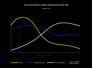
Charts describe love and relationships →
Love is complicated. It twists, it turns, and sometimes it smacks you in…
Browse the web of Wikipedia with Wikiweb iPad app
While we’re on the subject of the web that is Wikipedia, four-man, Baltimore-based…
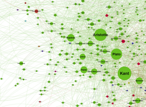
Graphing every idea in history →
Brendan Griffen created a giant network of people, using every profile on Wikipedia…
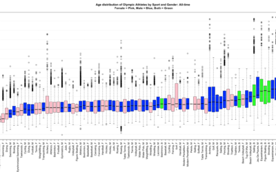
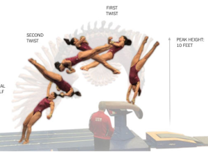
Olympian age distributions compared →
Last week, the Washington Post compared the ages of Olympians, but it only…
The future of maps isn’t maps →
Rebecca Rosen for The Atlantic on why maps aren’t the best interface all…

Map of the underwater Internet →
Nicolas Rapp, for Fortune Magazine, mapped the underwater cables that make the global…
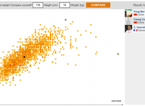
Where you measure up against Olympians →
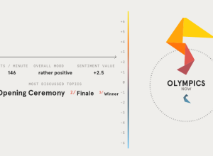
I think the theme of this year’s Olympic graphics is how you relate…
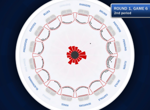
Sonification of Stanley Cup goals →
Artist Bard Edlund sonified the goals during the 2012 Stanley Cup.
The goals…
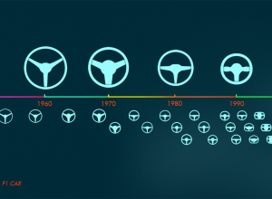
Evolution of the Formula One car, animated
Animator and illustrator Rufus Blacklock animated 60 years of Formula One race car…