Visualization
Showing the stories in data through statistics, design, aesthetics, and code.
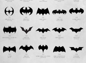
Evolution of Batman logo, 1940-2012
Available in print. See also: a video version. Still no confirmation for whether…

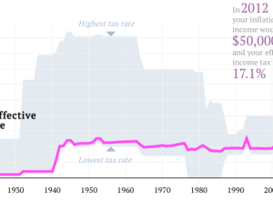
Your tax rate in 2012, and past rates since 1913
What is your effective tax rate now versus years past? Ritchie King made…
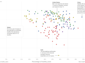
Longer life expectancy, more years of disease
Bonnie Berkowitz, Emily Chow and Todd Lindeman for the Washington Post plotted life…
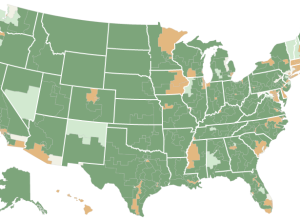
National Rifle Association grades for Congress members →
The New York Times mapped ratings for members of Congress, as given by…
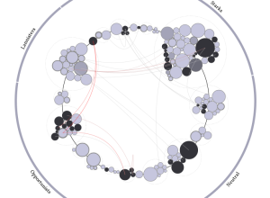
Animated growth of an organization
A company grows, it shrinks, people come and go. Justin Matejka, a research…
Small multiples with details on demand →
Small charts. Click. Big chart.…
An introduction to diagrams
As a teaser for a larger project on diagrams, Jane Nisselson describes how…
An ideal bookshelf
Thessaly La Force, with illustrator Jane Mount, recently published My Ideal Bookshelf, which…
This man makes data look beautiful →
A profile of the omnipresent Jer Thorp on Mashable…
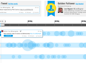
Get a visual recap of your year on Twitter
As 2013 nears, let the recaps, reviews, and best ofs begin. Twitter put…
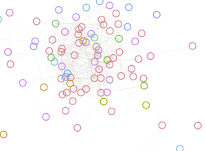
Relationships and kills in Game of Thrones replayed →
This one’s for you Game of Thrones fans and aficionados. Jerome Cukier visualized…
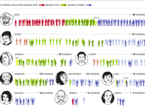
An infographical look at Walking Dead kills over three seasons →
Andrew Barr and Richard Johnson for the National Post took a detailed look…
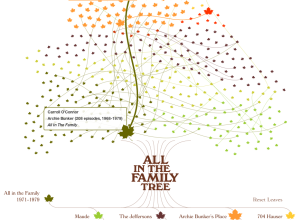
The family tree for All in the Family
James Grady from Fathom Information Design had a look at the family tree…
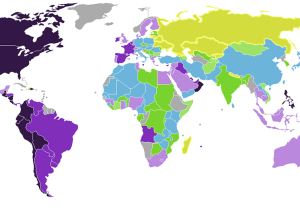
Emotion of countries mapped →
Max Fisher for the Washington Post mapped country emotion ratings, based on the…
Cartograms in D3 →
Cartograms in D3. Way smooth and interactive.…
Lunar Lander trails
In 1979, Atari released Lunar Lander, a game whose object was to land…