Visualization
Showing the stories in data through statistics, design, aesthetics, and code.
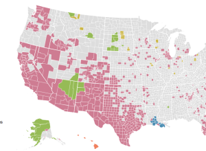
Where non-English language is spoken in the US →
Dan Keating and Darla Cameron for the Washington Post mapped commonly used languages…
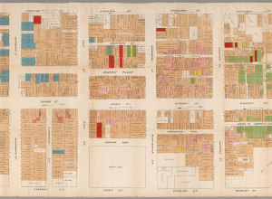
Map shows illegal activity in San Francisco Chinatown, from 1885
From the David Rumsey map collection, the detailed map of San Francisco Chinatown…
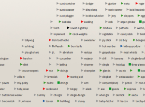
Extensive timelines of slang for genitalia
The title says it all. Jonathon Green, a slang lexicographer, has two new…
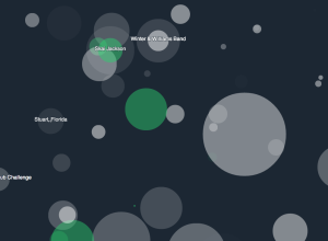
Beach Boys vocals visualized
Alexander Chen visualized “You Still Believe in Me” by the Beach Boys.
This…
Seeking a career in visualization
Some readers asked about career choices in visualization recently, and I was about…
Listening to Zen-like Wikipedia edits
It’s easy to think of online activity as a whirlwind of chatter and…
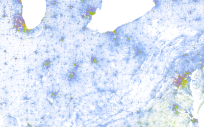
Racial dot map
Dustin Cable, a demographer at the University of Virginia’s Weldon Cooper Center for…
A second on the Internet →
In a straightforward view of online activity, Designly shows the approximate number of…
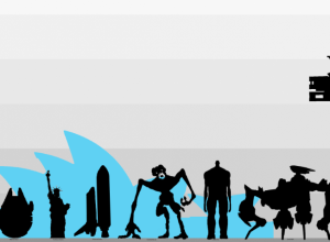
Size comparison of everything
If you’re like me, you often wonder how big the Stay Puft Marshmallow…
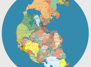
Pangea with political boundaries
What would Pangea look like if today’s political boundaries were drawn on it?…
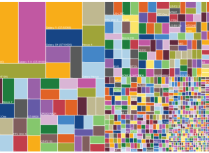
Useless infographics
The Guardian posted a small collection of useless infographics. It kind of looks…
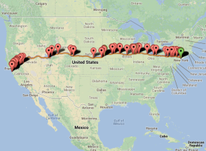
BreweryMap plans your next beer road trip
BreweryMap, a Google Maps mashup and mobile app, provides two main functions. The…
Breathing Earth
John Nelson of IDV Solutions strung together satellite imagery for dramatic animated GIFs.…

A study of quantified emotion
Mike Pelletier experimented with quantified emotion in his piece Parametric Expression. This is…
Internet critique as infographic music video
I’m not entirely sure how to interpret this music video from Franz Ferdinand,…
Tracking emoji usage on Twitter
The people I follow on Twitter almost never use emojis, but every now…
NYPL map vectorizer
The NYPL map vectorizer turns old maps into GIS data.…