Visualization
Showing the stories in data through statistics, design, aesthetics, and code.
Upward mobility and the potential for a better life
An analysis by Raj Chetty of Harvard University and Nathaniel Hendren of NBER…
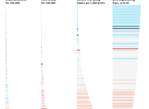
Black and White America compared as if they were countries
The Economist made a simple yet effective comparison of Black America and White…
Self-printing a wall-sized world map
Dominik Schwarz wanted a big world map. A really big one that covered…
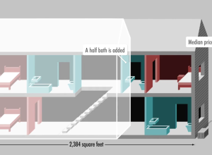
Median home in America, over 40 years
The median home in America has changed in a variety of ways. Square…
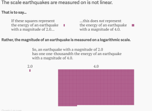
Earthquake magnitude and the logarithmic scale
The earthquake in Nepal was big, but there’s a discrepancy in just how…
Fashion trends seen through Google searches
Fashion trends, such as skinny jeans and Palazzo pants, can spike and fall…
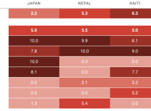
Disaster risk indices estimate impact on people
An earthquake with a magnitude of 7.8 can affect countries differently, depending on…
Quick change of mind on social issues
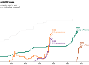
As Supreme Court hearings for same-sex marriage start today, Alex Tribou and Keith…
Recurring characters in film and the words used to describe them
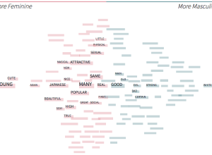
Stereotropes, made by the Bocoup Data Visualization Team, explores the many tropes in…
Why exploring big data is hard
The talks from OpenVisConf 2015 went up, so I’m slowly making my way…
Emptied reservoirs in California
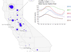
Winter is over and it’s shorts weather these days in California. This is…
Color timeline for Avengers comic book covers
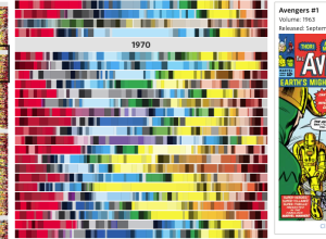
The Avengers comic has been around since 1963 and the look and feel…
Wealth inequality explained in charts
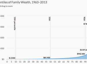
Wealth inequality is a real thing that is complex and a result of…
Life cycle of Earth’s carbon dioxide
The Cartography and Geovisualization Group at Oregon State University and NASA visualized a…
Speedy crossword solvers
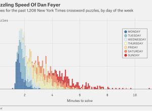
Oliver Roeder for FiveThirtyEight covered this year’s American Crossword Puzzle Tournament and the…
xkcd: U.S. of movie backgrounds
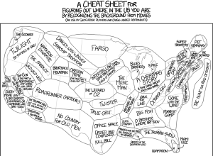
xkcd sectioned the United States by the background in movies. Because xkcd.…
Really slow speed of light
The “speed of light” typically means “really fast” but when it’s relative to…
Married couple tax bonuses and penalties
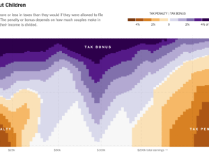
Using calculations by Nick Kasprak from the Center on Budget and Policy Priorities…


