Visualization
Showing the stories in data through statistics, design, aesthetics, and code.
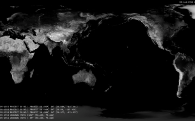
Nuclear detonations from 1945 to present
There have been over 2,000 nuclear detonations since 1945. Orbital Mechanics mapped each…
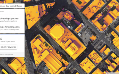
Mapped: Solar energy and savings if you got panels
Punch in your address. See how much you could save, based on a variety of data sources.
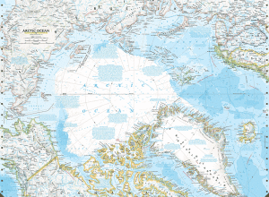
Disappearing Arctic reflected in National Geographic maps
In the most recent update to their atlas coming in September, National Geographic…
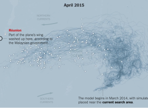
Possible float routes for Malaysia Airlines Flight 370
Malaysia Airlines Flight 370 went down a year ago, and with recently found…
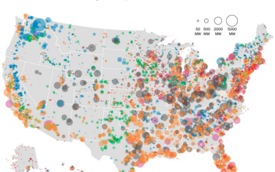
United States electricity map
The Washington Post mapped power plants in the United States by type and…
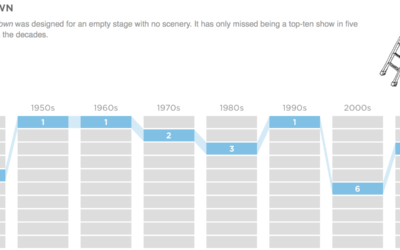
Top high school plays and musicals, by decade
Based on annual high school play and musical rankings from the magazine Dramatics,…
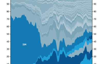
Technology sector, share of market over time
Here’s a straightforward stacked area chart from the Economist that shows shifting market…
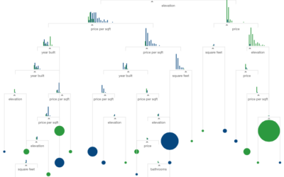
Visual introduction to machine learning
What is machine learning? It sounds like a bunch of computers get together…
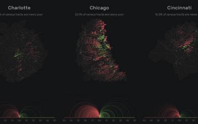
Million dollar blocks and the cost of incarceration
Incarceration costs a lot of money. We know this, sort of. But how…
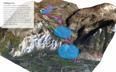
Ascent in the Tour de France
I was flipping through the channels the other night and happened on the…
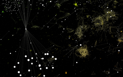
Interactive lets you fly through a software galaxy
This is a fun one. Software Galaxies by Andrei Kashcha visualizes popular software…
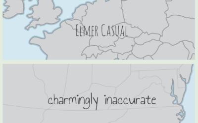
Hand-drawn map boundaries
You’ve probably seen those “maps” where people from other countries draw the United…
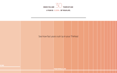
Why time flies when you’re older
When you’re a kid, a year seems like forever. Appending “and a half”…

