Visualization
Showing the stories in data through statistics, design, aesthetics, and code.
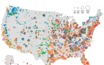
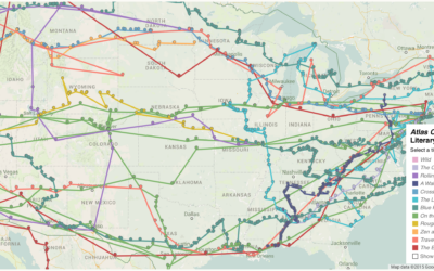
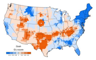
United States electricity map
The Washington Post mapped power plants in the United States by type and…
Top high school plays and musicals, by decade
Based on annual high school play and musical rankings from the magazine Dramatics,…
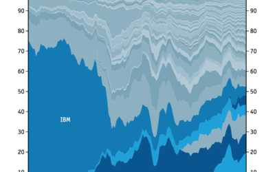
Technology sector, share of market over time
Here’s a straightforward stacked area chart from the Economist that shows shifting market…
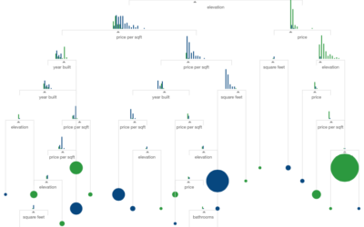
Visual introduction to machine learning
What is machine learning? It sounds like a bunch of computers get together…
Million dollar blocks and the cost of incarceration
Incarceration costs a lot of money. We know this, sort of. But how…
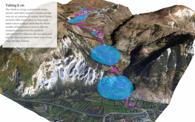
Ascent in the Tour de France
I was flipping through the channels the other night and happened on the…
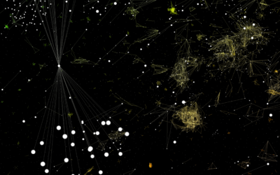
Interactive lets you fly through a software galaxy
This is a fun one. Software Galaxies by Andrei Kashcha visualizes popular software…
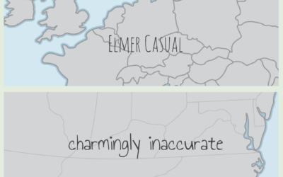
Hand-drawn map boundaries
You’ve probably seen those “maps” where people from other countries draw the United…
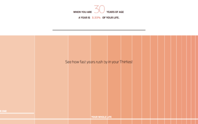
Why time flies when you’re older
When you’re a kid, a year seems like forever. Appending “and a half”…
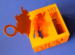
3-D paper model of a shrinking sea
The Aral Sea in Uzbekistan, formerly one of the largest lakes in the…
If the Moon were one pixel in size
Somehow these space-in-perspective graphics and interactives never get old. I guess the size…
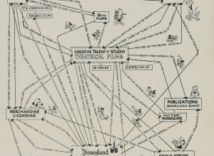
Disney business strategy chart, 1957
This is Walt Disney’s corporate strategy from 1957. The theatrical films serve as…
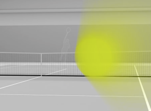
See a 150mph tennis serve to your face
Hawk-Eye is a collection of technologies that allows high-granularity sports tracking, most notably…
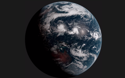
Earth time-lapse from 22,000 miles out
Japan has a new weather satellite in stationary orbit, Himawari-8, that takes a…
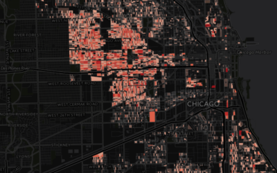
How we created an interactive map of Europe with 100k+ areas →
A lot of boundary areas, but still loads quickly.…