Visualization
Showing the stories in data through statistics, design, aesthetics, and code.
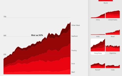
What the world eats
Diets vary around the world. Fathom Information Design for National Geographic charted the…
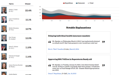
Missing votes in Congress
When members of the House of Representatives miss a vote, it is customary…

Average of faces in things
You’ve likely seen projects that take the average of people’s faces, but you…
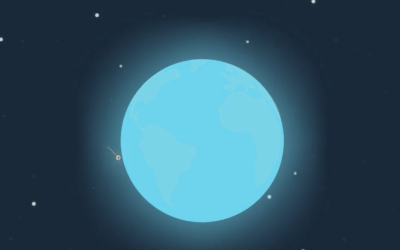
Pale Blue Dot motion graphic
Joel Somerfield created this motion graphic to Carl Sagan’s Pale Blue Dot monologue.…

Motion graphics in Keynote
As an experiment, Linda Dong used Keynote, typically for your everyday slide presentations,…
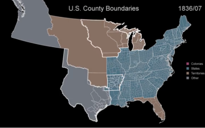
US boundary evolution
We saw a similar video of boundary development over the centuries before, but…
Past and future predictions of when the world will end
Wikipedia has a list of predicted dates for when apocalypse strikes, because of…
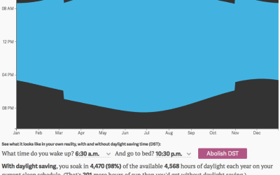
Daylight you get from daylight saving
We recently fell back an hour with the end of this year’s Daylight…
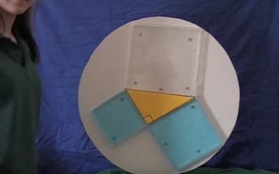
Pythagorean theorem water demo
This is years old, but it still tickles the neurons every time. It’s…
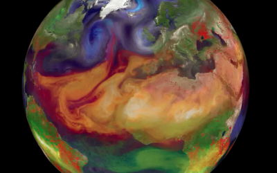
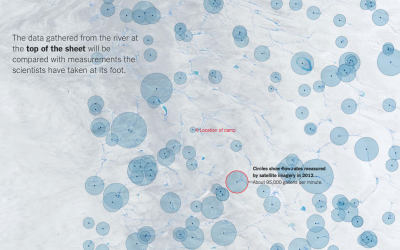
Particles swirling in the atmosphere
Gavin Schmidt shows different types of particles that swirl around in our atmosphere:…
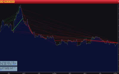
Stock trading game
Bloomberg Business has an interesting stock trading game with a simple premise. A…
Evolving LEGO color palette
DaveE from the Brickset Forum was curious about the changing LEGO color palette,…
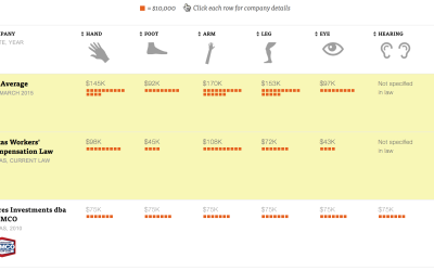
Value of body parts for injured workers
A detailed look at the state where companies can write their own workers' compensation plans.
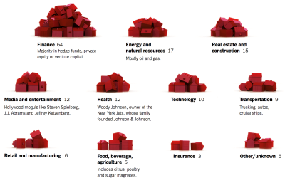
Monopoly pieces to show presidential funding
According to the New York Times, 158 families funded about half of the…
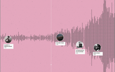
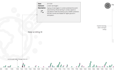
A timeline of history
“I wish there was a timeline browser for all the historical events documented…