Visualization
Showing the stories in data through statistics, design, aesthetics, and code.
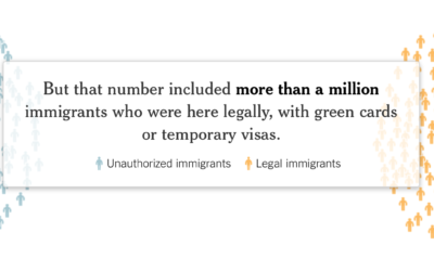
Actual deportation numbers
There was a lot of talk about deporting millions of illegal immigrants immediately,…

in/ex troversion
Here’s a short illustrated animation on introverts and extroverts by Julia Rodrigues.
This…
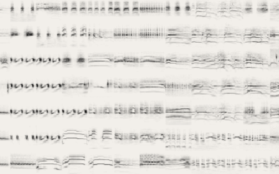
Visual collection of bird sounds
Different species of birds make different sounds. However, the sounds are so quick…

History of Earth in the context of a football field
In the latest addition to the put-big-numbers-in-context genre, here’s the history timeline of…
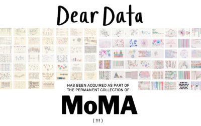
Dear Data headed to MoMA’s permanent collection
What started as a personal project and then turned into a book, Dear…

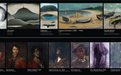
Visual connections between art pieces
This is neat. A Google Arts & Culture Experiment, X Degrees of Separation…
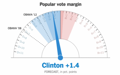
Showing uncertainty during the live election forecast
During the election, The New York Times showed a live gauge to show…
Data Sketches, a monthly visualization matchup
Data Sketches, a collaboration between Nadieh Bremer and Shirley Wu, aims to visualize…
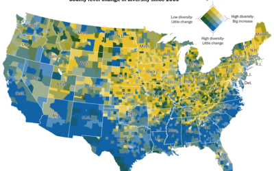
Peaks and valleys of presidential support
This is some fine map work by Lazaro Gamio and Dan Keating for…
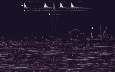
Randomness of scientific impact
A group of researchers wondered if there was a trend or predictability for…
Nuclear war is on the ballot
Neil Halloran, creator of the interactive World War II documentary focused on deaths,…
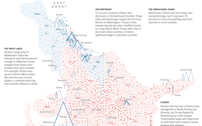
All the ways to map election results
Every election, there’s a slew of election maps that come in all shapes…
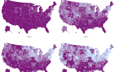
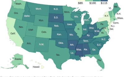
Impact of Obamacare in maps
It’s been three years since the Affordable Health Care Act. Margot Sanger-Katz and…
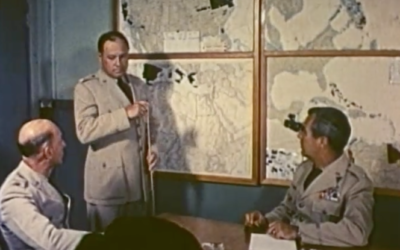
Vintage cartography and geography documentary, from 1961
This is too good not to watch. It’s a 1961 documentary on cartography…
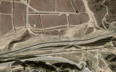
Visualizing the U.S.-Mexican border
There’s been a lot of talk about building a wall at the U.S.-Mexican…