Visualization
Showing the stories in data through statistics, design, aesthetics, and code.
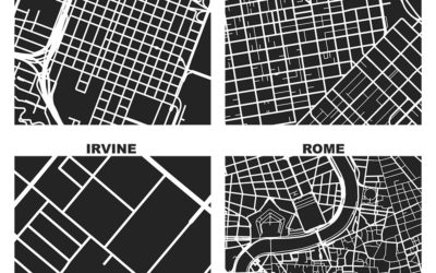
One square mile in different cities
As part of his dissertation, Geoff Boeing generated these maps that show one…
Sharing the same traits and qualities
My son used to watch Daniel Tiger’s Neighborhood (a modern take on Mister…
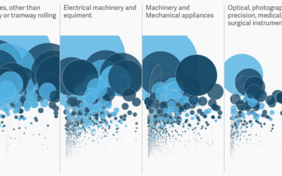
How much the US imports from Mexico
Most goods imported from Mexico are untaxed under the North American Free Trade…
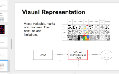
Teaching materials for visualization
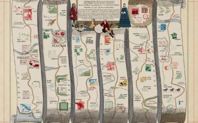
Enrico Bertini, who has taught information visualization at New York University for the…
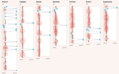
How different languages represent van Gogh
Christian Laesser takes an abstract look at how different languages represent Vincent van…
Demographics for immigrants from banned countries
As I’m sure you know, the current administration banned immigrants from seven countries…
Emotional arcs for inaugural addresses
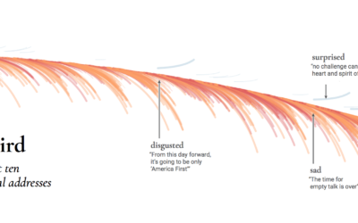
Inaugural addresses come in different flavors, with different messages and purpose. Periscopic passed…
Public versus experts, gun control
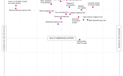
With this scatterplot, Quoctrung Bui and Margo Sanger-Katz for The Upshot describe where…
Immersive digital waves to visualize nature
FLOW is an interactive art installation by Maotik that represents real-time weather data…
Language in 2016, seen through Google Search Trends
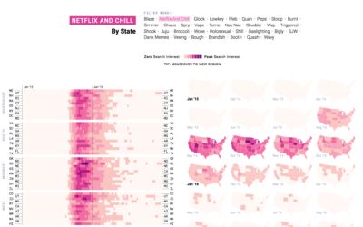
People go to Google to find information about things, and when new words…
Mixing cartography and landscape drawing
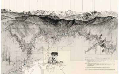
Artist Matthew Rangel hikes cross-country and through the mountains, exploring and drawing along…
Draw the patterns of Obama’s presidency
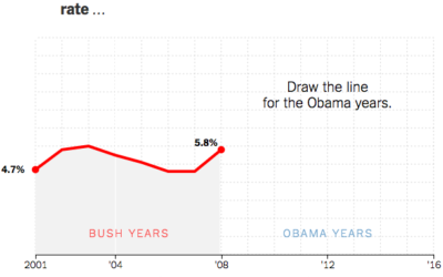
A couple of years back The New York Times asked readers to draw…
National Geographic Infographics, the book
Infographics devolved a bit in recent years, but there was a time the…
Giant map for inauguration planning
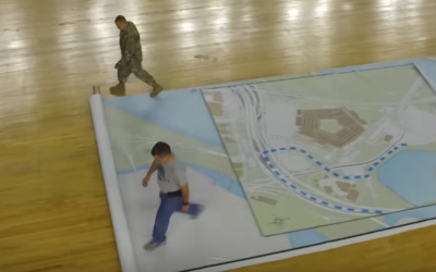
In planning for the upcoming inauguration, the U.S. military is using a giant…

