Big universities more often make the news, but the freeze in federal funding could affect research across the country. For the New York Times, Andrea Fuller, Zach Levitt, and Isabelle Taft use a Dorling cartogram and a beeswarm chart to show how funding is distributed, based on data from the National Center for Science and Engineering Statistics.
Universities that received federal funding for research
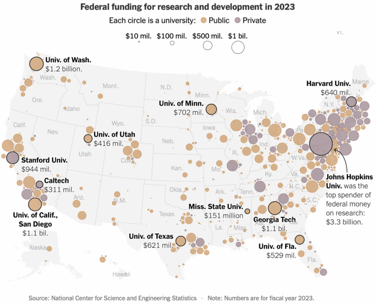
Chart Types Used


Second Edition
 Visualize This: The FlowingData Guide to Design, Visualization, and Statistics (2nd Edition)
 Visualize This: The FlowingData Guide to Design, Visualization, and Statistics (2nd Edition)
New tools, refined process.