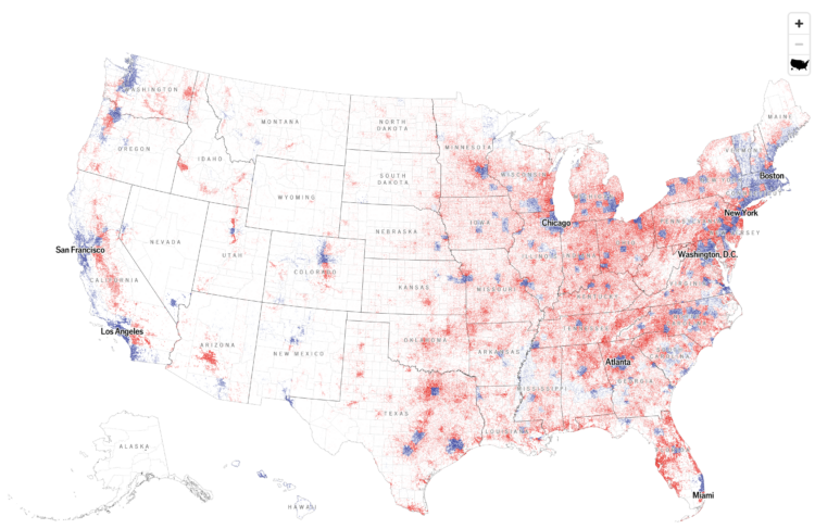
With what is now a common mapping method, The Economist used a dot density map to show election results by county. The dot counts are scaled to population density.
At first glance, I thought it was a 2024 version of this 2020 election map that shows the mix of voting within regions. A two-dimensional angle for grains of sand. But the map above shows just the winner of each county, which caught me off guard, because I associate the method with mixing demographic groups.


 Visualize This: The FlowingData Guide to Design, Visualization, and Statistics (2nd Edition)
