Mira Rojanasakul and Nadja Popovich, for The New York Times, mapped migration out of cities between 2020 and 2023. The dot density maps show where more people moved out than in as orange dots and the opposite in green. For many, this has meant more space and lower cost of living in exchange for moving closer to areas with higher natural disaster risk.
Maps showing migration out of cities
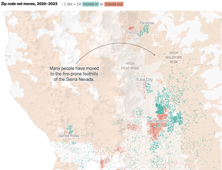
Chart Type Used

Second Edition
 Visualize This: The FlowingData Guide to Design, Visualization, and Statistics (2nd Edition)
 Visualize This: The FlowingData Guide to Design, Visualization, and Statistics (2nd Edition)
New tools, refined process.