For the Apple Women’s Health Study, which uses cycle tracking data from iPhones and Apple Watches, the Harvard T.H. Chan School of Public Health provides a visual explanation of how menstrual cycles vary. With some tweaks, it could also stand in as an explainer for distributions and averages.
Visual explanation of menstrual cycle length and variability
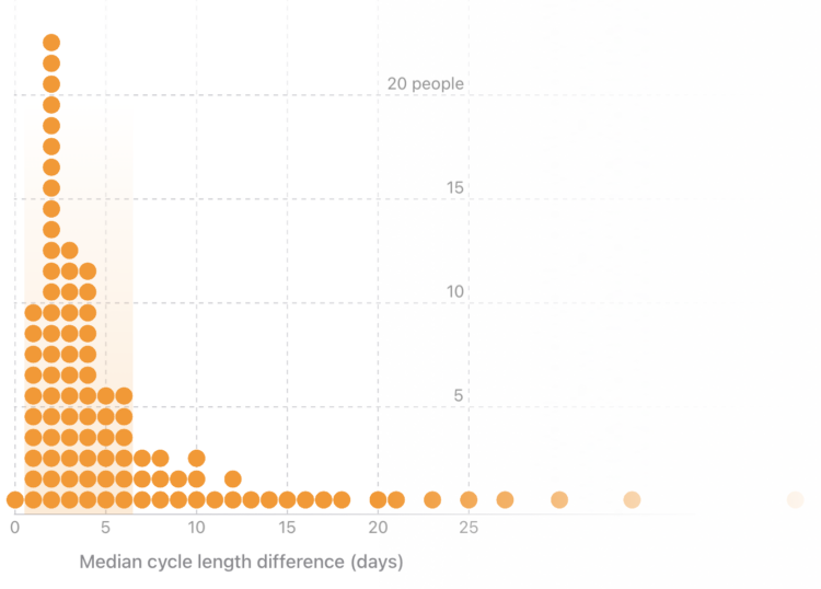
Chart Types Used


Second Edition
 Visualize This: The FlowingData Guide to Design, Visualization, and Statistics (2nd Edition)
 Visualize This: The FlowingData Guide to Design, Visualization, and Statistics (2nd Edition)
New tools, refined process.