Reuters goes with the radar chart to show gas supplies, as European countries prepare for the winter and possibly no gas from Russia. The circular shape shows the annual cycle, the gray shows the previous five-year average, and the blue shows the current year’s supply.
How much gas European sites have stored for the winter
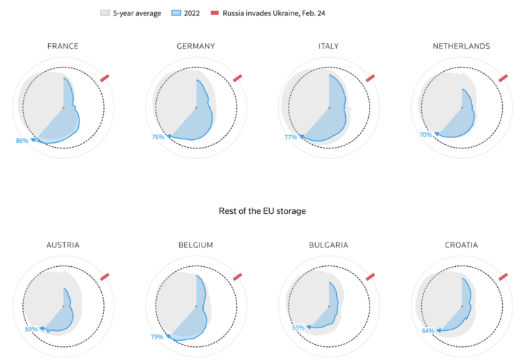
Chart Type Used

Second Edition
 Visualize This: The FlowingData Guide to Design, Visualization, and Statistics (2nd Edition)
 Visualize This: The FlowingData Guide to Design, Visualization, and Statistics (2nd Edition)
New tools, refined process.