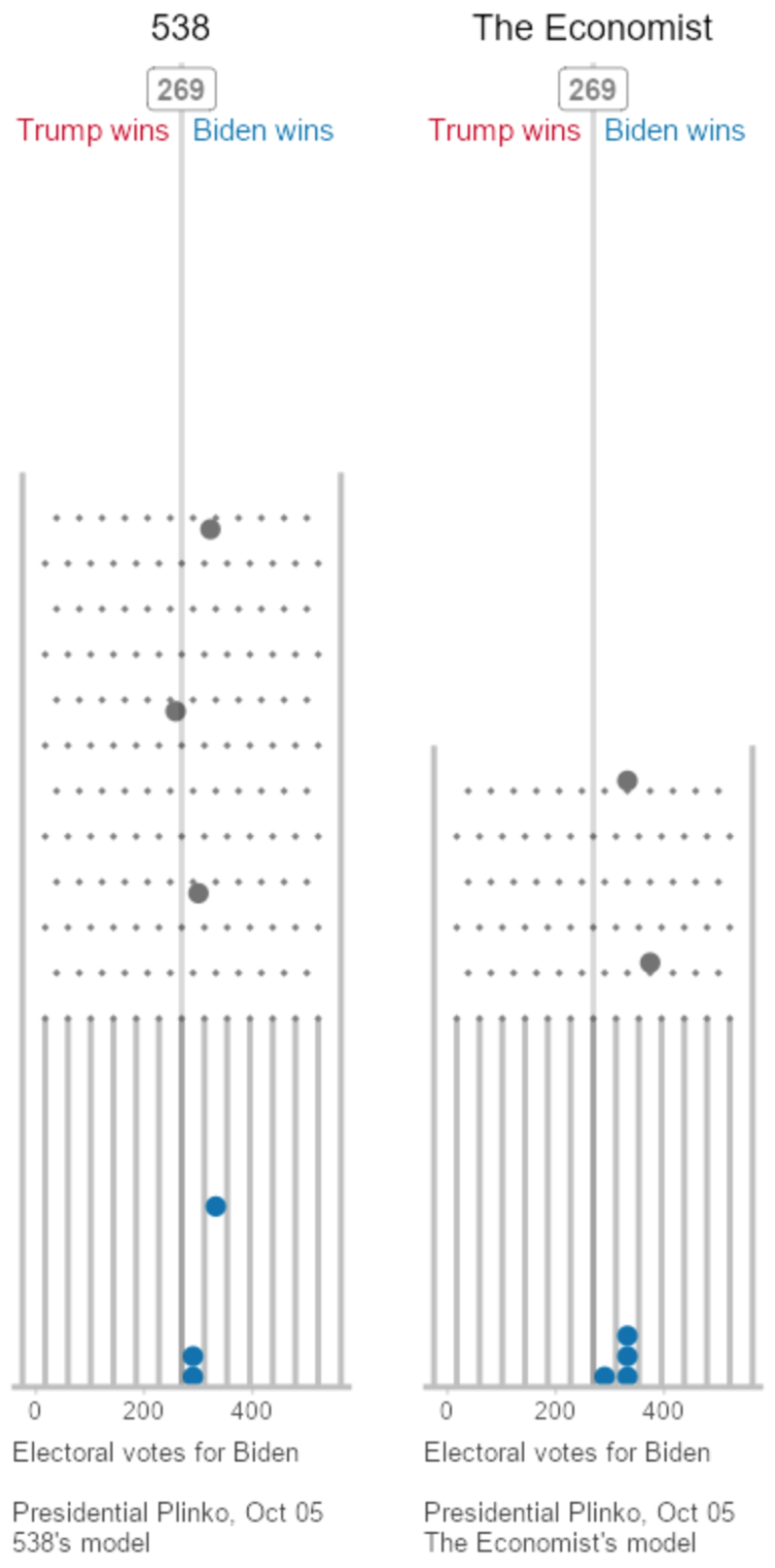
 To visualize uncertainty in election forecasts, Matthew Kay from Northwestern University used a Plinko metaphor. The height of each board is based on the distribution of the forecast, and each ball drop is a potential outcome. The animation plays to eventually shows a full distribution.
(And Kay made his R code available on GitHub.)

 Visualize This: The FlowingData Guide to Design, Visualization, and Statistics (2nd Edition)
