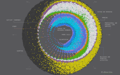
Air Quality Mapped Over Time
The wildfires keep coming. The sky turns orange. You wake up in the morning, it stinks of smoke when you walk outside, and you know a fire must be burning somewhere.
The animation above shows estimated air quality over the past couple of months. It’s based on data from the Environmental Protection Agency, which collects data from thousands of sensors and classify air quality based on levels of particulate matter.
The EPA provides six air quality classifications: good, moderate, unhealthy for sensitive groups, unhealthy, very unhealthy, and hazardous. As fires burn, you see the map get darker red towards hazardous. White areas that appear during the animation indicate segments where not enough data was available.
Notes
Sensor data from the EPA is irregular over time and space, so the animation uses interpolation to estimate air quality levels across the country. This makes patterns over time and space more obvious but should not be treated as exact measurements for any given location.
I made this before the most recent Northern California fires that started on September 27, 2020. Ugh.
Become a member. Support an independent site. Get extra visualization goodness.
See What You Get