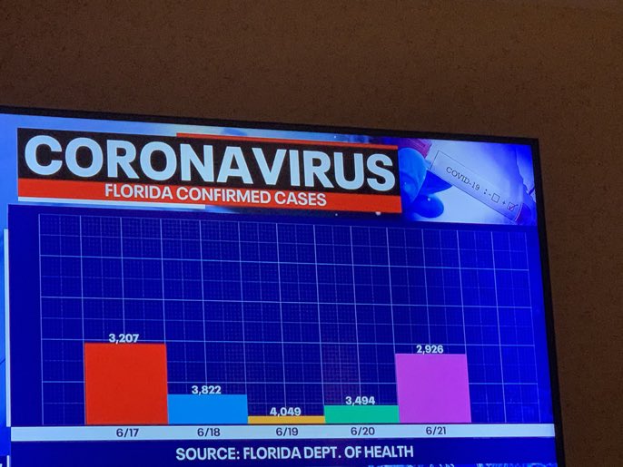
Welcome to whose bar chart is it anyway: where the geometries are made up and the numbers don’t matter. [via @dannypage]
Become a member. Support an independent site. Make great charts.
See what you get →
Minimum wage has increased over the years, but by how much depends on where you live.
Use this chart to see how many times over you’ll pay over the original loan amount, given the annual rate and the number of years of paying.
I compared time use for those with children under 18 against those without. Here’s where the minutes go.
Among households in the United States, 68% are owned and 32% are rented, based on estimates from the American Community Survey in 2021. That breakdown isn’t uniform across the country though.