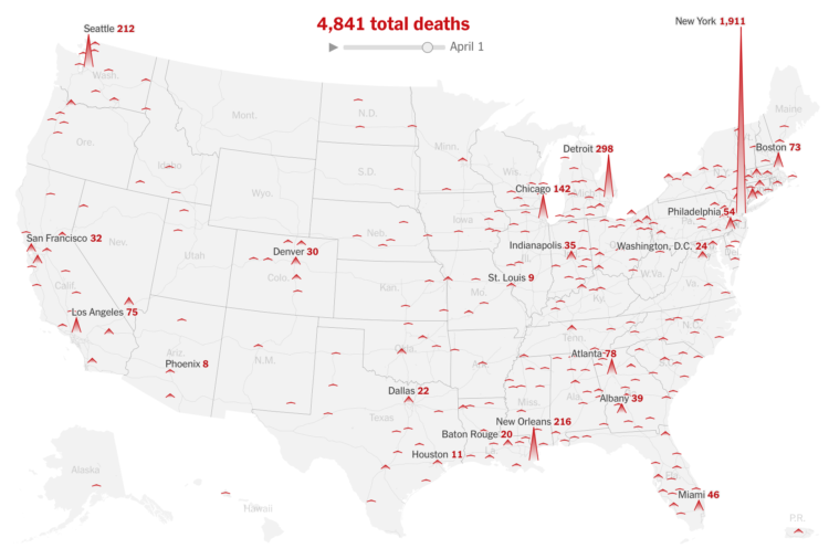
For The New York Times, Lazaro Gamio and Karen Yourish use an animated map to show known total coronavirus deaths over time. The height of each triangle represents the count for a Core-Based Statistical Area. Let it play out, and New York almost spikes out of view.
See also the county-based circular version for total confirmed cases.

 Visualize This: The FlowingData Guide to Design, Visualization, and Statistics (2nd Edition)