How to Draw Maps with Hatching Lines in R
Fill areas with varying line density to give more or less visual attention. With geographic maps, the technique is especially useful to adjust for population density.
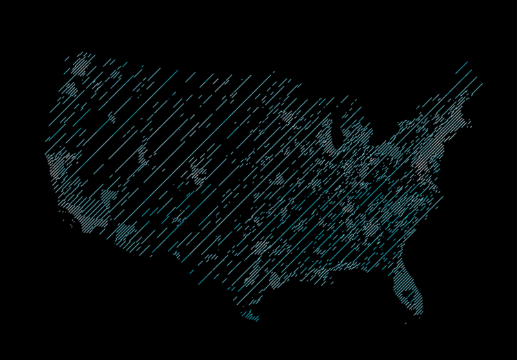
Hatching is an older technique to show varying degrees of shading. More lines and the area appears darker. Fewer lines and the area appears lighter. In the context of visualization, hatching tends to be used less, as filling polygons with solid and/or transparent colors is now trivial to do.
But I’ve been coming back to the method lately. In some cases, it’s been useful and others I think it just looks nice and provides a break from our standard, visually efficient charts.
Most recently, I used hatching to show population density and commute times.
To access this full tutorial, you must be a member. (If you are already a member, log in here.)
Get instant access to this tutorial and hundreds more, plus courses, guides, and additional resources.
Membership
You will get unlimited access to step-by-step visualization courses and tutorials for insight and presentation — all while supporting an independent site. Files and data are included so that you can more easily apply what you learn in your own work.
Learn to make great charts that are beautiful and useful.
Members also receive a weekly newsletter, The Process. Keep up-to-date on visualization tools, the rules, and the guidelines and how they all work together in practice.
See samples of everything you gain access to:

