As discussed previously, the “impeach this” map has some issues. Mainly, it equates land area to votes, which makes for a lot of visual attention to counties that are big even though not many people live in them. So, Karim Douïeb used a clever transition to change the bivariate map to a cartogram. Now you can have a dual view.
Fixing the ‘impeach this’ map with a transition to a cartogram
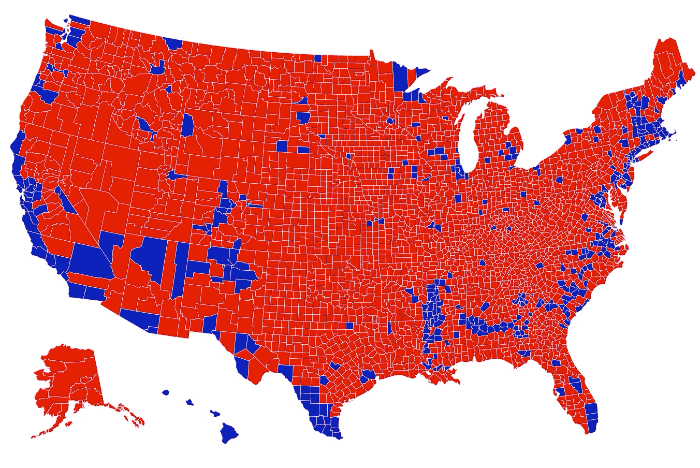
Chart Type Used

Second Edition
 Visualize This: The FlowingData Guide to Design, Visualization, and Statistics (2nd Edition)
 Visualize This: The FlowingData Guide to Design, Visualization, and Statistics (2nd Edition)
New tools, refined process.