The National Science Foundation announced the 2009 winners of their annual visualization challenge. As usual it’s mostly scientific visualization of biological organisms and phenomena speckled with a few data-focused entries. The above, for example, took first place in the photography category. It’s a picture of tiny fibers, nanometers in diameter, wrapping around a plastic ball while immersed in evaporating liquid.
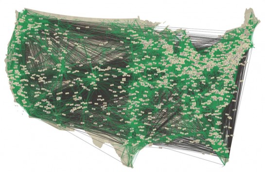
The most data-ish of the winners was from Christian Thiemann and Daniel Grady of Northwestern University. They made a video explaining how people across the country, based on data from Where’s George?, a dollar bill tracking site.
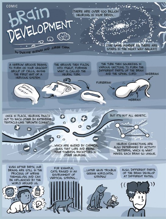
Out of the winners and honorable mentions, these two by far seem like odd selections. The first is from PhD comics, my absolute favorite Web comic. PhD (piled high and deeper) is a great comic, but I’m confused why I’m seeing it in a visualization challenge. The comic won first in the information graphics category. It explains brain development:
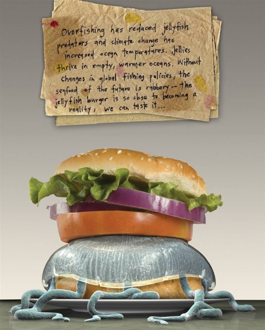
The second, is… a jellyfish burger.

Yeah, I don’t know what that’s about. See pics of the other winners on msnbc. Why the NSF doesn’t post pics on its own site is beyond me. I’m so confused.
Back to you. What do you think? Best of 2009?


Hi,
Thanks for that post. I would like to see the video of Christian Thiemann and Daniel Grady. Where can I find it?
Best,
click on the picture of the map. that’ll take you to the department page where there’s a link to the video.
Pingback: Around the Intertubez | Extreme Tolerance
The pictures from msnbc are quite disappointing. I see better pictures of science every week on the blogs I follow. The photo that opens your post is pretty amazing though.
You might want to look at http://www.sciencemag.org/special/vis2009/show/ for the images and explanations. I don’t think that this part is behind their pay-wall.
Thanks, Alex. Too bad the articles are behind the pay-wall. I would’ve liked to read about what all the picks were about.
Pingback: Daily Research » Shared Items – February 19, 2010
“Why the NSF doesn’t post pics on its own site is beyond me. I’m so confused.”
That’s because that’s the online press release for the news. Here’s the actual run-down, with images:
http://www.nsf.gov/news/special_reports/scivis/winners_2009.jsp
thanks, brian. when i wrote this post, that page wasn’t up yet. there always seems to be that delay between announcement and showcase. i think they should put it up all at once.
umm, I can only guess that the last one won because it visualized our food economy in about 20 years. (they should have used a seafood basket) but still. we are screwing ourselves.
Pingback: EastZoneSoupCube - Linklist: Visualization