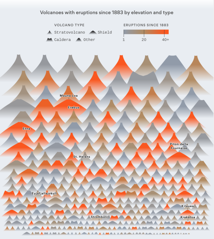
Slowly becoming the person who charts the past century of natural disaster events, Lazaro Gamio for Axios uses a pictogram to depict all known volcano eruptions since 1883. The vertical position represents elevation, color represents number of eruptions since 1883, and the shape represents volcano type.
I wonder if you get anything out of looking at eruptions over time. This view is more compendium than pattern revealer. You can grab the data from the Global Volcanism Program to check it out yourself.
 Visualize This: The FlowingData Guide to Design, Visualization, and Statistics (2nd Edition)