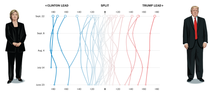
Using data from their Washington Post-ABC News polling, the Washington Post compares shifting support for Clinton and Trump among several demographic groups.
The presidential contest is often compared to a horse race, with the candidates fighting to finish in first place on Election Day. We offer a bit of a different metaphor here. The campaign is also a series of simultaneously fought tug-of-war matches for different demographic groups — based on gender, age, and race/ethnicity, among others.
By rotating the time series to put time on the vertical and candidate lead values on the horizontal, the graphic provides a different metaphor: more left, more right, and mostly middle. I like it.


 Visualize This: The FlowingData Guide to Design, Visualization, and Statistics (2nd Edition)
