Jobs Charted by State and Salary
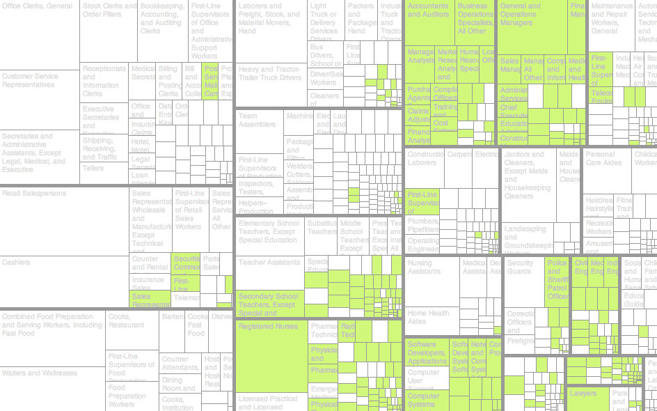
Prominent industries in a state can say a lot about an area. Is there a lot of farming? Is there a big technology market? Couple the jobs with salary, and you also see where the money’s at. You see a state’s priorities.
For example, look at California. You see an increased prominence of farmworkers and laborers, whereas the farming, fishing, and forestry sector is nearly nonexistent in many other parts of the country. I expected a lot more in the midwest states, but relative to the other occupations in those states, the farming sector doesn’t seem that big from an employee perspective.
For a drastic change, switch to Washington, D.C., where people who work in the legal and business sectors are much more common. I realize it’s a comparison between a city and states, but whoa, that’s a lot of lawyers packed in one place.
Move the median salary up a bit, and you get a sense of overall salaries (and a correlating cost of living, kind of) as you check out different states.
Anyway, it’s an interesting first look at employment data from the Bureau of Labor Statistics. I’ll have to poke more.
Chart Type Used

Become a member. Support an independent site. Get extra visualization goodness.
See What You Get