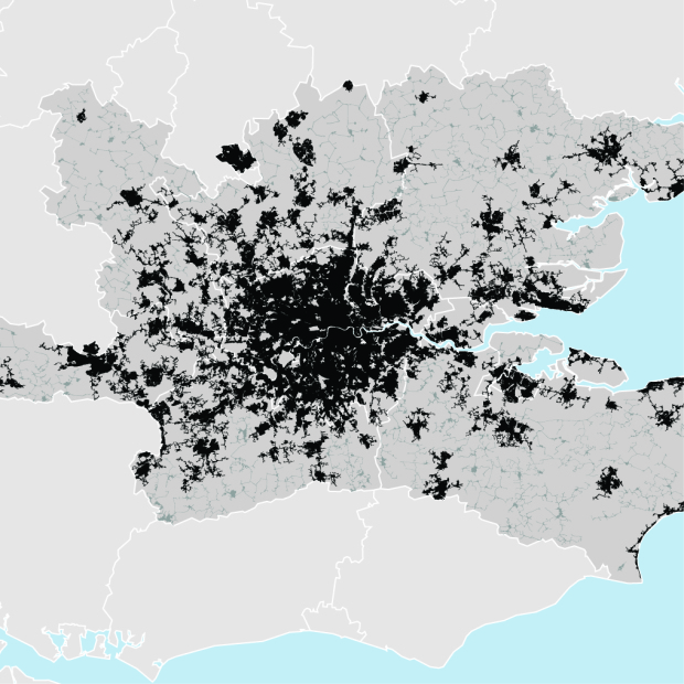
After identifying 129 metropolitan regions that represent 35 percent of the world’s urban population, LSE Cities mapped some of the densest areas with a simple black and white color scheme. The patterns reveal a footprint of where the much of the world’s population lives.
To get a sense of the spatial dynamics of these city regions, we mapped 12 cases at the same scale with core built-up areas in black and peripheral areas in grey. By comparing the footprint of the world’s largest urban conurbation in Tokyo with Atlanta, our sample’s most land-hungry city region, we see that roughly the same amount of land is occupied by 42 million as by 7.5 million people. Meanwhile, the map of London shows that 14 million people are spread across South-east England.
In other words, that’s a whole lot of people packed into Tokyo. I wonder what these maps would look like with Tokyo density.


 Visualize This: The FlowingData Guide to Design, Visualization, and Statistics (2nd Edition)

Something looks really off on their map with the area circles, top image from the first link.
I’m pretty sure they used the diameter of the area circles to represent population density, instead of area.
I wonder how they conclude that Atlanta is the most land hungry region. Seems like rural areas would be classified as more land hungry since fewer people are spread out over larger areas. The map reminds me of my favorite game,Download Minecraft, where everything is built by the users in these incredible worlds. Games imitating life.