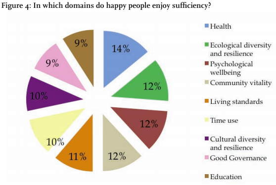
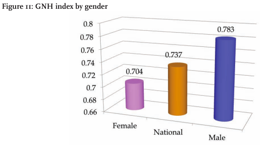
It feels oh so wrong posting about bad charts in a report about happiness around the world, but here you go. I do it for you. The first World Happiness Report was released by the United Nations earlier this month. It’s filled with gems like the 3-d bar chart above. Notice the axis that starts at 0.66. (You shouldn’t do that because length is the visual cue here, and it makes the differences look greater than they actually are.)
There are also a few of these bad boys.

Kaiser Fung has a go at the exploding pie charts:
I’m really curious how these domains add up to 100% exactly. Since the data came from some kind of survey, you typically would allow each respondent to pick more than one domains in which he or she is happy. If that is the case, then it would not make sense to add up responses, nor would the total (100%) signify anything.
If, on the other hand, respondents are forced to pick only one domain, it is very suspicious that all 9 domains would essentially receive the same number of votes. Nor would it make sense to ask survey-takers to select only one domain if all 9 domains contribute to someone’s happiness.
And someone please get Andrew Gelman a barf bag before he makes another mess.


 Visualize This: The FlowingData Guide to Design, Visualization, and Statistics (2nd Edition)

The bar graph at the top is a deliberate lie. Cropping the Y-axis from 1-10 to 6.6-8 gives the impression that men are 50% happier than women, rather than ~10%. Still a problem, certainly but not one that will be helped by distorted data.
Both of these charts are from Part II of that report. The other chapters have your standard Excel and Stata charts (with what looks like Times New Roman substituted for Calibri), which at least have the advantage of not distorting the numbers.
Maybe it feels wrong, but please keep doing posts like these! I’m a beginner in data visualization and these are so helpful (not to mention that they do make me feel a bit better!).
Check out Kaiser Fung’s blog “Junk Charts” http://junkcharts.typepad.com/ for lots of posts about bad charts (and ways to fix them!)
I agree with Michele. The best way to stop bad charts is to point them out for ridicule.
I’m going to throw in a voice here in defense of government agencies’ ugly plots. I work at a fairly high-profile state government agency, and the graphics in our reports are made almost exclusively in excel, which dramatically limits what you can do. They’re standard and boring and made by people with no training in any kind of graphic design–which would be almost all of us (and, sadly, we have a pretty much nonexistent training budget, and a nonexistent software budget). It’s not going to change anytime soon, and I can tell you that at least part of the reason why is that producing anything fancy-looking on the taxpayer’s dime is a public relations problem waiting to happen–especially in an economic downturn, and especially for an agency whose regulations affect business. Almost all our reports are black-and-white, and are simply photocopied and stapled together.
Certainly, these graphs you show have much bigger problems (the non-zero starting axis is a huge pet peeve of mine, and that second graphic is certainly suspicious), but being on the cutting-edge of infographics is just not a priority for most government agencies.
It’s really not about cutting edge, novelty, or complexity. With these sort of things, simple is almost always going to work better. People seem to be so obsessed with making things look interesting that they take away from the interestingness of the actual subject they’re dealing with.
I agree with Nathan; great graphics don’t have to be fancy or complex. I work for a high-profile federal government agency and talk about graphics to various other agencies in DC. Analysts at many of these agencies are just as enthusiastic about creating better graphics in the standard tools (eg, Excel) as they are with trying new and complex tools. You can see the slides from a talk I’ve been giving about basic improvements to Excel graphs here: http://www.slideshare.net/jschwabish/making-excel-graphs-better
I agree with Nathan, too. I realize now I’d clicked through to Andrew Gelman’s comments, who criticized the graphs as being “corporate standards, neither pretty nor innovative…,” and was reacting to those in my comment. My apologies. I agree that simple is a great approach.
While my pet peeve is the knee-jerk “the axis must include 0” (if zero doesn’t make sense for the data, it shouldn’t be on the graph), I will agree that the above graph’s scale is incredibly misleading.
And working at a government agency I feel your pain. You can actually fake Excel into doing dot charts, and probably other things, but I don’t even bother anymore. I have a dozen people who review every report I write before it goes out, and if I try to put in any nice graphs, they inevitably say “Make it a pie chart. Everyone understands those.” They’re management, I’m staff, and I get overruled.
But what if in the 3D bar chart above the statistically significant difference between Female and Male responses was just 0.01? (if each gender had a thousand samples, this is a likely margin). If that were the case, the gender gap is huge! I think it is perfectly acceptable to crop the scale to demonstrate meaningful differences.
So I was thinking about this too. The question is whether the variance is so low that scaling from 0 to 0.8 actually doesn’t show you much. It’s kind of like showing the distribution of top hitters in baseball on a scale that goes from 0 to 1; because most hitters are in the .280-0.340 range, you actually hide some of the differences by starting at 0 instead of some other number. Still doesn’t excuse the 3D chart and also whether you actually need a chart for just 3 numbers? Wouldn’t text suffice?
No, this wouldn’t mean the gender gap is huge and does not make the graph ok. With your definition (statistical significant) “huge” and “meaningful” depends on sample size. This does not really make sense. That’s why the term effect size usually expresses the size of the effect in terms of the standard deviance.
1. The axis starts at .66 because that is exactly what Excel spits out! Excel defaults to automatically determining the “axis minimum” by some internal formula rather than defaulting to zero.
2. The text in the report that accompanies this graphic says “49% of men are happy, while only one-third of women are happy, a result that is both striking and statistically significant.” If this was the striking and statistically significant data, why not chart that! I’m not sure how that relates to the GHI Index values of .783 for men and .704 for women.
3. A big problem lies with Excel. It defaults to and guides people step by step to HORRIBLE graphic representation of data. And trying to find the right place to click on the chart to edit each piece is tedious.
4. If Excel followed the basic rules of graphic representation by default, we’d have a lot less ugly charts to talk about.