Where are the biggest box office movies (not) streaming?
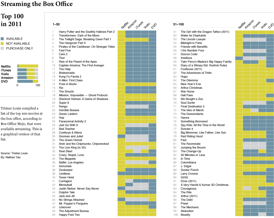
After seeing Tristan Louis’ list that tallied the streaming availability of 2011’s top 100 box office hits, I was curious what it looked like graphically. So I put together this little number. Blue means available, yellow means not, and gray means it’s only available for purchase. The last column for DVD simply means it’s available (since DVDs are of course not streaming).
Netflix streaming still isn’t a place to find the big movies (as any Netflix customer can tell you), with only five of the top 100 available. There is greater streaming availability from iTunes, Amazon, and Vudu, but those of course aren’t fair comparisons to Netflix, given that the latter is subscription-only.
My main takeaway is that if you’re deciding between the non-subscription services, it looks like price is the main thing to look at, since there doesn’t seem to be much variability in availability (although it could be different for smaller movies). As for Netflix, subscribe for the television and for the movies less so.
[Tristan Louis via Waxy]
Become a member. Support an independent site. Get extra visualization goodness.
See What You Get






When I first saw this I thought, “wow, Netflix has everything!” Then, I read the post and looked at the legend. I really dislike the color scheme and order of headings. Using bright (?) green for “not available” is confusing. I usually associate bright colors with availability and dimmed colors with no availability. It’s like how a program’s menus are grayed out when that function is unavailable. Furthermore, the chart should list most available on the left, least available on the right.
At least the lightness values are different, at work I’ve been given a similar “tick table shown like a heat map” chart with absolute red as ‘tick’ and absolute blue as ‘not tick’. People keep printing it in black and white and wondering why the entire chart is solid dark grey…
I’m a big fan of showing tick tables as tick tables: empty means no, strong mark means yes, part-weight appropriately chosen symbols mean other options. Here – “$$”? “!”? A shopping cart icon instead of a solid ‘play’ triangle? Stop sign? Empty circle rather than filled circle? Dash or * instead of tick shape? Then add dashes of appropriate colours as an optional piece of friendly redundancy to aid visual scanning.
I would have switched the yellow and gray colors and, as you mention, reverse the order of the columns (or at least switch dvd and netflix).
Definitely a dataset that lends itself to a clear visual. I wonder why NY Times didn’t bother?
To my eye, yellow is highlighted and blue-gray is not, so I first read the opposite of the intended color scheme.
Ah, simulpost! I think another factor that lead to me reading the visual wrong the first time is that I’d expect the most available streamer to be at left, and to see decreasing offerings to the right… Not sure if that’s just me though.
Hahah, I just saw that too! Great minds think alike. :)
To follow up on your idea of the highest streamer on the left, I assumed Netflix, because it’s the most popular, would dominate the list. “That’s what I thought, Netflix streams everything but Amazon stinks!”
+1! I misinterpreted yellow as positive and blue as negative, too.
I think yellow-green is good as it draws attention to the fact that these movies are NOT available at Netflix. It makes that stand out.
Also of interest, of the 5 that Netflix does have available, only 1 (Limitless) is available on the other 3.
I wonder if sorting by release date would cause the yellow bands (all unavailable) to clump together? I’m assuming mostly yes.
It might be interesting to see this in relation to release date. This graphic tells me that I ought to use my Amazon Prime for more than just getting my books faster.
The chart is doing an apples to goats comparison. Amazon Prime streaming (the ‘all you can eat’ plan) fairly compares to Netflix. Harry Potter isn’t on Amazon Prime streaming, it is on Amazon Instant Video (which is ‘a la carte’) and compares to iTunes.
Last time I checked, anything I pay $2.99 for is a purchase, even if it is only a rental.
Yeah, it’s really better to look at this as a survey of availability rather than a comparison of services.
Yeah, I got really excited for a minute until I realized that they aren’t all available on prime’s free streaming.
Amazon should really be broken out into 2 categories: Prime Eligible and Paid-Only. Prime competes with netflix streaming…but the paid only competes more with something like Red Box
It’s really unfortunate the Netflix column is there because, as you said, it’s an unfair comparison of Netflix’s “all you can eat” to others’ “a la carte.” It would be more meaningful to compare Netflix to the premium cable channels (HBO, Showtime, Cinemax) or the online services to Redbox.
Sorting by release date would be interesting. #69 is relatively new while #53 has been out for some time.
As Cody alludes to above, the key thing to realize is that all of the videos listed as available from Amazon are really a la carte VOD offerings, just like iTunes and Vudu.
Amazon’s subscription service, Prime Instant, suffers from the same limited availability as Netflix.
It looks to me as though the MPAA is happy to license their recent works to anyone on a la carte terms (Amazon, iTunes and Vudu have similar availability), but hates subscription services of all stripes. And for this, I hate them back.
I agree about the comparisons. This would be a great chart if it included Amazon Prime for comparison against Netflix.
I agree that the color scheme is confusing. Green is interpreted as positive, not negative.
Another flaw in this report is that iTunes doesn’t offer streaming. Netflix and Amazon are streaming video services (where the data is sent piece by piece, not stored on the device, and if you were to jump to another part of the video it would have to rebuffer). iTunes is a download service, whether you purchase or rent a video. Sure, you may be able to begin watching it before the entire video is downloaded, but unlike the other services you could not jump straight to the end of the video until entire movie has been downloaded to the device.
To me it looks a lot more like the issue is subscriptions (all you can eat) vs pay-per-view rentals as it seems others have pointed out. The content owners who controls who gets to show what want to collect tickets without going to the trouble of building a theater first.
I would go for basic icons. Green check for “Available”, red “X” for “Not Available” and a black/gray dollar sign for “can be purchased”.
Amazon Prime should be included as others have noted as it’s more of an “apples to apples” comparison with Netflix.
agreed- I would love to see this same chart with an Amazon Prime free-streaming section as well.
It would be cool to have the Rotten Tomatoes / IMDB ratings superimposed behind the titles, so that we could see which movies would be worth watching :D (so that i know to see Moneyball on Amazon and not see Never Say Never even though it’s on Netflix)
The implicit assumption of the graphic is that only movies released in 2011 are worth considering. I mean, how many of these do you really want to see…. or will remember after you have seen? One might also chart this against, say, the 100 All Time Best, or Oscar winners.
You forgot about Youtube, they stream movies now too. http://www.youtube.com/movies
The movies that are all yellow are the ones that the pirates are enjoying. A friend at dinner the other night (and after Megaupload was shut down) had just downloaded The Girl With the Dragon Tattoo and Mission Impossible to view with his wife. If he could have downloaded the movies legally, he would have, but since they were not “available” he strayed outside the law. Wake up Hollywood.
I initially read “yellow = available” too.
Can you add the Microsoft Zune catalog? I usually watch streaming movies via Zune on XBox 360; it tends to have the largest selection.
Just repeating what most posters are saying: Compare Amazon Prime Streaming versus Netflix Streaming. A separate second chart to compare availability Amazon Instant (pay per view) , Netflix (stream) Netflix (DVD rental), Redbox, Vudo, etc.