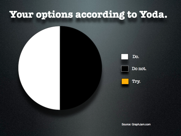
“Do or do not. There is no try.” — Yoda [via]
Yoda pie chart
FlowingData Delivered to Your Inbox
10 Comments
Second Edition
 Visualize This: The FlowingData Guide to Design, Visualization, and Statistics (2nd Edition)
 Visualize This: The FlowingData Guide to Design, Visualization, and Statistics (2nd Edition)
New tools, refined process.
It’s not clear that the proportions should be 50/50. Yoda strikes me as more of a “Do” guy. Maybe 80/20?
Much wisdom in this pie chart, there is.
Learned well, you have.
I’m trying to decide how much the chart is improved by graphic design. Graphjam’s built in template has ugly default options.
http://twitter.com/#!/markun/status/116589260475351040/photo/1/large
now, those are two of my favorite philosophers :)
Thats no pie chart, Thats a NY black and white cookie.
Overlap of do and do not, is there not?
LUV THIS!!! There is not try – just do it!
Shouldn’t that be green and white?
But nice try.
Ken you missed the point. There IS NO TRY, NICE OR OTHERWISE! *CHUCKLE*