Visualize This: Spotted in the wild
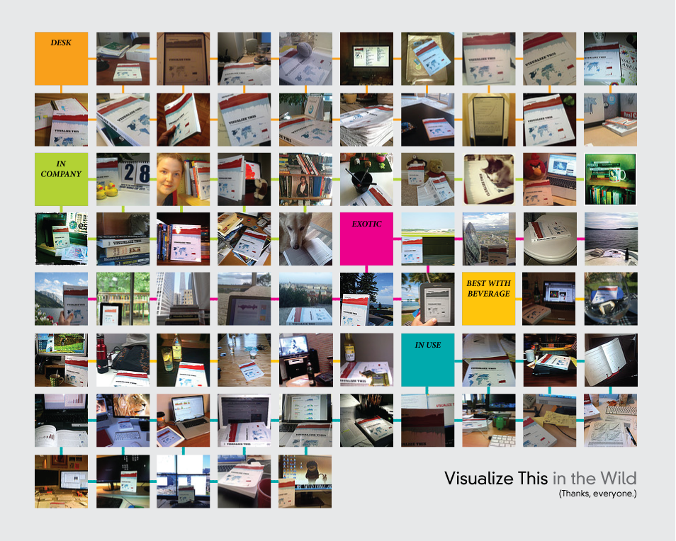
It’s been about a month since Visualize This came out, but it took a while for it to sink in. I mean, I don’t feel like, as my wife likes to put it, “a published author.” But people started tweeting pictures of the book in their hands, on their desk, and on actual boats (what??), and those pictures really made my day.
Plus, it was nice to see people finding the book useful. I still get that same nervous feeling whenever I publish a graphic, but it was on another level with the book.
So anyways, I asked for others to send in pictures, and I held a little drawing (winners should have received an email by now). Above is what everyone sent. Visualize This has made it all over the place. It’s on the beach, at the airport, and yes, in the bathroom (score!). I like how the book goes well with a fine bottle of wine just as it does with a bottle of suds.
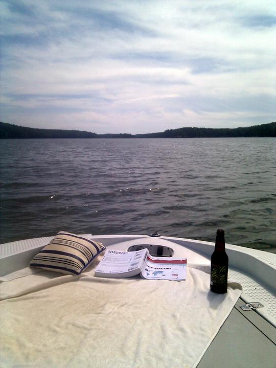
Steve gets the award for farthest away from shore:
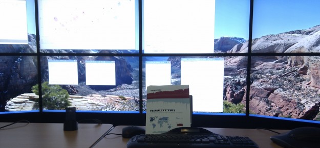
Paul gets a gold star for most insane workspace:
Alberto for most creative:
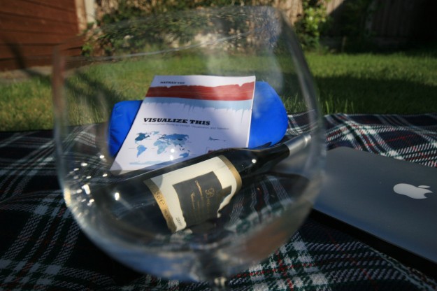
Jason, you get a star for cutest. Awwww:

Thanks again, everyone.
Still haven’t gotten your copy? More info here.
3 Comments
Become a member. Support an independent site. Get extra visualization goodness.
See What You Get

Ah, forgot to send a pic through, but no way I would compete with the interesting places some of these readers have had the book – my kitchen table is just dull!
As for Paul and his amazing workplace, do you really manage to get any work done Paul! Inspired by this image he sent in, if anyone’s interested, I’ve started a post here > http://www.visualisingdata.com/index.php/2011/08/send-me-a-pic-of-your-design-workspace/ where I’m aiming to collect examples of other interesting workplaces people do their design work from.
Andy,
Glad the workspace inspired you. And I have to confess that most days I work from a regular old cube farm. This set-up is for the special occasions when there are many data :)
It is excellent fun to work in though
After sitting on my shelf since it came out, I finally took a closer look at Visualize This. Great book! Once I opened it up, I couldn’t put it down – I actually read through it in one sitting (ok, truth be told I skimmed the R and Illustrator specifics). Phenomenal book. I just blogged about it in case you’re interested: http://www.storytellingwithdata.com/2011/09/visualize-this.html