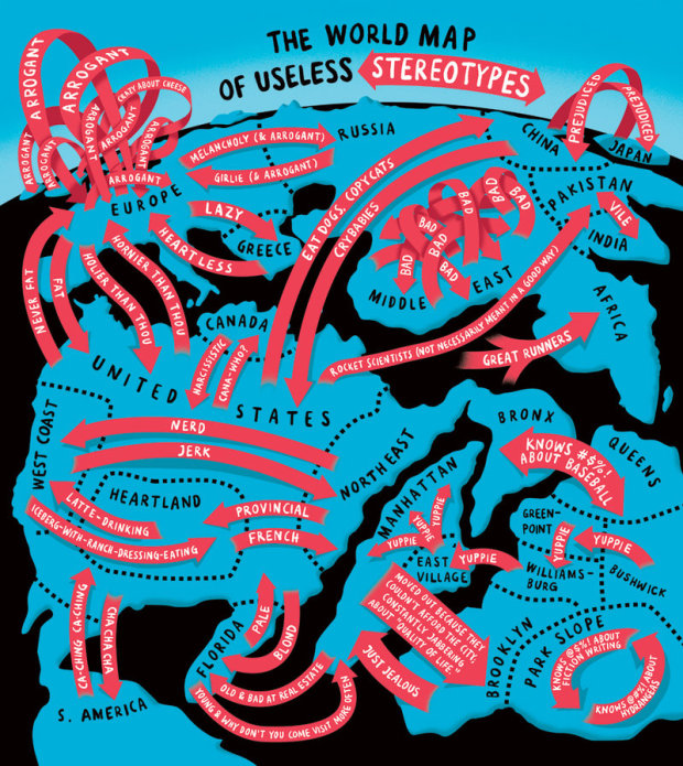
We saw Europe in the eyes of different countries a while back. Christoph Niemann, for The New York Times, runs with the idea and made this handy world map of stereotypes. My favorite is the arrogant arrows in Europe. True?
World map of useless stereotypes


 Visualize This: The FlowingData Guide to Design, Visualization, and Statistics (2nd Edition)

No. There are a lot of stereotypes in Europe, well crafted in the last hundreds of years. I think I never heard e.g. the Irish called arrogant.
Ahah! Such a map without all the stereotypes about us Italians cannot be considered complete.
Your comment, sir, is the heart of arrogance!
true, true, you cowardly, latin lover…
I think my major issue with this is that the whole of the US is depicted as larger than the rest of the world. Could that be classed as arrogance?
I’m with Matt. The fact that the USA dominates more than half of the world map here probably says more about USA prejudices than anything else. There’s a lot more variety and diversity in Europe than the USA, as well as more than twice as many people. And China and India are far bigger still, yet barely make it onto the map!
Here’s some advice for the brilliant folks who post here…metro NYC is also not half the land area of the US. It’s umm… a joke and meant first for New Yorikans.
An map from an U.S. point of view is not bad per se. But calling something a “world map” without further limitations implies some kind of balance.
I think that is the point of the joke, it’s not serious, whoever made it is probably american and taking the piss as well as exploiting the stereotypes they know most about. Within the UK alone there are hundreds of stereotypes.
You’re right, Hellen, I was being very literal in my reading of the map. Mind you, it would be fun to see some of the many other regional useless stereotypes presented in a simlar way.
In hindsight, looking at it with less early morning grumpy eyes, it would seem that the relative size of the nations is poking fun at the possible stereotypical notion that they are bigger than every other nation combined. The fact that Canada is so tiny is an obvious reference to this. That is, if it was meant in that way (ie the US poking fun at the USA).
Yep. I mean, it’s a comic. It’s a New Yorker poking fun at New York, which is why Manhattan, etc is just about as big as the rest of the US.
this map reflects American stereotypes about stereotyping. the ideas that everyone in Europe thinks that everyone else is “arrogant” and that everyone in the Middle East thinks that everyone else in the Middle East is “bad” are themselves American sterotypes.
it’s a meta-stereotype map.
Well said. There should be one stereotyp arrow be for “bad” and Middle East: From the US. But not within the ME.
erm. where is australia?!!
Where is New Zealand?
Lols Russia is out of the picture and comment on India inclusive to Pakistan as vile unacceptable..Middle east being bombed by USA!!! Bad revert the arrow to USA please..African ruling America lols!!